 Previous Topic
Manipulating Data Components in Web Report
You can manipulate data components, which refer to tables, crosstabs, charts, banded objects, KPIs, and geographic maps, in Web Report Studio. This topic describes how you can work on the data components in web reports.
 Most of the manipulations require selecting the component first. To select a component, hover the mouse pointer on the component, then when Server displays the icon
  at its upper left corner, select the icon.
This topic contains the following sections:
- Manipulating a Table
- Showing/Hiding the Headers/Footers and Detail in a Table
- Showing/Hiding Table Columns
- Adjusting Order of Table Columns
- Changing the Table Definition
- Switching Table Column Fields
- Adding and Removing Table Groups
- Sorting Data in a Group Table
- Sorting Data in a Summary Table
- Aggregating on a Table Detail Column
- Customizing the Data Value Formats in a Table
- Adjusting Table Column Width According to the Content
- Showing/Hiding Summary Fields in Header/Footer Rows in a Summary Table
- Removing Table Columns
- Adding Table Columns and Groups by Dragging and Dropping
- Manipulating a Crosstab
- Changing the Crosstab Definition
- Switching Crosstab Fields
- Sorting Data in a Crosstab
- Converting a Crosstab into a Chart
- Rotating a Crosstab
- Customizing the Data Value Formats in a Crosstab
- Auto Fitting Values in a Crosstab
- Changing the Aggregate Function of an Aggregation in a Crosstab
- Removing Column/Row Headers or Aggregations from a Crosstab
- Adding Column/Row Headers or Aggregations in a Crosstab by Dragging and Dropping
- Manipulating a Chart
- Changing the Chart Definition
- Switching Chart Fields
- Sorting Data in a Chart
- Swapping Chart Groups
- Formatting Chart Elements
- Changing the Chart Type
- Converting a Chart into a Crosstab
- Showing/Hiding the Chart Legend or Legend Label
- Changing the Chart Legend Position
- Showing/Hiding Labels on the X/Y Axis in a Chart
- Showing/Hiding X/Y Gridlines in a Chart
- Customizing the Data Format of Chart Data Labels
- Stopping or Resuming a Real Time Chart from Refreshing
- Zooming in Chart Values
- Manipulating a Banded Object
- Manipulating a KPI
- Manipulating Geographic Map Group Markers/Areas
- Converting Between Table/Crosstab/Chart/Banded Object Using the Visualization Toolbar
- Saving a Data Component as a Library Component
 Back to top
Manipulating a Table
Showing/Hiding the Headers/Footers and Detail in a Table
Right-click the icon
of the table, then on the shortcut menu, select/clear the corresponding names from the Show > Table Header/Table Footer/Table Detail/Table Group Header/Table Group Footer submenu to show/hide them.
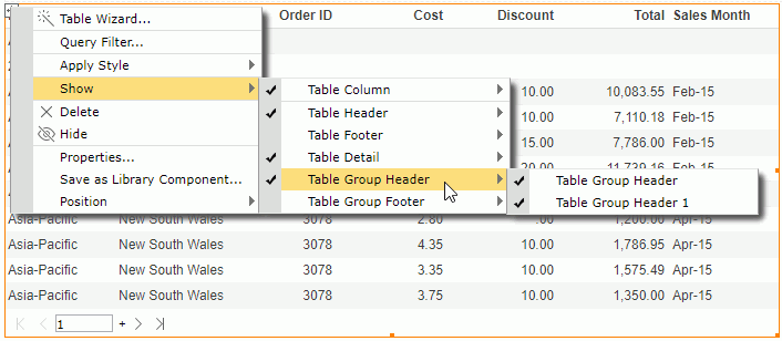
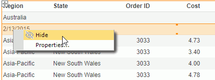
You can also hide a table header, footer, or the detail: select anywhere in the corresponding row and when Server displays the button  at the leftmost on the row, select the button to select the row, then right-click on the selected row and select Hide from the shortcut menu.
Showing/Hiding Table Columns
You can use the following ways to show/hide a table column:
- To show/hide a column, right-click the icon of the table, then on the shortcut menu, select/clear the column names from the Show > Table Column submenu to show/hide them.
- To hide a column, select anywhere in the column, select the button
 that Server displays on the column header to select the column, then right-click on the selected column and select Hide.
 - To show/hide a detail column, select the table and then select the Show/Hide Detail button
 on the toolbar. From the drop-down list, select/clear the object name to show/hide its detail column.
 - To show/hide a summary column, select the table and then select the Show/Hide Summary button
 on the toolbar. From the drop-down list, select/clear the aggregation object name to show/hide the corresponding summary.
Adjusting Order of Table Columns
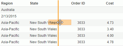
You can easily adjust the order of columns in a table. To do this, select anywhere in a column, then select the button that Server displays on the column header to select the column. Drag the selected column to the left or right boundary of another column, when Server displays a highlighted line along the column boundary, release the mouse.
Changing the Table Definition
- Select the table and do one of the following:
- Select Menu > Edit > Wizard.
- Select the Table Wizard button
 on the visualization toolbar.
 - Right-click the icon of the table and select Table Wizard from the shortcut menu.
Server displays the Table Wizard.
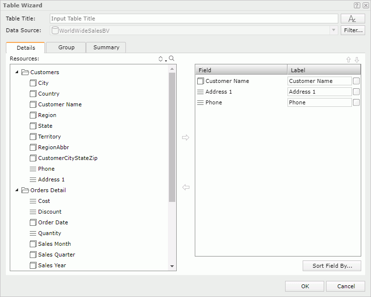
- In the Table Title text box, edit the title of the table.
- You can select the font button
 to customize the font, size, and style of the title.
 - Select the Filter button to apply some filter conditions on the business view that the table uses to narrow down data in the table.
- Define the data to display in the table.
- For a group table: in the Details tab, add or change the detail fields to display in the table; in the Group tab, modify the grouping criteria of the table; in the Summary tab, modify the summary fields of the table.
- For a summary table: in the Columns tab, change the fields you want to display in the table; in the Summary tab, add or edit the aggregations in the header/footer rows of the table and groups.
- Select OK to apply the modifications.
See Inserting a Table for more information about how to define a table.
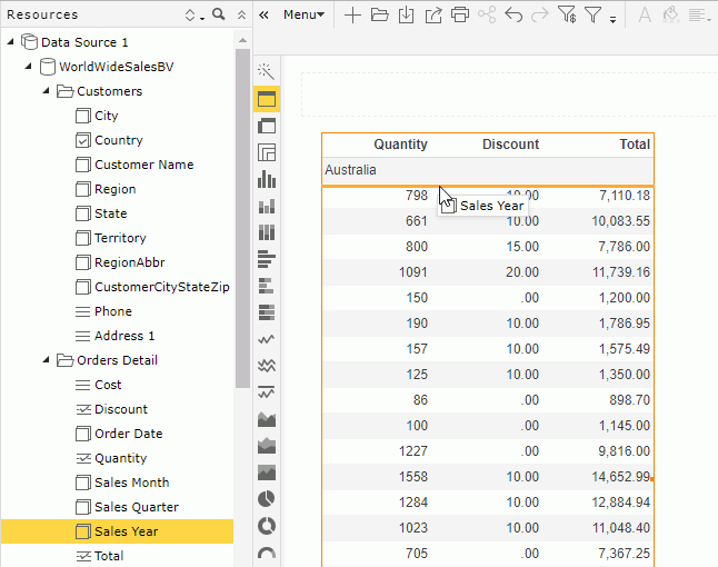
Switching Table Column Fields
In addition to the preceding method, another more convenient way to change the fields in the detail columns or group columns of a table is using the Switch command.
- To change the field in a detail column:
Select anywhere in the column, then select the arrow button that Server displays on the column header to select the column. Right-click the column and select Switch Column from the shortcut menu. Server lists the objects in the business view used by the table and the available dynamic resources which you can apply to the detail column, on the submenu with the currently used one being selected at the top. Select the object you want to use to replace the current one in the column.
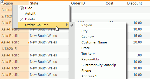
- To change the group field in a group column:
Right-click any value of the group and select Switch Group from the shortcut menu. Server lists group objects in the business view used by the table and the available dynamic formulas used as Group, on the submenu with the currently used one being selected. Select the object you want to use to replace the current one in the column.
Adding and Removing Table Groups
You can add more groups into a table or remove the groups that you do not want from a table.
- To add a group into a table:
Select the table, then on the toolbar select the Add/Remove Group button . Server displays a list of group objects in the business view used by the table. Select the group object you would like to add into the table as a group. If there is no existing group in the table, Server places the added group at the left-above position. If the table already contains groups, Server adds the new group as the highest-level group and follow the same position pattern as the closest existing group.
 - To remove a group from a table:
You can use one of the following ways:
- Right-click any value of the group and select Delete from the shortcut menu.
- Select the table, then use the Add/Remove Group button on the toolbar: clear the group you want to remove from the drop-down list.
- Select any value of the group, then select the arrow button that Server displays at the leftmost on the row to select the group row, or the button on the column header to select the group column. Drag and drop the row or column outside the report page.
Sorting Data in a Group Table
You can take the following ways to sort data in a group table. When you sort a group table by values in a detail column and then values in another detail column, Server sorts data in the table by the later sort condition first and then by the former sort condition.
- Using shortcut menu
To sort the data based on values in any column, right-click any value in the column, then on the shortcut menu select Ascend or Descend from the Sort submenu. If the column is a group column, Server rearranges groups at the current group level. To remove the sort condition, select No Sort.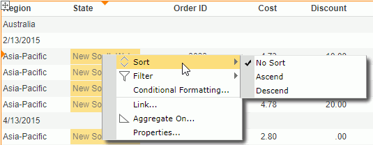
- Using the sort button on table column header
You can use the sort button on any table column header to sort values in the column if you did not disable the option Sort on Column Headers in the server profile.- Put the mouse pointer on any column header and you can see the sort button
 .
.
- To sort values in the column in ascending order, select the upward triangle; to sort the values in descending order, select the downward triangle. When you applied a sort order, Server highlights the corresponding triangle. To remove the sort order, select the highlighted triangle.
You cannot sort a summary column that contains multiple aggregation objects using this way. Moreover, Server always merges a group header in a table that you created in Web Report Studio as a table cell. If a summary column contains only one aggregation object which is in a merged group header, you cannot use this way to sort it either.
- Put the mouse pointer on any column header and you can see the sort button
- Using labels
With Logi Report Designer, you can bind a label in a table with a field used in the table to enable sorting on the label, by setting the label's Bind Column and Sortable properties. Then when running the table in Web Report Studio, you can select the sort button beside the label to sort values of the bound field. This functions the same as via the table column headers.When a label is bound with a field and you did not disable the Sort on Column Header feature in the server pr, the former has higher priority. For example, if you bind the label in column A header with the field in column B, when selecting the sort button on column A header, Server sorts the values in column B.
Sorting Data in a Summary Table
You can use the same methods on group tables to sort the group and summary columns in summary tables. However, for summary tables, you can define whether to use major sort or minor sort via the Use Major Sort as Default option in the server profile. By default, Server applies major sort which is to sort data in a summary table by the last sort condition only, that is to say the later sort condition always replaces the former one.
When you use minor sort, sort of a lower group is always based on the sort result of all its higher-level groups. For example, a summary table contains group columns G1, G2, and G3 (G1 the highest group level and G3 the lowest), and the summary columns S1 and S2. When you applied minor sort, after sorting the group column G1 ascending, if you apply a sort on G2 descending, Server sorts the table based on G1 ascending first and then G2 descending; if you further sort G3 descending and the sort result is G1 ascending, G2 descending, and G3 descending. Based on this sort result, if you apply the ascending order on the summary column S1, Server sorts the table based on G1 ascending, G2 descending, and S1 ascending. Server removes the sort order on G3, and this is because all summary columns calculate data based on the lowest group in a summary table and Server considers them as one group, so on the lowest group and the summary columns only one sort order can take effect. Therefore, based on the former sort result, if you apply a sort order on G3 again, Server removes the sort on S1.
Aggregating on a Table Detail Column
You can summarize the data in a detail column. To do this:
- Do either of the following:
- Right-click any value in the detail column and select Aggregate On from the shortcut menu.
- Select anywhere in the column, then select the button that Server displays on the column header to select the column. On the toolbar, select the Aggregate On button
 .
.
Server displays the Aggregate On dialog box.
- Select a function from the Function drop-down list to summarize the data.
When you selected DistinctSum, you should select the ellipsis button
 next to the Distinct On text box. Server displays the Select Fields dialog box. Select one or more group and detail objects according to whose unique values to calculate DistinctSum.
For more information, see Aggregate Functions in the Logi Report Designer Guide.
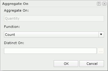
- Select OK.
- If the table has groups, Server summarizes data at each group level and in the whole table respectively in the column.
- If the table has no groups, the summary is based on the whole table.
When you finish summarizing a detail column, Server creates a dynamic aggregation at the same time in the Dynamic Resources > Aggregations list in the Resources panel, and gives it a default name Function_DetailFieldName. You can use it again in the current report.
Customizing the Data Value Formats in a Table
You can customize the data format of the values in a table if they are of the Number/Date/Time type. To do this, right-click on any value, then select a format from the Format submenu, or type a format in the text box at the bottom of the submenu and press Enter.
Adjusting Table Column Width According to the Content
When the content in a table column needs more space to completely display, you can adjust the width of the table column according to the content. To do this,
- Select anywhere in the column and select the button that Server displays on the column header to select the column.
- Right-click on the selected column and select Autofit on the shortcut menu.
- Set the property Autofit in the Inspector panel for the data field or label whose content needs more space in the column to true.
Showing/Hiding Summary Fields in Header/Footer Rows in a Summary Table
Once you have placed any aggregation object on the table header/footer or group header/footer when creating or editing a summary table via the table wizard, after generating the table Server activates the Show Summary Field command on the shortcut menu of all the summary columns in the table. You can use the command to show or hide the aggregation objects in the header/footer rows. To do this, select anywhere in the summary column that contains the required aggregation object, select the button on the column header to select the column, then right-click on the column and from the Show Summary Field submenu select/clear the corresponding table/group header/footer to show/hide the aggregation object on the specified locations.
Removing Table Columns
To remove a table column, select anywhere in the column, then select the button on the column header to select the column. Right-click on the selected column, and then select Delete on the shortcut menu, or drag and drop the column outside the report page.
Adding Table Columns and Groups by Dragging and Dropping
From the Resources panel, you can drag view elements and dynamic resources into a table to add new columns and group rows in the table. To do this, first select the table to locate the business view it uses in the Resources panel, then:
- To add a new table column:
Drag the required object from the Resources panel and move the mouse pointer to the boundary of an existing table column until Server displays a highlighted vertical line, then release the mouse. Server places the new column where the highlighted line lies.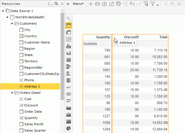
- To add a new group row:
Drag a group object or a dynamic formula used as Group from the Resources panel and move the mouse pointer in the detail section or to the boundary of an existing table group row until Server displays a highlighted horizontal line, then release the mouse. Server places the new group row where the highlighted line lies.
Manipulating a Crosstab
Changing the Crosstab Definition
- Select the crosstab and then do one of the following:
- Select Menu > Edit > Wizard.
- Select the Crosstab Wizard button on the visualization toolbar.
- Right-click the icon of the crosstab and select Crosstab Wizard from the shortcut menu.
Server displays the Crosstab Wizard.
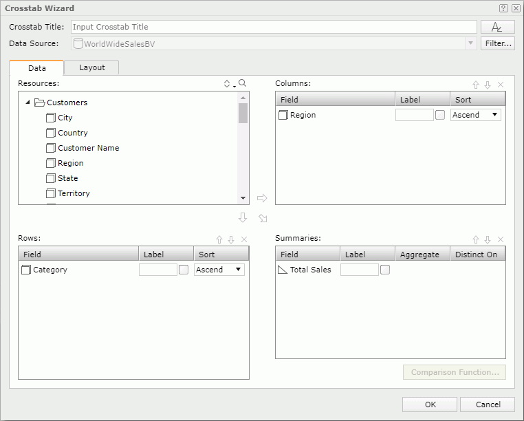
- In the Crosstab Title text box, edit the title of the crosstab.
- You can select the font button to customize the font, size, and style of the title.
- Select the Filter button to apply filter conditions on the business view that the crosstab uses to narrow down data in the crosstab.
- In the Data tab, change the column/row fields and aggregate fields in the crosstab.
- In the Layout tab, customize the layout of the crosstab.
- Select OK to apply the modifications.
See Inserting a Crosstab for more information about how to define a crosstab.
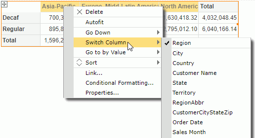
Switching Crosstab Fields
In addition to the preceding method, another more convenient way to change the fields in a crosstab is to use the Switch command. To do this, right-click any column header, row header, or aggregation value and select Switch Column/Switch Row/Switch Summary from the shortcut menu. The submenu lists objects in the business view used by the crosstab and the available dynamic resources which can apply as the row/column/aggregation field, with the currently used one being selected. Select the object you want to use to replace the current one.
Sorting Data in a Crosstab
You can sort the data in a crosstab based on any column or row field. To do this, right-click on any value on the column or row header, then choose the command Ascend or Descend from the Sort submenu on the shortcut menu. To remove the sort condition, select Sort > No Sort from the shortcut menu.
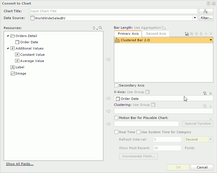
Converting a Crosstab into a Chart
- Select the crosstab and then do either of the following:
- Select Menu > Edit > To Chart.
- Right-click the icon of the crosstab and select To Chart from the shortcut menu.
Server displays the To Chart dialog box.
- In the Chart Title text box, type a title for the chart.
- You can select the font button to customize the font, size, and style of the title.
- The Resources box lists the view elements used in the crosstab. You can only define the chart based on these objects. Select the required chart type from the chart type drop-down list in the Primary Axis tab.
- Add aggregation objects
 or detail objects
  from the Resources box to the chart type box.
 - Add a group object to the Category box.
- Add a group object to the Series box.
- Select OK to finish the conversion.
See Inserting a Chart for more information about how to define a chart.
You can also select a chart type icon on the visualization toolbar to directly convert the crosstab to that chart type.
Rotating a Crosstab
You can exchange the columns and rows in a crosstab. This operation is called rotating a crosstab.
To rotate a crosstab, first select it, and then do one of the following:
- Select Menu > Edit > Rotate Crosstab.
- Select the Rotate Crosstab button
 on the toolbar.
 - Right-click the icon of the crosstab and select Rotate Crosstab from the shortcut menu.
Customizing the Data Value Formats in a Crosstab
You can customize the data format of the values in a crosstab if they are of Number/Date/Time type. To do this, right-click any value, then select a format from the Format submenu, or type a format in the text box at the bottom of the submenu and press Enter.
Auto Fitting Values in a Crosstab
When the values in the crosstab row/column headers or aggregation cells need more space to completely display, right-click any value in the row/column header or aggregation cell and select Autofit from the shortcut menu. Server then adjusts the width of the corresponding cells to match the content in them. However, for performance concern, you should not select the option because it may cause poor performance.
Changing the Aggregate Function of an Aggregation in a Crosstab
Right-click an aggregation that is based on a detail object or a dynamic aggregation and select Switch Function from the shortcut menu, then choose a new function from the submenu. If you selected DistinctSum as the function, Server displays the Select Fields dialog box for you to select the detail objects according to whose unique values to calculate DistinctSum.
Removing Column/Row Headers or Aggregations from a Crosstab
Right-click a value in the column/row header or any aggregation value, and then select Delete from the shortcut menu. Or drag the value and drop it outside the report page.
Adding Column/Row Headers or Aggregations in a Crosstab by Dragging and Dropping
From the Resources panel, you can drag view elements and dynamic resources into a crosstab to add new column/row headers and aggregations in the crosstab. To do this, first select the crosstab to locate the business view it uses in the Resources panel, then:
- To add a column header:
Drag a group object or a dynamic formula used as Group from the Resources panel and move the mouse pointer to the boundary of a column header until Server displays a highlighted horizontal line, then release the mouse.
- When the crosstab has no column/row/aggregation labels, Server directly places the new column header where the highlighted line lies.
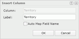
- When you have specified any labels to label the column headers/row headers/aggregations in the crosstab using the wizard, Server displays the Insert Column dialog box. By default, Server uses the display name of the object to label the new column header. To edit the label text for the new column header, select in the Label text box and type a new one. If you want to automatically map the label text to the dynamic display name of the object, select the Auto Map Field Name option. Select OK and Server places the new column header where the highlighted line lies.
- To add a row header:
Drag a group object or a dynamic formula used as Group from the Resources panel and move the mouse pointer to the boundary of a row header until Server displays a highlighted vertical line, then release the mouse.
- When the crosstab has no column/row/aggregation labels, Server directly places the new row header where the highlighted line lies.
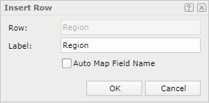
- When you have specified any labels to label the column headers/row headers/aggregations in the crosstab using the wizard, Server displays the Insert Row dialog box. By default, Server uses the display name of the object to label the new row header. To edit the label text for the new row header, select in the Label text box and type a new one. If you want to automatically map the label text to the dynamic display name of the object, select the Auto Map Field Name option. Select OK and Server places the new row header where the highlighted line lies.
- To add an aggregation in the crosstab:
Drag a detail object, an aggregation object , a dynamic formula used as Detail , a dynamic formula used as Aggregation , or a dynamic aggregation from the Resources panel and move the mouse pointer above or below the desired aggregation until Server displays a highlighted horizontal line, then release the mouse. The position determines whether Server creates detail aggregations, subtotals, or grand totals in the crosstab.
- If the selected object has been predefined with an aggregate function,
- When the crosstab has no column/row/aggregation labels, Server inserts the object into the specified position directly.
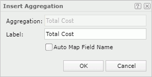
- When you have specified any labels to label the column headers/row headers/aggregations in the crosstab using the wizard, Server displays the Insert Aggregation dialog box. By default, Server uses the display name of the object to label the new aggregation. To edit the label text for the new aggregation, select in the Label text box and type a new one. If you want to automatically map the label text to the dynamic display name of the object, select the Auto Map Field Name option. Select OK and Server inserts the aggregation to the specified position.
- If the selected object has no predefined aggregate function, Server displays the Insert Aggregation dialog box. From the Aggregate Function drop-down list, select the function for calculating the object.
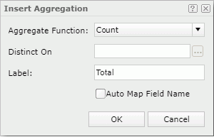
When you selected DistinctSum, you should select the ellipsis button
next to the Distinct On text box. Server displays the Select Fields dialog box. Select one or more detail objects according to whose unique values to calculate DistinctSum.By default, Server uses the display name of the object to label the new aggregation. To edit the label text for the new aggregation, select in the Label text box and type a new one. If you want to automatically map the label text to the dynamic display name of the object, select the Auto Map Field Name option. Select OK and Server inserts the aggregation to the specified position. However, whether the label you specified here will display depends on whether you have added any labels to label the column headers/row headers/aggregations in the crosstab using the wizard and whether there is appropriate position to place the label in the current crosstab. If you have not defined any labels in the wizard, Server ignores the label you added in the Insert Aggregation dialog box.
- If the selected object has been predefined with an aggregate function,
After you have added a column/row header or an aggregation using the drag method, when you open Crosstab Wizard, you can find the fields based on which Server creates the column/row header or aggregation, in the corresponding box.
Manipulating a Chart
For the chart in a KPI, that is a KPI chart, you can only perform some of the following operations.
Changing the Chart Definition
- Do one of the following to access the Chart Wizard:
- Select the chart, then select Menu > Edit > Wizard.
- Select the chart, then select the Chart Wizard button on the visualization toolbar.
- Right-click on the chart and select Chart Wizard from the shortcut menu.
Server displays the Chart Wizard.
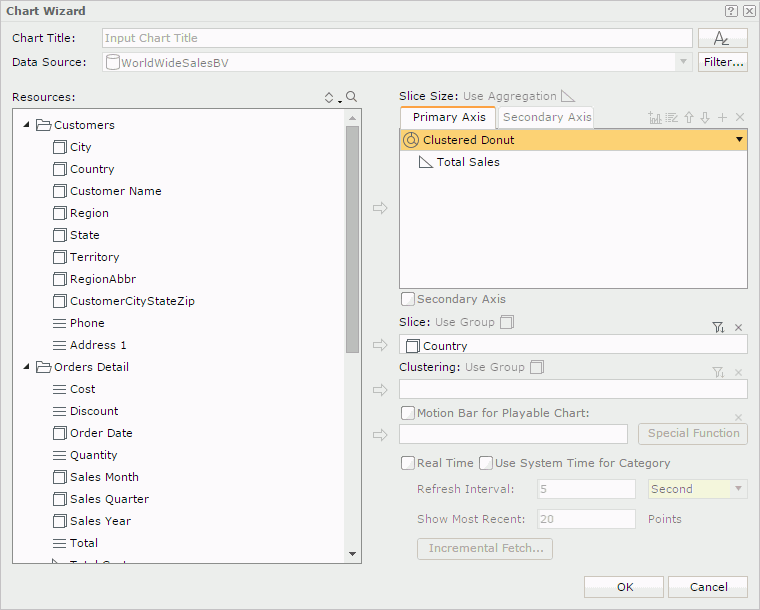
- In the Chart Title text box, edit the title of the chart.
- You can select the font button to customize the font, size, and style of the title.
- Select the Filter button to apply filter conditions on the business view that the chart uses to narrow down data in the chart. The button is not available for a KPI chart.
- Change the fields in the chart.
- Specify other options.
- Upon finishing, select OK to apply the modifications.
See Inserting a Chart for more information about how to define a chart.
Switching Chart Fields
In addition to the preceding method, another more convenient way to change the fields in a chart is to use the Switch command.
- To change the field on the value axis:
Right-click on the chart and select Switch Values on the shortcut menu. The submenu lists aggregation objects in the business view used by the chart, as well as the available dynamic resources (including dynamic aggregations and dynamic formulas used as Aggregation), with the currently used one being selected. Select an unselected object to add it to the value axis.If a chart has multiple fields on its value axis, you can also select the up or down arrow beside the currently used ones to adjust their order, or clear a selected field to remove it from the chart. When there is only one field on the value axis, you cannot remove it.
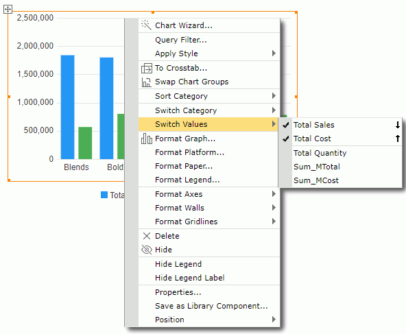
For a combo chart, you can change the fields in the chart one by one for each chart type.
- To change the field on the category/series axis:
Right-click the chart and select Switch Category/Switch Series from the shortcut menu. The submenu lists group objects in the business view used by the chart and the available dynamic formulas used as Group, with the currently used one being selected. Select the object you want to use to replace the current one on the axis.
Sorting Data in a Chart
You can sort data labels on the category and series axes of a chart alphabetically. To do this, right-click the chart, then on the shortcut menu select Ascend or Descend from the Sort Category or Sort Series submenu. To remove the sort condition, select No Sort on the Sort Category or Sort Series submenu.
Swapping Chart Groups
You can swap the chart groups by switching data between the category and series axes, or between the category and value axes when the chart has no field on the series axis but several on the value axis.
- To switch data between the category and series axes, first select the chart, then select the Swap Chart Groups button
 on the toolbar; or right-click on the chart and select Swap Chart Groups from the shortcut menu.
 - To switch data between the category and value axes, select the chart and then select the Swap Chart Groups button on the toolbar.
Formatting Chart Elements
You can format the elements in a chart to suit your requirements using dialogs.
- To format the platform/paper/legend of a chart, right-click on the chart and select Format Platform/Format Paper/Format Legend from the shortcut menu. In the Format Platform dialog box/Format Paper dialog box/Format Legend dialog box, specify the settings.
- To format the wall of a chart, right-click on the chart and select Format Walls > Format Wall from the shortcut menu. In the Format Wall dialog box, specify the settings.
- To format an axis, right-click on the chart and select the axis from the Format Axes submenu. In the Format Category (X) Axis dialog box, Format Value (Y) Axis dialog box, or Format Value (Y2) Axis dialog box, specify the axis settings.
- To format the gridlines of an axis, right-click on the chart and select the corresponding command from the Format Gridlines submenu. In the Format Category (X) Gridline dialog box, Format Value (Y) Gridline dialog box, Format Value (Y2) Gridline dialog box, or Format Series (Z) Gridline dialog box, set the gridline properties accordingly.
- To format the graph such as the areas, bars, or lines of a chart, right-click on the chart and select Format Graph from the shortcut menu (for a combo chart, the option name is Format Graph (Y) and Format Graph (Y2)). In the Format Area dialog box, Format Bar dialog box, Format Bench dialog box, Format Donut dialog box, Format Indicator dialog box, Format Line dialog box, Format Pie dialog box, Format Activity Gauge dialog box, Format Bar Gauge dialog box, Format Bubble Gauge dialog box, Format Dial Gauge dialog box, or Format Solid Gauge dialog box, set the graph settings.
- For a pie/donut chart, if you specify to display KPI values on it, you can format the KPI value labels, for example, edit the size and border of the labels, and change the label font size and color. To do this, right-click on the chart and select Format KPI Label from the shortcut menu. Then in the Format KPI Label dialog box, set the properties according to your requirements.
When an activity, bar, dial, or solid gauge chart displays the gauge labels, pointer labels, and target labels, you can also format the labels accordingly. To do this, right-click on the chart and select Format Gauge Label/Format Pointer Label/Format Target Label from the shortcut menu. Then in the Format Gauge Label dialog box/Format Pointer Label dialog box/Format Target Label dialog box, specify the properties.
- You can also format the nodes and lines in an org chart. To do this, right-click the org chart and select Format Node/Format Line from the shortcut menu. In the Format Org Node dialog box/Format Org Line dialog box, specify the properties.
- For a heat map chart, you can customize the rectangle separator and rectangle title of a specific group. To do this, right-click the heat map, select Format Rectangle/Format Rectangle Title and then select a group name on the shortcut menu. Then in the Format Rectangle dialog box/Format Rectangle Title dialog box, set the properties.
Changing the Chart Type
Select the chart, then on the toolbar select the Chart Type button  . From the drop-down list, select the desired chart type and its subtype.
Converting a Chart into a Crosstab
- Select the chart and then do either of the following:
- Select Menu > Edit > To Crosstab.
- Right-click on the chart and select To Crosstab on the shortcut menu.
Server displays the To Crosstab dialog box.
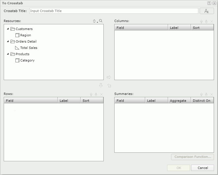
- In the Crosstab Title text box, type a title for the crosstab.
- You can select the font button to customize the font, size, and style of the title.
- The Resources box lists the view elements used in the chart. You can only define the crosstab based on these objects. Add the group objects to the Columns and Rows boxes as the group fields in the crosstab.
- Add aggregation objects or detail objects to the Summaries box as the aggregate fields to summarize data in the crosstab. For a detail object specify the aggregate function for it from the Aggregation drop-down list. When you selected DistinctSum as the aggregate function, you should select the ellipsis button next to the Distinct On text box. Server displays the Select Fields dialog box. Select one or more detail objects according to whose unique values to calculate DistinctSum.
- For each column/row/summary field, you can select in the Label text box and type a name to label the corresponding column header/row header/summary, or select the Auto Map Field Name checkbox beside the text box if you want to automatically map the label text to the dynamic display name of the field. When the text box is blank and you do not select the checkbox, Server will not create the label.
- In the Sort column, specify a sorting manner on a group field.
- You can select Comparison Function to set the comparison function for the aggregate fields.
- If you want to remove any group/aggregate field, select it and select the Remove button
 .
. - To adjust the order of group/aggregate fields, select a group/aggregate field and select the Move Up button
 or the Move Down button
  .
. - Select OK to finish the conversion.
- You cannot convert the org chart type to crosstab or any other chart type, and vice versa.
- You can only use additional values in charts. If you convert a chart with additional values into a crosstab, Server does not convert the additional values together with the chart.
Showing/Hiding the Chart Legend or Legend Label
Right-click on the chart, then select the corresponding Show or Hide command from the shortcut menu to show or hide the legend or legend label. However, the legend always displays in the export or print result.
Changing the Chart Legend Position
You can place chart legend at the top, bottom, left, or right position in a chart. To change the legend position, select the chart, then on the toolbar select the Chart Options button  . From the drop-down menu, go to the Legend submenu and select the desired position.
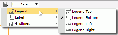
Showing/Hiding Labels on the X/Y Axis in a Chart
Select the chart, then on the toolbar, select the Chart Options button . From the drop-down menu, go to the Label submenu, then select/clear the desired labels to show/hide them.
Showing/Hiding X/Y Gridlines in a Chart
Select the chart, then on the toolbar select the Chart Options button . From the drop-down menu, go to the Gridlines submenu, then select/clear the desired gridlines to show/hide them.
When the chart displays gridlines, it is better to also show the wall to make the background gridlines more intuitive. To show the wall, follow the preceding steps, then on the Gridlines submenu, select Wall.
Customizing the Data Format of Chart Data Labels
You can customize the data format of the legend entry labels and data labels on the category and series axes if they are of Number or Date/Time type. To do this, right-click on any label and select the required format from the Format submenu, or type a format in the text box at the bottom of the submenu and press Enter.
Stopping or Resuming a Real Time Chart from Refreshing
For a real time chart, you can stop or resume it from automatically refreshing, by right-clicking it and selecting the Pause Refresh or Resume command from the shortcut menu.
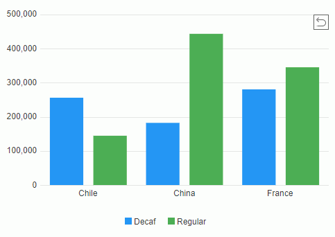
Zooming in Chart Values
For a bar, bench, line, area, or stock chart, you can select the values you are interested in to zoom in them. To do this, make sure you are in the View Mode of Web Report Studio, then drag the mouse from the start value to the end value that you want to select and release the mouse.
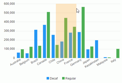
Server zooms in the selected values. To return to the initial status, select the return button  on the upper right corner of the chart paper.
Manipulating a Banded Object
Editing the Banded Object Template
Web Report Studio provides the template editor for you to edit the templates of banded objects easily. You can nest banded objects and they can contain other components with absolute layout for precise design. By modifying the template of a banded object, you can easily design a complex report with sophisticated layout without having impact on the performance.
To display the template editor of a banded object, right-click the icon of the banded object and select Edit Template from the shortcut menu, or select the Edit Template icon  on the visualization toolbar. To exit the template editor, select the Return icon
  on the visualization toolbar or Return on the top-right corner of the Web Report Studio window.
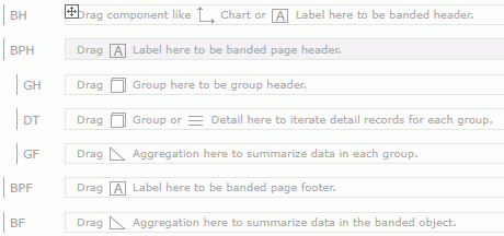
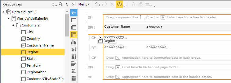
By default, a banded object template contains the following panels which Server identifies on the left side by their abbreviations: a banded header panel (BH), a banded page header panel (BPH), a detail panel (DT), a banded page footer panel (BPF), a banded footer panel (BF), a group header panel (GH), and a group footer panel (GF). You can add more panels, insert components, and add data into the panels according to your requirements.
- Managing the banded panels
- To add a banded panel, hover on the name section of a panel of the same type, select the icon
 beside the panel name and select Insert Panel Before or Insert Panel After. Server inserts a blank panel of the same type into the banded object.
 - To delete a banded panel from a banned object, select the icon beside the panel name and select Delete Panel. You cannot delete a panel of a certain type if it is the only one of that type.
- To hide a banded panel from view, select the icon beside the panel name and then select Hide.
- To show the hidden banded panels, select the Show Hidden Objects button
 on the toolbar. Server displays the hidden panels and marks them with the icon
  which means that the panels are hidden. You can then select , or select the icon beside the panel name and select Unhide from the shortcut menu to change a panel from being hidden to show.
 - To resize a banded panel, drag the boundary below the banded panel until the panel is at the required height.
- To add a banded panel, hover on the name section of a panel of the same type, select the icon
- Adding components and data to the banded panels
You can add components such as tables, crosstabs, charts, web controls, images, and horizontal/vertical lines from the Components panel and drag view elements and dynamic resources from the Resources panel into the banded panels.When you add a table, crosstab, or chart to the banded header panel, banded footer panel, group header panel, or group footer panel, you can make it inherit data from the banded object. By inheriting the parent's business view, the report becomes powerful. For example, if you want to automatically filter a chart by the group of the parent banded object, you can put it in the group panel in the banded object and make it inherit data from its parent, then Server replicates the chart for each group in the parent. In addition, having data components inherit data from the parent banded objects whenever possible will have a dramatic effect on the performance of your reports.
See an example about embedding a chart in a banded object using inherited data.
- Insert a banded object using WorldWideSalesBV in the SampleReports catalog and only group it by the Country group object.
- Go to the template editor of the banded object.
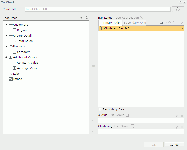
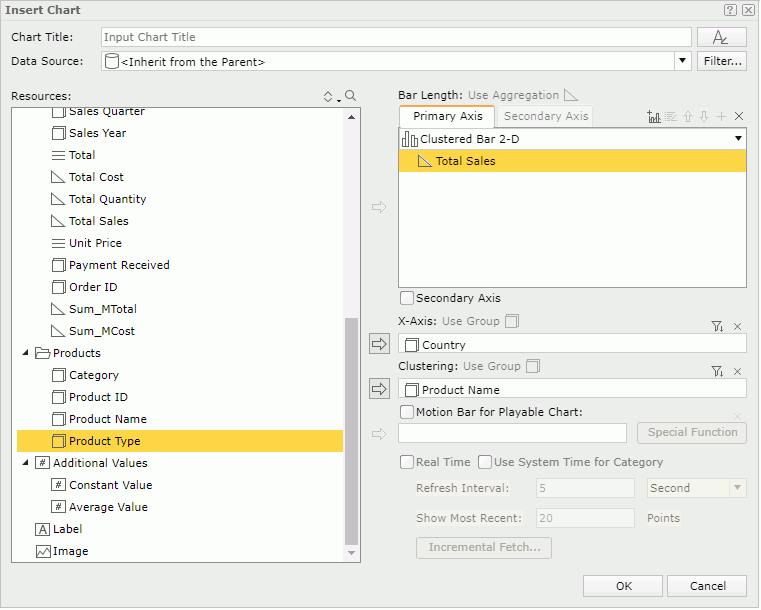
- Drag Chart from the Components panel to the GH panel. Server displays the Insert Chart dialog box and selects <Inherit from the Parent> in the Data Source drop-down list.
- Add Total Sales to the Bar Length box.
- Add Country to the X-Axis box.
- Add Product Name to the Clustering box.
- Select OK to insert the chart in the group panel.
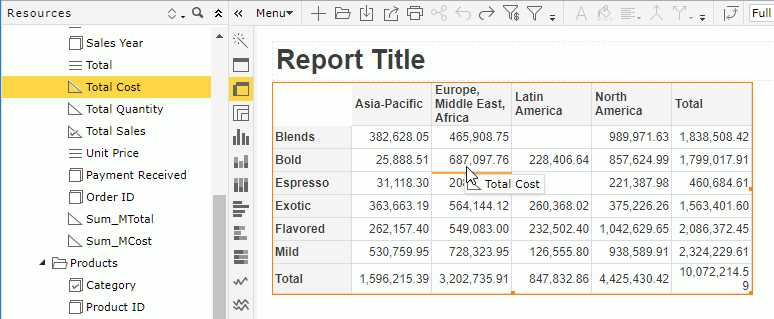
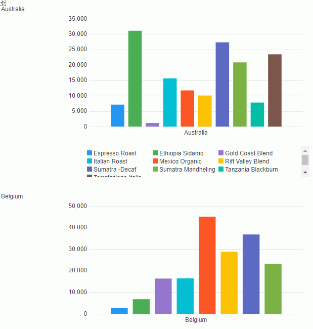
- Exit the template editor. The banded object and chart display as follows. You can see that Server filters the total sales for each product in each country in the chart according to the group-by field Country in the banded object.
- Insert a banded object using WorldWideSalesBV in the SampleReports catalog and only group it by the Country group object.
- Adding groups to the banded object
- Right-click the icon of the banded object and select Insert Group from the shortcut menu. Server displays the Insert Banded Group dialog box.
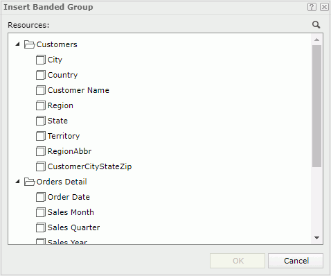
- Server lists all the group objects in the business view based on which you created the banded object. Select the group object you would like to use for the new group.
- Select OK. Server inserts a new group into the banded object as the top-level group.
When there are existing groups in the banded object, you can also use either of the following ways to add a group:
- Drag a group object from the Resources box to above or below the GH or GF panel of a group until Server displays a horizontal line and then release the mouse.
- Select the icon in the GH or GF panel of a group and select Insert Group Before or Insert Group After. Server displays the Insert Banded Group dialog box. Select a group object and then select OK.
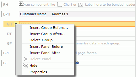
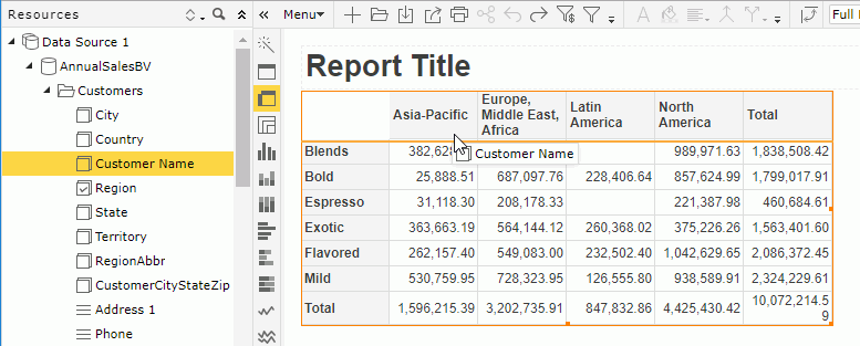
When you added a group to the GH panel, the level of the new group follows the inserted position. However, when you added to the GF panel, Server still places the new group in the new GH panel but with the opposite level. See the following table:
Inserted Position Level of New Group Above or before GH Higher level Below or after GH Lower level Above or before GF Lower level Below or after GF Higher level - Right-click the icon
- Removing groups from a banded object
Select the icon in the GH or GF panel of the required group and select Delete Group from the shortcut menu.
Tip: Some operations in the template editor are also supported in the Edit Mode of Web Report Studio. For example, you can drag view elements and dynamic resources into a banded object to add new detail fields in the banded object. To do this, select the banded object to locate the business view it uses in the Resources panel, drag the required object from the Resources panel and move the mouse pointer to the detail section in the banded object and release the mouse. You can also add/remove groups in the banded object and insert/delete banded panels using the shortcut menu of the banded object.
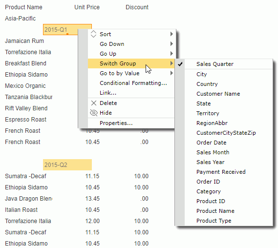
Switching the Group-by Fields in a Banded Object
In the Edit Mode of Web Report Studio, you can change the group-by fields in a banded object using the Switch Group command. To do this, right-click any value of the required group level and select Switch Group from the shortcut menu. The submenu lists group objects in the business view used by the banded object and the available dynamic formulas used as Group, with the currently used one being selected. Select the object you want to use to replace the current one.
Sorting Data in a Banded Object
You can take the following ways to sort data in a banded object. When you sort a banded object by values of a detail field and then by values of another detail field, Server sorts data in the banded object by the later sort condition first and then by the former sort condition.
- Using shortcut menu
To sort the data based on values of a detail field, right-click any value of the detail field, then on the shortcut menu select Ascend or Descend from the Sort submenu.To sort groups of a group level, right-click any value of the group level and select Ascend or Descend from the Sort submenu.
To remove the sort condition, select No Sort.
- Using labels
With Logi Report Designer, you can bind a label in a banded object with a field used in the banded object to enable sorting on the label, by setting the label's Bind Column and Sortable properties. Then when running the banded object in Web Report Studio you can select the sort button beside the label to sort values of the bound field. This functions the same as via the table column headers.
Manipulating a KPI
Removing the KPI Chart from a KPI
Right-click the icon of the KPI, then on the shortcut menu select Remove KPI Chart.
Manipulating Geographic Map Group Markers/Areas
Going Up/Down on Geographic Map Group Markers/Areas
- For the group level that is higher than some other group levels in a geographic map component, right-click its group marker/area, and select Go Down from the shortcut menu to jump one group level down. The go-down action always happens along with the generation of a filter condition based on the selected value. You can find the condition at the bottom of the map after Server generates the result. For example, if you perform the action on the country Germany and the next group level is state, you will get data of states in Germany only after going down.
- For the group level that is lower than some other group levels in a geographic map component, right-click its group marker/area, and select Go Up from the shortcut menu to jump one group level up.
Showing/Hiding Geographic Map Group Markers/Areas
By default, Server displays all visible group markers/areas of the current group level. To hide them, right-click the geographic map (not the group markers/areas) and select Hide Markers/Hide Areas from the shortcut menu. If you want to show them again, right-click the geographic map and select Show Markers/Show Areas from the shortcut menu.
Converting Between Table/Crosstab/Chart/Banded Object Using the Visualization Toolbar
You can convert tables, crosstabs, and charts to one another easily using the visualization toolbar. When the current data component contains enough data fields for the target component type, Server accomplishes the conversion directly. Otherwise, it displays a conversion dialog box which enables you to reload all the objects from a business view and to define the target component.
You can only convert a chart in a KPI to another chart.
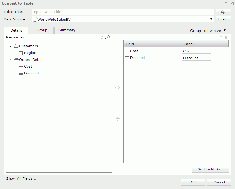
To convert to a table:
You can convert a table, crosstab, or chart to a table. Select the data component and then select the table icon  on the visualization toolbar.
- When you are converting a crosstab or chart to a table, Server generates the table directly according to the data fields in the crosstab or chart.
- When you are converting a table to a table, Server displays the Convert to Table dialog box for you to define the new table. You can select another business view for the table or use the current one. If you use the current one, you can select the Show All Fields link to show all the objects in the business view. See Inserting a Table for more information about how to define a table.
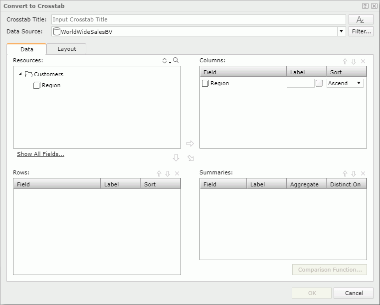
To convert to a crosstab:
You can convert a table or chart to a crosstab. Select the data component and then select the crosstab icon  on the visualization toolbar.
- When the data component contains enough data fields required by a crosstab, Server generates the crosstab directly according to the current data fields.
- When the current data fields are not enough for a crosstab, Server displays the Convert to Crosstab dialog box for you to select more fields to define the crosstab. You can select another business view for the crosstab or use the current one. If you use the current one, you can select the Show All Fields link to show all the objects in the business view. See Inserting a Crosstab for more information about how to define a crosstab.
To convert to a chart:
You can convert a table or crosstab to a chart, and convert one chart type to another. Select the data component and then select the desired chart type icon on the visualization toolbar.
- When the data component contains enough data fields required by the target chart type, Server generates the chart directly according to the current data fields.
- When the current data fields are not enough for the target chart type, Server displays the Convert to Chart dialog box for you to select more fields to define the target chart type. You can select another business view for the chart or use the current one. If you use the current one, you can select the Show All Fields link to show all the objects in the business view. See Inserting a Chart for more information about how to define a chart.
To convert a table to a banded object:
You can convert a table that is not in any banded object to a banded object. To do this, select the table and then select the banded object icon  on the visualization toolbar, Server converts the table to a banded object automatically.
Saving a Data Component as a Library Component
You can save the tables, crosstabs, charts, KPIs, and geographic maps in a web report (not a shared one) as library components and then use them in dashboards directly.
- Right-click the icon of a data component and select Save as Library Component from the shortcut menu. Server displays the Save As dialog box.
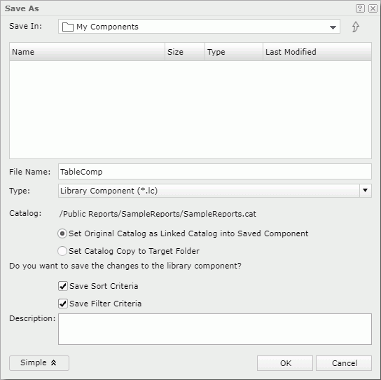
- In the Save In section, browse to the folder in the server resource tree where you want to save the library component. You can use the up button
 to return to the parent folder.
If you selected My Components or its subfolder, only you can access and use the library component in dashboards. If you selected a public folder, Server treats the library component as a public resource, and it inherits user permissions from the report.
- In the File Name box, type the name of the library component or use the default name. The default file type is Library Component.
- You can select the Advanced button to set advanced settings for the library component.
- Specify the relationship between the library component and the catalog it uses to run. By default, Server links the library component to its catalog in which way it can always run with the latest version of the catalog. You can also choose to copy the catalog to the directory where you save the library component by selecting Set Catalog Copy to Target Folder.
There should be only one catalog per folder. If there is already a catalog in the folder where you are going to copy the catalog to, it may cause other library components in the folder to be unable to run as they may use the wrong catalog. Also, if there is a newer version of the same catalog in the target folder, Server overwrites it, and existing library components that use it cannot run with the newer catalog version. Therefore, it is always better to link the catalog rather than copy it.
- By default, Server saves the library component together with the sort and filter criteria. Then Web Report Studio automatically applies the criteria to the library component the next time it opens.
- Optionally, type comments in the Description box as a description for the library component.
- Specify the relationship between the library component and the catalog it uses to run. By default, Server links the library component to its catalog in which way it can always run with the latest version of the catalog. You can also choose to copy the catalog to the directory where you save the library component by selecting Set Catalog Copy to Target Folder.
- Select OK to convert the data component to a library component and save the library component.
- Select OK in the Confirm dialog box.
If you are saving to an existing library component, Server displays a Confirm dialog box asking whether you want to replace it or save a new version into it.