 Previous Topic
Inserting Components in Web Report
You can insert components into a web report via the Components panel on the left of the Web Report Studio window. This topic describes how you can insert different components in web reports.
The following table lists the report areas that are valid targets for the various components:
| Report Layout Area | ||||||
|---|---|---|---|---|---|---|
| Component | Report Body | Page Header/Footer | Tabular Cell | Table Cell | KPI | Banded Panel |
| Chart | Y | Y | Y | N | N | Y |
| Crosstab | Y | Y | Y | N | N | Y |
| Table | Y | Y | Y | N | N | Y |
| Banded Object | Y | Y | Y | N | N | N |
| KPI | Y | Y | Y | N | N | N |
| Label | Y | Y | Y | Y | Y | Y |
| Image | Y | Y | Y | N | Y | Y |
| Web Control | Y | Y | Y | N | N | Y |
| Special Field | Y | Y | Y | Y | Y | Y |
| Multimedia Object | Y | Y | Y | N | N | Y |
| Horizontal/Vertical Line | N | N | N | N | N | Y |
| Page Break | Y | N | N | N | N | N |
| Formula | N | Y | Y | Y | Y | Y |
| Group Object | N | Y | Y | Y | Y | Y |
| Detail Object | N | Y | Y | Y | Y | Y |
| Aggregation Object | N | N | N | Y | Y | Y |
This topic contains the following sections:
- Inserting a Table
- Inserting a Crosstab
- Inserting a Chart
- Inserting a Banded Object
- Inserting a KPI
- Inserting a Label
- Inserting an Image
- Inserting a Web Control
- Inserting a Special Field
- Inserting a Multimedia Object
- Inserting a Horizontal/Vertical Line
- Inserting a Page Break
 Back to top
Inserting a Table
The procedure for inserting tables in a web report varies with the way you use to access Web Report Studio: using the quick start method or the traditional method.
To insert a table using the quick start method:
- Drag the table icon
 from the visualization toolbar or Table from the Components panel to the destination where you want to insert the table. Server displays the Select Data Source dialog box.
 - Select a business view and define the table.
- Select OK to insert the table.
To insert a table using the traditional method:
You can choose the table type as you want: Group Above, Group Left, Group Left Above, or Summary Table.
- Inserting a group table
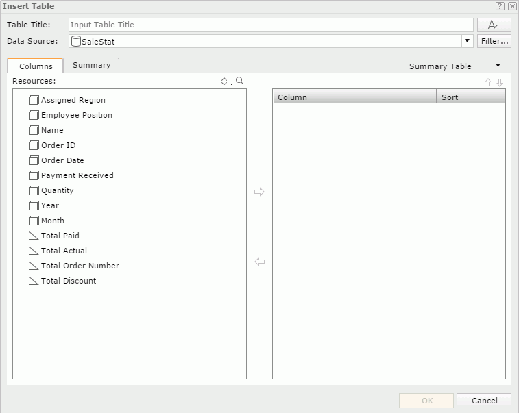
- Drag the table icon from the visualization toolbar or Table from the Components panel to the destination where you want to insert the table. Server displays the Insert Table dialog box.
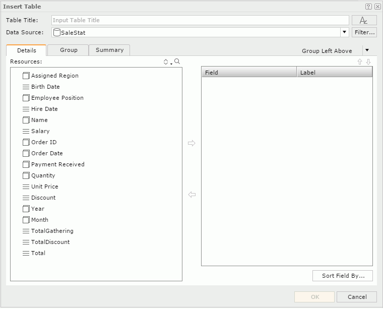
- Type a title for the table in the Table Title text box.
- Select the font button
 to set the font properties for the title.
 - From the Data Source list, select the business view you want to create the table with.
When you are going to insert the table into a banded header/footer panel or group header/footer panel in a banded object, it by default inherits data from the business view used by the parent banded object (Server selects <Inherit from the Parent> by default). You can select another business view to create the table if you want.
- Select Filter if you want to add filter conditions to the business view to narrow down data in the table.
- Select a group type from the table type list: Group Left, Group Above, or Group Left Above.
- In the Details tab, add detail objects
 or group objects
  from the Resources box to display as detail fields in the table.
 - To adjust the display order of the objects in the right box, select one, and then select the Move Up button
 or the Move Down button
  .
. - By default, Server uses the display names of the added objects to label the corresponding detail columns. To edit the label text for a detail column, select the Label text box and type a new one. If you want to automatically map the label text to the dynamic display name of the object, select the Auto Map Field Name checkbox beside the text box.
- If you want to sort the detail data in the table by the values of specified fields, select Sort Fields By and set the sort manner in the Custom Sort dialog box.
- From the Resources box select a field in the current business view and select the Add button
 to add it to the right box as the sort-by field.
 - Select a sort order from the Sort column. Server sorts the detail data in the table based on the values of the sort-by field in ascending or descending order.
- Repeat the preceding two steps to add more sort-by fields.
- Select the Up button or the Down button to adjust the order of the sort-by fields, which defines the sort priority of the fields.
- Select OK to accept the sort settings.
- From the Resources box select a field in the current business view and select the Add button
- In the Group tab, add group objects as the grouping criteria.
- You can select the Move Up button or the Move Down button to adjust the group levels.
- In the Sort column select the sort manner of each group level, which can be No Sort, Ascend, Descend, or Custom Sort.
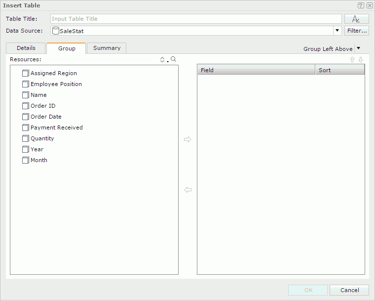
To customize the sort manner of a group:
- Select Custom Sort as the sort manner for the group. Server displays the Custom Sort dialog box.
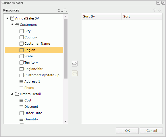
- From the Resources box select a field in the current business view and select the Add button to add it to the right box as the sort-by field.
- Select a sort order from the Sort column. Then Server sorts the groups at this group level by the values of the first record in each group on the related field based on the defined sort direction.
- Repeat the preceding two steps to add more sort-by fields.
- Select the Up button or the Down button to adjust the order of the sort-by fields, which defines the sort priority of the fields.
- Select OK to accept the sort settings.
- Select Custom Sort as the sort manner for the group. Server displays the Custom Sort dialog box.
- In the Summary tab, add aggregation objects
 to summarize data in the table: in the right box, select the group to apply the aggregation to, then select an aggregation object in the Resources box and click the Add button to add it to the right box. You can add several aggregations for any group level.
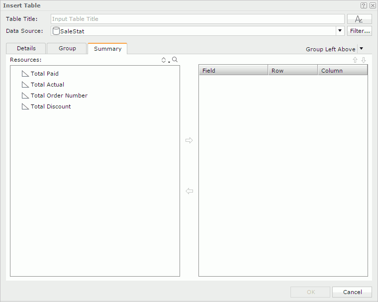
- You can select the Move Up button or the Move Down button to adjust the order of the aggregations in the current group or move an aggregation to another group.
- For a Group Left table, you can use the Row and Column columns to control the position of the aggregations in the table.
- Select OK to insert the table.
- Drag the table icon
- Inserting a summary table
You can use summary tables for showing group and summary information, and they can only contain group and aggregation objects. In a summary table, the groups on the left have higher group levels than those on the right. Calculation of the aggregation objects is always based on the innermost group no matter where you position them in the table.- Drag the table icon from the visualization toolbar or Table from the Components panel to the destination where you want to insert the table. Server displays the Insert Table dialog box.
- Type a title for the table in the Table Title text box.
- Select the font button to set the font properties for the title.
- From the Data Source list, select the business view you want to use to create the table.
When you are going to insert the table into a banded header/footer panel or group header/footer panel in a banded object, it by default inherits data from the business view used by the parent banded object (Server selects <Inherit from the Parent> by default). You can select another business view to create the table if you want.
- You can select Filter to add filter conditions to the business view to narrow down data in the table.
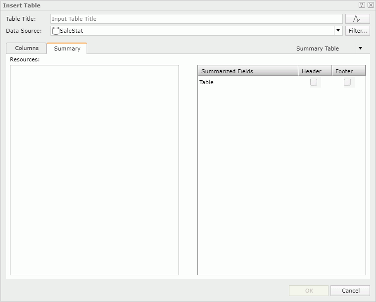
- Select Summary Table from the table type list.
- In the Columns tab, add group objects and aggregation objects in the specified business view from the Resources box to display in the table.
- You can select the Move Up button or the Move Down button to adjust the display order of the added objects. The order of the group objects defines the group levels in the table: the topmost group object the highest group level and the lowest group object the innermost group level. All the aggregations are parallel, and Server calculates them based on the lowest group.
- In the Sort column select the sort manner of groups in each group level, which can be No Sort, Ascend, Descend, or Custom Sort.
- In the Summary tab, you can insert the aggregation objects you selected in the Columns tab to the table header/footer and to the group headers/footers of existing groups. First select an aggregation object in the Resources box, then select a Header or Footer in the right box.
Server places the aggregation in the intersection of its summary column and the table/group header/footer row.
- Select OK to insert the table.
- Drag the table icon
Inserting a Crosstab
- Drag Crosstab from the Components panel or the crosstab icon
 from the visualization toolbar to the destination where you want to insert the crosstab. Server displays the Insert Crosstab dialog box.
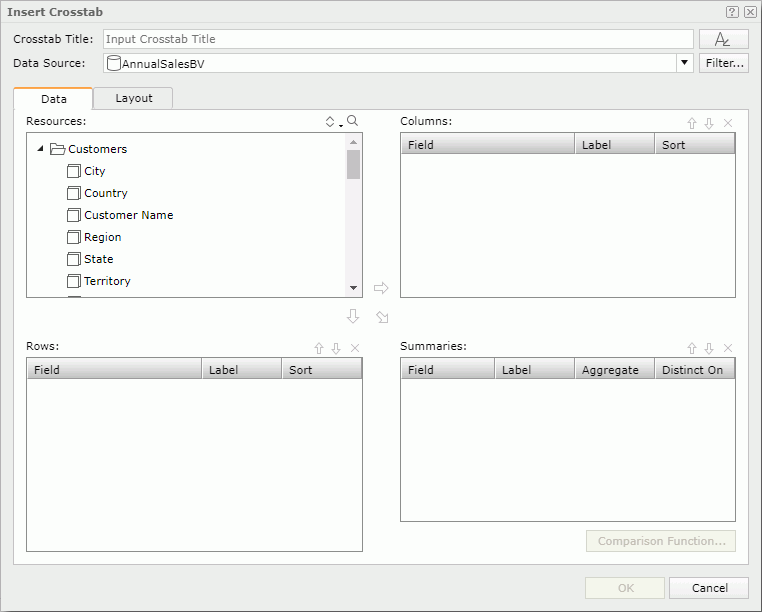
- Type a title for the crosstab in the Crosstab Title text box.
- Select the font button to set the font properties for the title.
- From the Data Source list, select the business view you want to use to create the crosstab.
When you are going to insert the crosstab into a banded header/footer panel or group header/footer panel in a banded object, it by default inherits data from the business view used by the parent banded object (Server selects <Inherit from the Parent> by default). You can select another business view to create the crosstab if you want.
- You can select Filter to add filter conditions to the business view to narrow down data in the crosstab.
- In the Data tab, select a group object from the Resources box and then select the add button or
 to add it as a column or row group in the crosstab.
 - In the Sort column, specify the sort manner of the group.
- Select an aggregation object or a detail object and then select the add button
 to add it to the Summaries box as an aggregate field to create aggregations in the crosstab. If you added a detail object, select the aggregate function for it from the Aggregate list. When you selected DistinctSum as the function, you should select the ellipsis button
  next to the Distinct On text box to select one or more detail objects according to whose unique values to calculate the DistinctSum function using the Select Fields dialog box.
 - You can specify a comparison function for the aggregate field.
To define comparison function for an aggregate field:
- Select the aggregate field in the Summaries box and select Comparison Function. Server displays the Comparison Function dialog box.
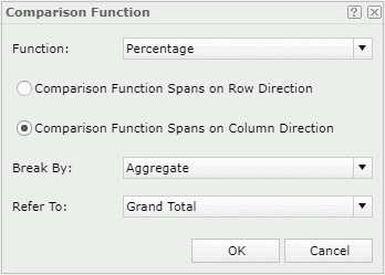
- From the Function list, select the required function: Percentage, Permillage, or Difference.
- Select a position for the comparison function.
- Comparison Function Spans on Row Direction
Server places the comparison function into the column total cell of the crosstab. - Comparison Function Spans on Column Direction
Server places the comparison function into the row total cell of the crosstab.
- Comparison Function Spans on Row Direction
- Use the Break By and Refer To properties to define the numbers that form the calculation of the comparison function.
Items in the Break By list vary based on the position of the comparison function. It indicates the first parameter of the comparison function: the detail aggregation in the crosstab (Aggregate) or the subtotal of a specified row/column group.
Items in the Refer To list also vary according to what you have selected from the Break by list. It indicates the other parameter of the comparison function: the grand total or subtotal for an outer row/column group.
- Select OK. Server adds a new object into the Summaries box.
- Set the label text for the object in the Label column.
- Select the aggregate field in the Summaries box and select Comparison Function. Server displays the Comparison Function dialog box.
- For each column/row/summary field, you can type a name in the Label text box to label the corresponding column header/row header/summary, or select the Auto Map Field Name checkbox beside the text box if you want to automatically map the label text to the dynamic display name of the field. When the text box is blank and you have not selected the checkbox, Server does not create a label.
- Add more column/row groups and aggregate fields to display in the crosstab.
- To adjust the display order of the fields, select a field and then select the Move Up button or the Move Down button .
- To remove an unwanted field, select it and select the Remove button
 .
. - In the Layout tab, specify the layout properties for the crosstab.
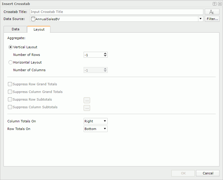
- Select OK to insert the crosstab.
Tip: When you create a crosstab using a wizard, by default, Server does not create labels for its columns, rows, or summaries (the Label columns in the Columns, Rows, and Summaries boxes of the wizard are blank by default). You can make Web Report Studio automatically provide the labels which by default are the display names of the added objects, by setting the profile options Add Labels for Crosstab Rows and Columns and Add Labels for Crosstab Summaries. You can also customize the profile option Display Crosstab Summaries Vertically to make the summaries in crosstabs display horizontally in Web Report Studio.
Inserting a Chart
Normally, a chart displays values in a static way, and you cannot change the values on it once you create it. However, Logi Report provides you with options to make the chart interactive and dynamic. For example, if your data source uses data that changes quickly over time such as stock market values, you can create a real time chart, so that the chart will update itself based on a defined interval using the real time data from the data source. You can make a chart move at runtime based on the value changes of a motion field by creating a motion chart. In a motion chart, the chart is playable. You can start or stop the chart to play the dynamic trend of the motion field, control the moving speed of the chart, and if you create a bubble motion chart, you can even use a trail control to make the chart move showing a bubble or line trail.
In Web Report Studio, when you create a chart, you can choose to make it a common chart, an organization chart, a heat map, a real time chart, or a motion chart.
- Drag Chart from the Components panel or a chart icon from the visualization toolbar to the destination where you want to insert the chart. Server displays the Insert Chart dialog box.
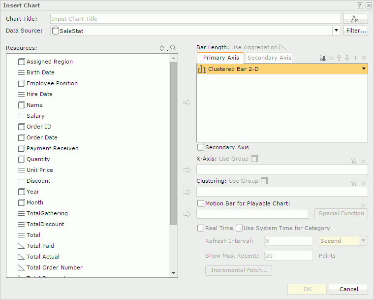
- Type a title for the chart in the Chart Title text box.
- Select the font button to set the font properties for the title.
- From the Data Source list, select the business view you want to use to create the chart.
When you are going to insert the chart into a banded header/footer panel or group header/footer panel in a banded object, it by default inherits data from the business view used by the parent banded object (Server selects <Inherit from the Parent> by default). You can select another business view to create the chart if you want.
- You can select Filter to add filter conditions to the business view to narrow down data in the chart.
- To create a single chart, in the Primary Axis box on the right, select a chart type from the list.
To create a combo chart, select the Add Combo Chart button
 above the Primary Axis box. Server adds an additional chart type. You can change the additional chart type by selecting one from the chart type list. Repeat this to add more chart types. Select Secondary Axis if you want to add the secondary axis (Y2), and then define the chart types on the axis. To delete a chart type, select it, and then select the Remove button .
 - In the Primary Axis or Secondary Axis box, select a chart type, and then add an aggregation object , a numeric detail object , or an additional value
 as the value of the type. Add at least one value to each added chart type. You can add more than one value to a chart type.
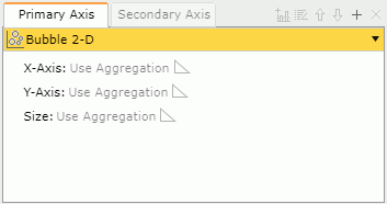
For the Bubble chart type, you need to specify the values for the bubble X axis, Y axis, and the size of the bubbles, respectively. When you add a value for the bubble X axis, Server displays it on the category axis instead of that you specified for the category axis, while still including the value you added to the category axis in data calculation.
To add an additional value to a chart type:
- Select the chart type.
- In the Resources box, select Constant Value or Average Value in the Additional Values node.
- Select the add button at the top. Server displays the Edit Additional Value dialog box.
- In the Name text box, type the display name for the constant/average value.
- Type the constant value of numeric type in the Value text box, or select a field based on which you want to calculate the average value from the Based On list.
- Select OK. Server adds the defined constant/average value to the chart type.
To modify a constant/average value, select it, then select the Edit button
 . In the Edit Additional Value dialog box, edit the value as required.
- Add a group object or a detail object from the Resources box to display it on the category axis of the chart.
- Add a group object to display on the series axis. The labels for the category and series axes vary with different chart types, for example, they are X-Axis and Clustering for a clustered bar chart.
- If you want to customize the sort order and define the Select N condition for values displayed on the category/series axis of the chart, select the Top N button
 above the axis box, then define the order and condition in the Category Options dialog box or Series Options dialog box.
- In the Category/Series Order box, select an order to sort values of the category/series field.
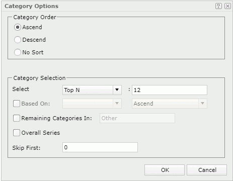
- In the Category/Series Selection box, set the Select condition to All, Top N, or Bottom N. If you select All, Server displays all category/series values in the chart. If you select Top N or Bottom N, Server displays a text box next to it, and you can type an integer N here, to display the first or last N category/series values in the chart.
- If you want to sort the values based on other fields, select Based On. Server displays the Custom Sort dialog box for you to select fields and set the sort order for them.
When you do not select Based On, Server sorts all category/series values or its first/last N values in the order you selected in the Category/Series Order box.
- If you have selected Top N or Bottom N from the Select list, you can select Remaining Categories/Series In, and then type a string in the text box, so that Server merges the category/series values beyond the first or last N range into the group with the name as the string.
- If you have selected Top N or Bottom N and you are specifying the Order/Select N condition for the category axis, you can also select Overall Series to calculate the top or bottom N category values based on the series values.
- If you have selected Top N or Bottom N, you can type a number M in the Skip First text box. Then, Server skips the first M category/series values and begins with M+1. Server merges the skipped values into the remaining Categories/Series group.
- Select OK to accept the settings.
- In the Category/Series Order box, select an order to sort values of the category/series field.
- Select OK to insert the chart.
To create an organization chart:
Organization chart, also referred to as org chart, is a one-root-node-tree-structure diagram showing the ownership or reporting relations among the nodes that you map to a specific entity.
- Repeat steps 1 to 5 for creating a common chart.
- In the Primary Axis box, select the Org chart type.
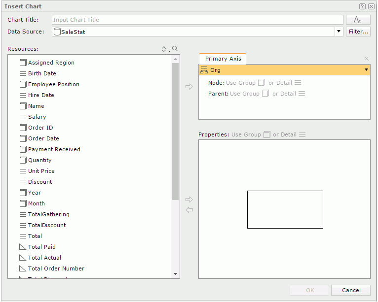
- Select Node in the Primary Axis box, select a group object or a detail object from the Resources box, and select the add button . Server displays the values of the object as the nodes in the org chart.
- Select Parent in the Primary Axis box, select a group object or a detail object from the Resources box, and select the add button to define the ownership or reporting relationship among the node field values. The parent field should be of the same data type as the node field but different from the node field. The values of the parent field should be a subset of those of the node field. For example, if the node field is Employee ID, the parent field can be the one about IDs showing which employ ID reports to which employ ID.
- The Properties box displays a node model for specifying the information you want to display in each node in the org chart. You can add group objects, detail objects, labels, and images to display in the nodes. To add an object, select it in the Resources box and select the add button beside the Properties box. You can resize the node model and adjust the position and size of the added objects in the node model. To remove an unwanted object from the node model, select it, and then select the remove button
 .
. - Select OK to insert the chart.
A heat map displays values by colors and sizes in a matrix. It is composed of several rectangles that are grouped by group objects. Each rectangle represents a value of a group object or a combination of values of multiple group objects.
- Repeat steps 1 to 5 for creating a common chart.
- In the Primary Axis box, select the Heat Map chart type.
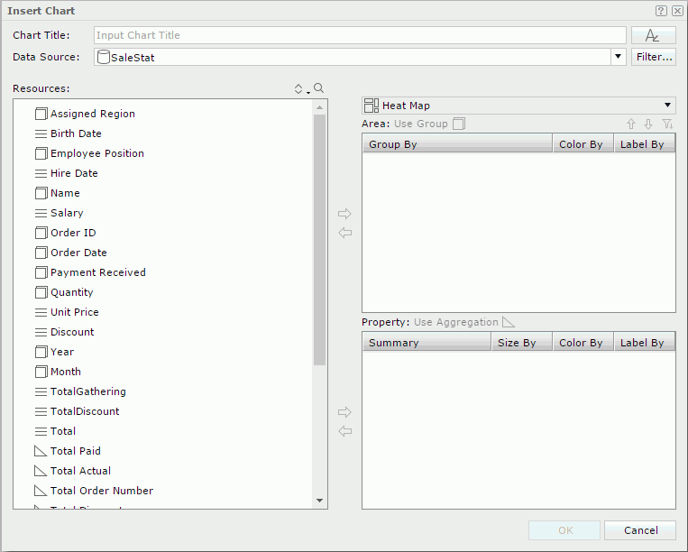
- Add group objects into the Area box to create groups in the heat map.
- You can use the Move Up button and the Move Down button to adjust the group levels. Each rectangle in the heat map represents a combination of the groups in all the group levels.
- To remove a group, select it, and then select the Remove button .
- If you want to customize the sort order and define the Select N condition on a group, select it and select the Top N button above the Area box. Server displays the Group Options dialog box. Specify the order and condition as you do for the category/series axis.
- Add aggregation objects into the Property box to define the properties of the rectangles.
- In the Area and Property boxes, select Color By for the objects that define the fill color of the rectangles, and Label By for the objects the values of which you want to display in the rectangles. You can select only one object in the Property box for Color By.
- In the Property box, select an object's Size By to use it to define the size of the rectangles. Server ignores the negative values of the size-by object when it generates the heat map.
You can create real time charts using single bar, bench, line, and area chart types.
- Repeat steps 1 to 5 for creating a common chart.
- In the Primary Axis box, select a chart type of bar, bench, line, or area, then add the detail objects or group objects of numeric type as the data.
- Select Real Time.
- To use the time at which the chart refreshes itself as the category value, select Use System Time for Category. Server displays Use System Time for Category in the category box.
When you do not select Use System Time for Category, you can add a group object
to display on the category axis. If you want to customize the sort order and define Select N condition for values on the category axis, select the Top N button above the category box, then define the order and condition in the Category Options dialog box. - In the Refresh Interval text box, specify the time interval at which the chart will get data and refresh itself automatically.
- In the Show Most Recent text box, type the most recent N records to keep for the real time data in the chart.
- Select Incremental Fetch to add the objects you want to use as the unique key of the real time chart in the Unique Key dialog box.
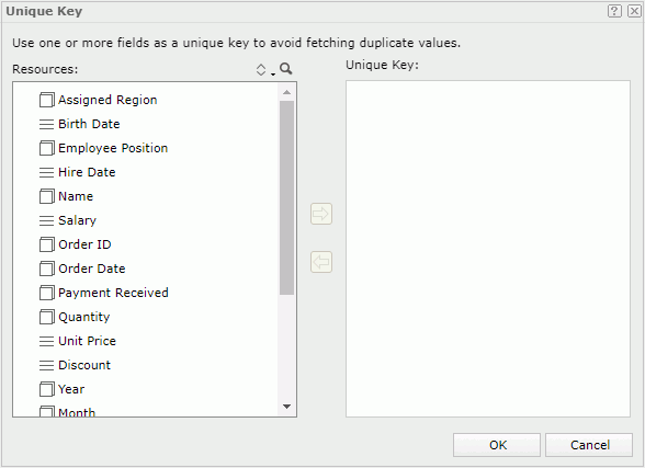
Once you define a unique key, each time when the chart automatically updates itself, Server filters the data that has the same unique key value as the previous loaded data records and only adds data with different unique key value to the chart. For instance, if you add the fields Country and Product ID as the unique key of a real time chart, when Server has already loaded a record with the product ID 1 in USA into the chart, it adds no more records of this product ID in USA to the real time chart because they have the same unique key value. The most common usage is with a time field so when a time is part of the unique key, Server updates the data in the chart each time new records are added to the database.
- Select OK to insert the chart.
You can create motion charts using single chart of bar, bench, and bubble types.
- Repeat steps 1 to 5 for creating a common chart.
- In the Primary Axis box, select a chart type of bar, bench, or bubble, then add aggregation objects or additional values as the data of the type.
If you select the Bubble chart type, you need to specify the values for the bubble X axis, Y axis, and the size of the bubbles, respectively. When you add a value for the bubble X axis, Server displays it on the category axis instead of that you specified for the category axis, while still including the value added to the category axis in data calculation.
- Add a group object from the Resources box to display its values on the category or series axis of the chart. The labels of the two axes vary with different chart types, for example, they are X-Axis and Clustering for a clustered bar chart.
- If you want to customize the sort order and define the Select N condition for values on the category or series axis, select the Top N button above the category or series box, then define the order and condition in the Category/Series Options dialog box.
- Select Motion Bar for Playable Chart.
- Add a group object of Integer, Date, or Time type as the motion field. When the group object is of the Date type, you can define a special function for it by selecting Special Function.
- Select OK to insert the chart.
When you created a motion chart, you can use the motion control section to make the chart move. Select the play button, and the chart shows its dynamic trend based on the value change of the motion field which is bound in the motion bar. To stop it, select the button again. You can also control its moving speed by dragging the slider between Slow and Fast on the speed control. For a bubble chart, you can control whether the chart will be moving in bubble or line trail.
Inserting a Banded Object
- Drag Banded Object from the Components panel or the banded object icon
 from the visualization toolbar to the destination where you want to insert the banded object. Server displays the Insert Banded Object dialog box.
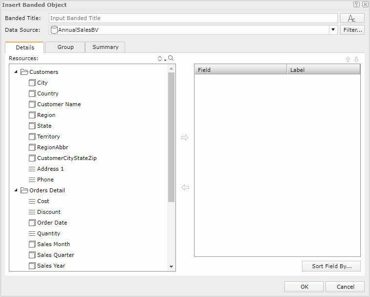
- Type a title for the banded object in the Banded Title text box.
- Select the font button to set the font properties for the title.
- From the Data Source list, select the business view you want to use to create the banded object.
- You can select Filter to add filter conditions to the business view to narrow down data in the banded object.
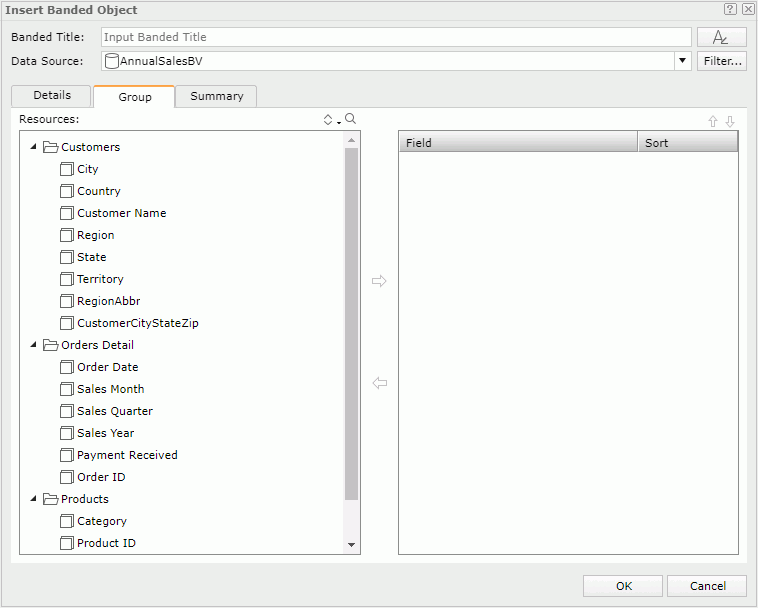
- In the Details tab, add detail objects or group objects from the Resources box to display as detail fields in the banded object.
- To adjust the display order of the objects, select one and select the Move Up button or the Move Down button .
- By default, Server uses the display names of the added objects to label the corresponding detail columns. To edit the label text for a detail column, select the Label text box and type a new one. If you want to automatically map the label text to the dynamic display name of the object, select the Auto Map Field Name checkbox beside the text box.
- If you want to sort the detail data in the banded object by the values of specified fields, select Sort Fields By and set the sort manner in the Custom Sort dialog box.
- In the Group tab, add group objects as the grouping criteria.
- You can select the Move Up button or the Move Down button to adjust the group levels.
- In the Sort column select the sort manner of the groups in each group level, which can be No Sort, Ascend, Descend, or Custom Sort.
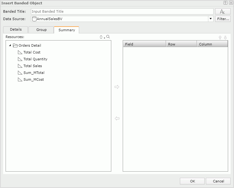
- In the Summary tab, add aggregation objects to summarize data in the banded object: in the right box, select the group to which you want to apply the aggregation, then select an aggregation object in the Resources box and add it to the right box. You can add several aggregations for any group level.
- You can select the Move Up button or the Move Down button to adjust the order of the aggregations in the current group or move an aggregation to another group.
- Select OK to insert the banded object.
Inserting a KPI
- Drag KPI from the Components panel or drag the KPI icon
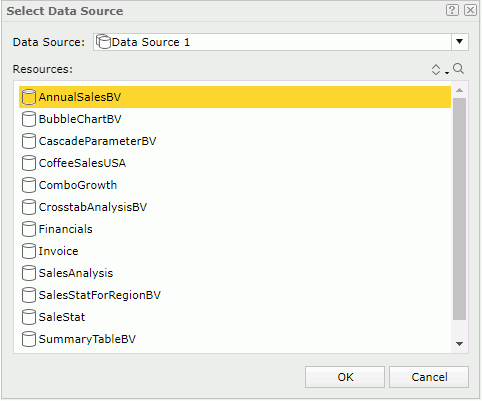
 from the visualization toolbar to the destination where you want to insert the KPI. Server displays the Select Data Source dialog box.
 - Select a data source and then a business view in the current catalog to bind with the KPI.
- Select OK.
- Server inserts a blank KPI in the report. You can now define the KPI by adding objects into it.
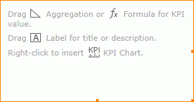
- Drag an aggregation object or a dynamic formula from the Resources panel as the KPI value.
- Server adds the name label of the object in the KPI at the same time. You can edit the label text.
- Insert a KPI chart to demonstrate data about the KPI value:
- Right-click the blank area of the KPI and select Insert KPI Chart from the shortcut menu. Server displays the Insert Chart dialog box.
- Type a title for the chart in the Chart Title text box.
- You can select the font button to set the font properties for the title.
- The Data Source list shows the business view bound with the KPI. You cannot change it.
- Select the chart type for the KPI chart in the Primary Axis box. You can only select the following chart types for a KPI chart: Bar, Bench, Line, Area, Pie, and Bullet.
- Define the KPI chart in the same way you would do for a general chart.
- Select OK. Server inserts the chart into the KPI.
- Add more aggregation objects, dynamic formulas, labels, or images into the KPI if you want.
- Resize the KPI and the objects in it and adjust the position of the objects by dragging to improve the layout.
Inserting a Label
- Drag Label from the Components panel to the destination.
- Double-click the label. When the text box becomes editable, type the desired text.
- Select outside of the label to apply the change.
Inserting an Image
- Drag Image from the Components panel to the destination where you want to insert the image. Server displays the Insert Image dialog box.
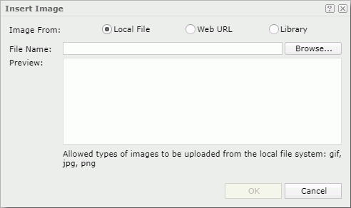
- Specify the image you want to insert.
- To use an image in the local file system, select Local File. Then select Browse to find the image.
- To use an image on a website, select Web URL. Then type the image URL or paste the URL in the File URL text box.
- To use an image in the image library of Web Report Studio, select Library. Then select the image in the My Pictures box.
- Select OK to insert the image.
Inserting a Web Control
You can insert the following web controls into a web report: parameter control, parameter form control, filter control, and navigation control. For more information, see Using Web Controls in Web Report.
Inserting a Special Field
To insert a special field into a web report, drag the special field from the Components panel to the destination in the report.
Inserting a Multimedia Object
- Drag Multimedia Object from the Components panel to the destination where you want to insert the multimedia object. Server displays the Insert Multimedia dialog box.
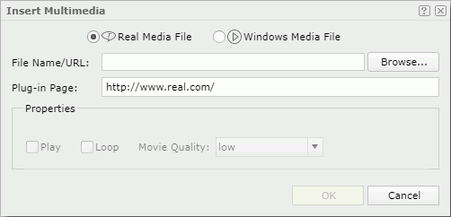
- Choose from the two multimedia object types: Real Media File or Windows Media File.
- Select Browse to select the multimedia object you want to insert if it is on your local drive.
- The Plug-in Page text box provides a default URL from which Server downloads the player to play the inserted multimedia object on a web page.
- In the Properties box, specify the properties for the multimedia object.
- Select OK to insert the multimedia object.
Inserting a Horizontal/Vertical Line
You can only insert a horizontal/vertical line into a banded object in a web report. To do this, drag Horizontal Line or Vertical Line from the Components panel to the destination in the banded object.
Inserting a Page Break
For a web report that is not laid out using tabular (you did not select Use Tabular when you created the report using Web Report Wizard), if you want a component in the report body to display in a new page when running or exporting the report in the formats that support page layout such as PDF and RTF, you can insert a page break above the component to achieve this. To insert a page break, drag Page Break from the Components panel to the destination.