 Previous Topic
Insert Chart Dialog Box Properties
This topic describes how you can use the Insert Chart dialog box to define a chart and insert it to the destination. The dialog box varies with different chart types: common chart types, organization chart, heat map, and KPI chart.
Server displays the dialog box when you do either of the following:
- Drag Chart from the Components panel to the destination.
- Right-click the icon
 of a KPI or the blank area in a KPI that contains no KPI chart, then select Insert KPI Chart from the shortcut menu.
OK
Select OK to insert a chart in the destination.
Cancel
Select Cancel to close the dialog box without inserting a chart.

Select to view information about the Insert Chart dialog box.

Select to close the dialog box without inserting a chart.
For Common Chart Types
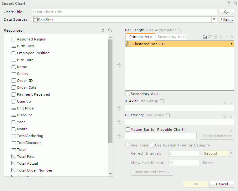
Chart Title
Specify the title of the chart. The title is a special label bound with the chart. Though you can position the chart title freely in a report, once you remove the chart from the report, Server removes the chart title too.

Specifies the font properties of the chart title.
After you select the button, Server displays the following dialog box for you to edit the font properties:

- Font
Select the font face of the title. - Font Style
Select the font style of the title: regular, bold, italic, and bold italic. - Size
Specify the font size of the title. - Align
Specify the position of the title to be left, right, center, or justify. - Font Color
Specify the font color of the title.To change the color, select the color indicator. Server displays the color palette. Select a color, or select More Colors to access the Color Picker dialog box in which you can specify a color within a wider range. You can also type a hexadecimal RGB value to specify a color, for example, #9933ff.
- Background Color
Specify the background color of the title. - OK
Select to apply any changes you made here and exit the dialog box. - Cancel
Select to close the dialog box without saving any changes.
- Font
Lists all the available font faces that can be selected to apply to the title. - Font Style
Specifies the font style of the title. It can be one of the following: plain, bold, italic, and bold italic. - Size
Specifies the font size of the title. - Align
Specifies the position of the title to be left, right, center or justify. - Font Color
Specifies the font color of the title. - Background Color
Specifies the background color of the title.
Data Source
Specifies the business view in the current catalog on which the chart will be built.
- <Inherit from the Parent>
Specifies to inherit data from the business view used by the parent object. Available only when the chart is to be inserted into any of the following panels in a banded object: banded header panel, banded footer panel, group header panel, and group footer panel.
Filter
Opens the Query Filter dialog box to specify the filter you want to apply to the selected business view.
Resources
Displays the resources that can be added to the chart.

Sorts the view elements in the specified order from the drop-down list. Once a user changes the order, it will be applied to all the resource trees where business view elements are listed for this user.
The order can be one of the following:
- Predefined Order
Select if you want to sort the resources in the order as in the Business View Editor of Designer. - Resource Types
Select if you want to sort the resources by the resource type. Namely, category objects come first, then group objects, then aggregation objects, and at last detail objects. - Alphabetical Order
Select if you want to sort the resources in alphabetical order. Logi Report sorts the resources that are not in any category first, and then the categories. It also sorts the resources in each category alphabetically.

Launches the search bar to search for view elements.
See the following properties in the search bar:

- Text box
Type the text you want to search in the text box. Server lists the values that contain the matched text.  Close button
Select to close the search bar.-
 More Options button
Select the button and Server displays more search options.- Highlight All
Select if you want to highlight all matched text. - Match Case
Select if you want to search for text that meets the case of the typed text. - Match Whole Word
Select if you want to search for text that looks the same as the typed text.
- Highlight All
-
 Previous button
Select to go to the previous matched text when you have selected Highlight All. -
 Next button
Select to go to the next matched text when you have selected Highlight All.

Adds the selected resource to be displayed in the chart.
Value box
The actual name of the box varies with different chart types, for example, it is Bar Length for a clustered bar chart. The box lists the values you want to show in the chart. For a real time chart, the values you add must be of Numeric type and cannot be aggregation objects.
- Primary Axis
Adds a chart type to the primary axis. - Secondary Axis
Adds a chart type to the secondary axis. Active only when the option Secondary Axis is selected. Not available to gauge chart. - X-Axis
Lists the value you want to show on the X axis of the bubble chart. - Y-Axis
Lists the value you want to show on the Y axis of the bubble chart. - Size
Lists the value you want to show as the bubble size.

Adds a combo chart to the Primary Axis or Secondary Axis. Not available to gauge chart.

Opens the Edit Additional Value dialog box to edit the selected additional value.
 Move Up button
Select to move the selected item higher in the list.
 Move Down button
Select to move the selected item lower in the list.

Adds a new pair of Y Axis and Radius for the bubble chart.
Secondary Axis
Specifies whether to show the secondary axis in the chart. Not available to gauge chart.
Category box
The actual name of the box varies with different chart types, for example, it is X-Axis for a clustered bar chart. The box lists the group object  that will be displayed on the category axis of the chart.
For a real time chart, if no object is specified on the category axis, Use System Refresh Time will be automatically displayed in the Category text box, namely, the time at which the chart refreshes itself will be used as the category value.
Series box
The actual name of the box varies with different chart types, for example, it is Clustering for a clustered bar chart. The box lists the group object that will be displayed on the series axis of the chart. Not available to real time chart.

Opens the Category Options dialog box or Series Options dialog box to define the sort order of the category or series values and specify the number of the category or series values that will be displayed in the chart.
Motion Bar for Playable Chart
Lists the group object you want to use as the motion field. A motion field can only be of Integer, Date or Time data type. Available to single bar, bench, and bubble chart types only.
- Special Function
Available only when the motion field is of Date data type. Select it to define the special function.- Field
Displays on which field the special function will be applied. - Function
Specifies the special function to the field. - OK
Accepts the special function settings and leaves the dialog box. - Cancel
Cancels the special function settings and leaves the dialog box.
- Field
Real Time
Specifies to run the chart in real time mode, which means it will be updated automatically using real time data. Available to single bar, bench, line, and area chart types only.
- Use System Time for Category
Specifies to use the time at which the chart refreshes itself as the category value. - Refresh Interval
Specifies the time interval at which the chart will get data and refresh itself automatically. - Show Most Recent N Points
Specifies the number of records that will be kept for the real time data in the chart. - Incremental Fetch
Opens the Unique Key dialog box to configure a unique key for the real time chart.
Removes the selected resource.
 Back to top
For Organization Chart
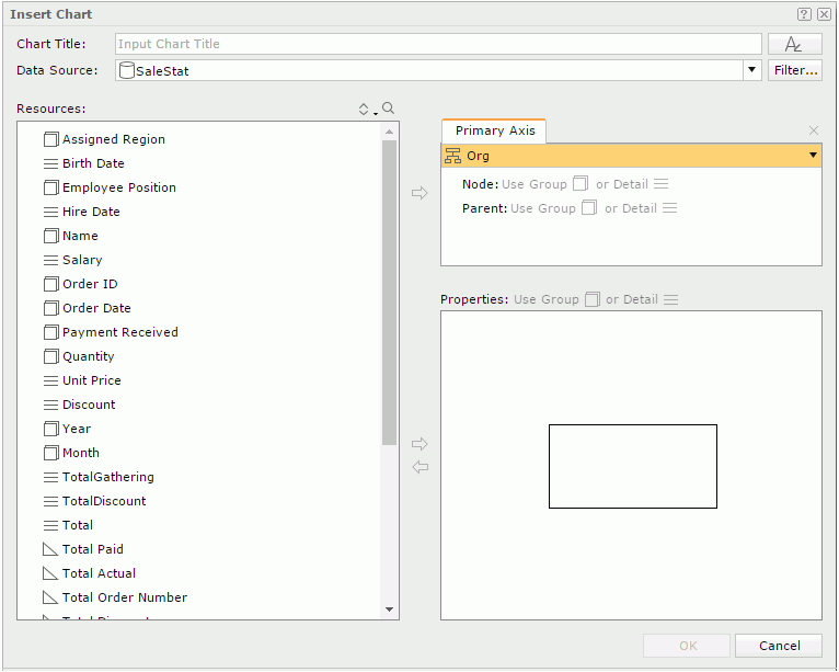
Chart Title
Specify the title of the chart. The title is a special label bound with the chart. Though you can position the chart title freely in a report, once you remove the chart from the report, Server removes the chart title too.
Specifies the font properties of the chart title.
Data Source
Specifies the business view in the current catalog on which the chart will be built.
- <Inherit from the Parent>
Specifies to inherit data from the business view used by the parent object. Available only when the chart is to be inserted into any of the following panels in a banded object: banded header panel, banded footer panel, group header panel, and group footer panel.
Filter
Opens the Query Filter dialog box to specify the filter you want to apply to the selected business view.
Resources
Displays the resources that can be added to the chart.
Sorts the view elements in the specified order from the drop-down list. Once a user changes the order, it will be applied to all the resource trees where business view elements are listed for this user.
Launches the search bar to search for view elements.
Value box
- Primary Axis
Select Org from the chart type drop-down menu. - Node
Adds a field from the Resources box which identifies the entity by selecting both the field and Node and then selecting. - Parent
Adds a field from the Resources box which shows the "reporting to" relationship among the entity members, that is, which child node field member reports to or belongs to which child node field member, by selecting both the field and Parent and then selecting. -
Removes the selected child node or parent field.
Properties
The properties box presents a node model of the org chart. Data fields, labels and images can be inserted into the node as the information about the entity in the org chart, using . By default, all added objects are placed at the left top of the node, you need to adjust their positions and sizes in the node. You can also resize the node.
To remove an object from the node, select it, and then select  .
.
For Heat Map
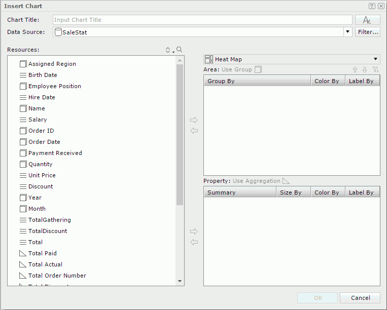
Chart Title
Specify the title of the chart. The title is a special label bound with the chart. Though you can position the chart title freely in a report, once you remove the chart from the report, Server removes the chart title too.
Specifies the font properties of the chart title.
Data Source
Specifies the business view in the current catalog on which the chart will be built.
- <Inherit from the Parent>
Specifies to inherit data from the business view used by the parent object. Available only when the chart is to be inserted into any of the following panels in a banded object: banded header panel, banded footer panel, group header panel, and group footer panel.
Filter
Opens the Query Filter dialog box to specify the filter you want to apply to the selected business view.
Resources
Displays the resources that can be added to the chart.
Sorts the view elements in the specified order from the drop-down list. Once a user changes the order, it will be applied to all the resource trees where business view elements are listed for this user.
Launches the search bar to search for view elements.
Adds the selected field into the Area or Property box.
Removes the selected field from the Area or Property box.
Chart type drop-down list
Displays Heat Map as the selected chart type.
Area
Lists the fields used to group the data to different areas. There should be at least one group. When there are multiple groups, their levels are defined by their positions from top down. The group at the top is of the highest level and the bottom the lowest.
- Color by
Specifies whether to color by a group. 0-n groups can be used as the color-by fields. - Label by
Specifies whether to show the group name in the innermost rectangle. -
Moves the selected group field higher in the list. -
Moves the selected group field lower in the list. -
Opens the Group Options dialog box to define the sort order of the group values and specify the number of the group values that will be displayed in the chart. -
Removes the selected group field.
Property
Lists the summary fields used as size-by/color-by or displayed in the innermost rectangle.
- Size by
Specifies to size by one summary or none. - Color by
Specifies to color by one summary or none. - Label by
Specifies whether to show a summary in the innermost rectangle.
For KPI Chart
Chart Title
Specify the title of the chart. The title is a special label bound with the chart. Though you can position the chart title freely in a report, once you remove the chart from the report, Server removes the chart title too.
Specifies the font properties of the chart title.
Data Source
Specifies the business view in the current catalog on which the chart will be built.
Resources
Displays the resources that can be added to the chart.
Sorts the view elements in the specified order from the drop-down list. Once a user changes the order, it will be applied to all the resource trees where business view elements are listed for this user.
Launches the search bar to search for view elements.
Adds the selected resource to be displayed in the chart.
Value box
The actual name of the box varies with different chart types, for example, it is Bar Length for a clustered bar chart. The box lists the values you want to show in the chart. For a real time chart, the values you add must be of Numeric type and cannot be aggregation objects.
- Primary Axis
Adds a chart type to the primary axis. - Secondary Axis
Adds a chart type to the secondary axis. Active only when the option Secondary Axis is selected.
Adds a combo chart to the Primary Axis or Secondary Axis.
Opens the Edit Additional Value dialog box to edit the selected additional value.
Move Up button
Select to move the selected item higher in the list.
Move Down button
Select to move the selected item lower in the list.
Secondary Axis
Specifies whether to show the secondary axis in the chart.
Category box
The actual name of the box varies with different chart types, for example, it is X-Axis for a clustered bar chart. The box lists the group object that will be displayed on the category axis of the chart.
For a real time chart, if no object is specified on the category axis, Use System Refresh Time will be automatically displayed in the Category text box, namely, the time at which the chart refreshes itself will be used as the category value.
Series box
The actual name of the box varies with different chart types, for example, it is Clustering for a clustered bar chart. The box lists the group object that will be displayed on the series axis of the chart. Not available to real time chart.
Opens the Category Options dialog box or Series Options dialog box to define the sort order of the category or series values and specify the number of the category or series values that will be displayed in the chart.
Motion Bar for Playable Chart
Lists the group object you want to use as the motion field. A motion field can only be of Integer, Date or Time data type. Available to single bar and bench chart types only.
- Special Function
Available only when the motion field is of Date data type. Select it to define the special function.- Field
Displays on which field the special function will be applied. - Function
Specifies the special function to the field. - OK
Accepts the special function settings and leaves the dialog box. - Cancel
Cancels the special function settings and leaves the dialog box.
- Field
Real Time
Specifies to run the chart in real time mode, which means it will be updated automatically using real time data. Available to single bar, bench, line, and area chart types only.
- Use System Time for Category
Specifies to use the time at which the chart refreshes itself as the category value. - Refresh Interval
Specifies the time interval at which the chart will get data and refresh itself automatically. - Show Most Recent N Points
Specifies the number of records that will be kept for the real time data in the chart. - Incremental Fetch
Opens the Unique Key dialog box to configure a unique key for the real time chart.
Removes the selected resource.