 Previous Topic
General Operations in JDashboard
This topic describes the general operations you can perform on JDashboard, dashboards, and the objects in the dashboard header and body.
This topic contains the following sections:
- Operations on JDashboard
- Operations on Dashboards
- Operations on Objects in the Dashboard Header
- Operations on Components in the Dashboard Body
Operations on JDashboard
- Applying a theme to JDashboard
Select the Options button on the toolbar and select Themes from the option list. In the Themes dialog box, select a theme from the left panel and then select OK.
 - Exiting JDashboard
If you want to exit JDashboard and release the resources, select the Options button on the toolbar and select Exit from the option list. Do not use the close button on the browser window as that may not release the resources used by JDashboard. - Asking for help
At any time, you can select the Options button on the toolbar and select Help from the option list to access the JDashboard help documents. Furthermore, you can select  in any dialog box to show the help document about the dialog box.
 Back to top
Operations on Dashboards
- Creating a new blank dashboard in the current web browser
The ways to create a dashboard differ depending on whether your Logi Report Server enables Visual Analysis.- When Server disables Visual Analysis, choose a method from the following:
- Select the add button + beside the rightmost dashboard tab.
- Select the New button
 on the toolbar.
 - Select the Options button on the toolbar and select New from the option list.
- When Server enables Visual Analysis, choose a method from the following:
- Select + beside the rightmost dashboard tab.
- Put the mouse pointer on the + button beside the rightmost dashboard tab for one second until a drop-down menu displays, then select Dashboard from the menu.
- On the toolbar, select the New button and then select Dashboard.
- On the toolbar, select the Options button and then select New > Dashboard.
A blank dashboard tab will be added in the browser. You can then add components to customize the dashboard.
- When Server disables Visual Analysis, choose a method from the following:
- Opening another dashboard in the current web browser
Select the Open button on the toolbar, or select the Options button and then select Open from the option list. JDashboard displays a dialog box. Browse to the desired folder, select the dashboard you want to open and then select OK, or simply double-click the dashboard to open it.
 - Showing, hiding, and resizing the dashboard header
To show or hide the dashboard header, select the Options button on the toolbar and select Show/Hide Dashboard Header from the option list.
Even though the dashboard header is open, its border is unseen by default. However, when you drag objects into the dashboard editing area, you will see the area is divided into two sections with the activated section highlighted in gray: the upper section is the header and the lower the body. Or you can simply press Ctrl on the keyboard to make the border between the header and body shown. Then drag the border line vertically to adjust the size of the header and body.
- Removing all filters from a dashboard
JDashboard provides the ability to remove all the filters from the current dashboard at one time including those generated via filter controls, messages, drilling and going actions and those designed using web browsers such as Page Report Studio and Web Report Studio, except query filters and others designed and taking effect in Logi Report Designer. To do this, select the Clear Filters button on the toolbar, or select the Options button and then select Clear Filters from the option list.
 - Refreshing the current dashboard
Select the Refresh button on the toolbar to refresh the data of the current dashboard.
 - Customizing the way of showing the component title bar
You can customize the way of showing the component title bar and icons on it for each component in the current dashboard. - Select the Options button on the toolbar and select Component Title Bar from the option list. Server displays the Customize Component Title Bar dialog box.
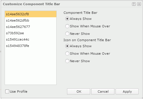
- Select a library component from the component box on the left.
- Specify the way of showing its component title bar and the icons on it: Always Show, Show When Mouse Over, or Never Show. Icons on the component title bar enable you to edit a component, so you'd better not select the Never Show option.
- Repeat the preceding steps to customize the component bar for other library components in the dashboard.
- If you want to apply the profile settings for the component title bar, select Use Profile, then the settings defined for the component title bar in the JDashboard profile will apply to all library components in the dashboard.
- Select OK to apply the changes.
- Viewing in-memory cube status
If you have enabled the Show Status When Using Cube Data option in the server profile, you will find the Cube Status button on the toolbar. By selecting this button you can view the information about whether the data components in the current dashboard apply in-memory cubes and the reasons if not in the Cube Status dialog box.
 - Setting a dashboard as the server home page
Setting a dashboard as the home page of the Server Console enables a faster and easier access to the frequently visited dashboard with its latest data. When you sign in to the Server Console, you will be directed to the Home tab right away which displays the dashboard. Later you can select the Home tab on the system toolbar of the Server Console to open the dashboard directly. The Home tab is available after you have set a dashboard as the server home page.Before you can set a dashboard as the server home page, you need to first enable the feature in the server profile by selecting Use a Dashboard for the Home Page option. Then:
- Open the dashboard that you are going to view a lot and make sure it has been saved.
- Select the Options button on the toolbar and you can see Set as Server Home is enabled in the option list. Select the option to set the dashboard as the home page.
Operations on Objects in the Dashboard Header
- Moving an object
Place the mouse pointer on the object then select the mouse button and it becomes a four-arrow icon, then drag to the desired position. - Resizing an object
Place the mouse pointer on the object until an orange rectangle appears, next move the pointer on the right border, bottom border, or the bottom right corner until the pointer becomes a two-arrow icon, then drag to the desired position.
- Editing an object
Hover the mouse pointer on the object and then select the Edit button that appears around the object.
- For a label or the dashboard title, you can edit the text related properties like font face and font color in the Edit Label dialog box.
- For a special field, you can change it to another special field and edit the text related properties in the Edit Special Field dialog box.
- For an image, you can select another image to replace the current one in the Edit Image dialog box.
- Deleting an object
Hover the mouse pointer on the object and then select the Delete button that appears around the object.
Operations on Components in the Dashboard Body
- Resizing a component
Place the mouse pointer on the component's right border, bottom border, or the bottom right corner until the pointer becomes a two-arrow icon, then drag to the desired position. - Navigating component data via scrollbar
For tables, crosstabs, and charts, you can use the scrollbar to navigate their data if the container cannot display all data of the component. - Turning component pages
If a table or a crosstab contains more than one page, a page navigation bar specific for the component will be available under the component. You can use the navigation bar to view the desired pages:- Select a number to go to that page.
- Type a number in the text box.
- Select Prev to go to the previous page.
- Select Next to go to the next page.
- Going to links
When an object in a library component is linked to a report, a web page, or an email address, you can right-click the trigger object and select Show Linked Target from the shortcut menu to launch the linked target. If the report designer gave the Link action the highest Click Priority for the library component at design time, you can also directly select the trigger object to open the link. - Automatically arranging components in the current dashboard
Sometimes you may drag many library components to random positions in a dashboard and would like them to look neat, there is a simple way to do this: on the toolbar, select the Arrange button , or select the Options button and then select Arrange from the option list, the dashboard layout will then be adjusted immediately. Arrange is an instant action, selecting it once will arrange the layout once, and in this sense, it benefits when you seldom need to reorder the layout.
In the case when frequent reorder of dashboard layout is required, select the Options button
on the toolbar and select Auto Arrange on the option list. Then later each time a library component is resized, moved, removed, or added, the dashboard body will be rearranged automatically so that the library components will be placed neatly. When Auto Arrange is selected, it functions similarly as Responsive View. - Responsive View
When JDashboard is in view mode, it can be responsive to any size of browsers on any mobile devices or computers. Dashboard contents excluding the dashboard header can automatically scale and fold according to the current browser window size, as long as the window is smaller than the designed dashboard size. Information presented is always legible and the layout perfectly adapts to best utilize the available display screen. This is called Responsive View. It is always available to mobile devices. When JDashboard runs on computers, you can specify whether to apply it by default in the JDashboard view mode and how to folder components via the View Dashboards in Responsive Mode option in the JDashboard profile.
When running JDashboard on computers in the view mode, if Responsive View is enabled, you can open or close it as follows:
- Select the Open Responsive Mode button
 or the Close Responsive Mode button
  on the toolbar.
 - Select the Options button on the toolbar and select/clear Responsive View.
- Select the Open Responsive Mode button
The following operations require using the component title bar or icons on the bar, which could always display on the component or display when mouse over, depending on your customization.
- Moving a component
Place the mouse pointer on the component title bar, select the mouse button and it becomes a four-arrow icon, then drag to the desired position. - Maximizing a component
Select on the component title bar and the component will take up the whole dashboard body. By selecting the button again the component will be restored to the original size.
 - Editing the title of a component
Double-click on the component title bar and it will become editable. Type the new title and select Enter on the keyboard to confirm the change. - Showing component information
Information about a component such as a library component's ID, the author and the email address, and the description about the component are provided. To view the information, select on the component title bar and select About from the drop-down menu. A panel will be displayed showing the information. You can select the OK button in the panel to close the panel.
 - Deleting a component
Select on the component title bar and select Delete from the drop-down menu. - Making use of the configuration panel
The configuration panel can be used to specify parameter values to its library component, and if defined to filter or sort the data of the library component or change properties of objects in the library component. - Automatically refreshing a library component
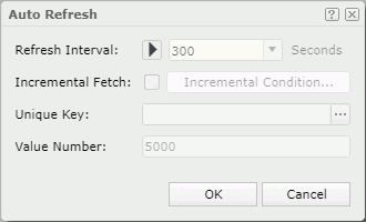
JDashboard supports automatically refreshing the data components as well as objects that are not bound with data in a library component based on specified interval and conditions.To automatically refresh the data components in a library component:
- Do either of the following:
- Select the Options icon on the component title bar and select an item from the Auto Refresh drop-down menu. Server lists all the business views used by the data components in the library component on the submenu. Select the name of a business view. In this way, all the data components using the business view automatically refresh when the auto refresh action takes place.
- Right-click a data component in the library component and select Auto Refresh from the shortcut menu. In this way, other data components in the library component which use the same business view as the specified data component will also automatically refresh when the auto refresh action takes place.
Server displays the Auto Refresh dialog box.
- Select the Options icon
- Select
 to enable the auto refresh action, then specify the refresh interval by typing the time interval in the combo box that follows or selecting the drop-down list to select a value.
When the auto refresh action is started, to make it stopped, select
 .
. - If you only want to fetch incremental data for each auto refresh, select Incremental Fetch, then select the Incremental Condition button to specify the condition in the Incremental Condition dialog box.
The dialog box has the basic and advanced modes for you to define the incremental condition using either simple expressions or complex expressions.
- To define the incremental condition using simple expressions:
- Make sure the dialog box is in the basic mode.
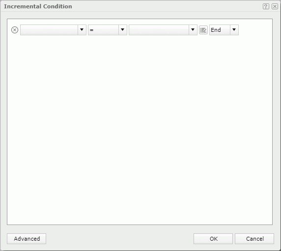
- Select the field on which the filter will be based from the field drop-down list.
- From the operator drop-down list, set the operator with which to compose the condition expression.
- Type the values of how to filter the field in the value text box, or select one or more values from the drop-down list. You can also select the button
 and then select a parameter from the drop-down list to
 - If you want to add another condition line, from the logic operator drop-down list,
- To add a condition line of the AND relationship with the current line, select AND, then define the expression as required.
- To add a condition line of the OR relationship with the current line, select OR, then define the expression as required.
You can repeat this to add more condition lines. To delete a condition line, select
 on its left.
- Make sure the dialog box is in the basic mode.
- To define the incremental condition using complex expressions:
- Switch the dialog box to the advanced mode.
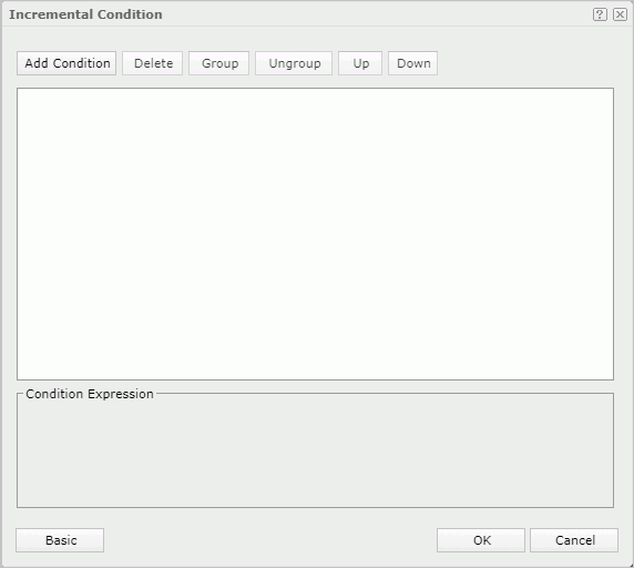
- Select the Add Condition button to add a condition line.
- From the field drop-down list, select the field on which the filter will be based.
- From the operator drop-down list, set the operator with which to compose the filter expression.
- Type the values of how to filter the field in the value text box, or select one or more values from the drop-down list. You can also select the button and then
- To add another condition line, select the Add Condition button and define the expression as required. Then select the logic button until you get the required logic to specify the relationship between the two filter expressions. The logic can be AND, OR, AND NOT, or OR NOT.
- You can repeat the preceding steps to add more condition lines.
To group some conditions, select them and select the Group button, then the selected conditions will be added in one group and work as one line of filter expression. Conditions and groups together can be further grouped. To take any condition or group in a group out, select it and select Ungroup. It is the equivalent of adding parenthesis in a logic expression.
To adjust the priority of a condition line or a group, select it and select the Up or Down button.
To delete a condition line or a group, select it and select the Delete button.
- Switch the dialog box to the advanced mode.
- To define the incremental condition using simple expressions:
- To specify a unique key for the components, manually type the unique key or select the ellipsis button
 to open the Unique Key dialog box to specify one.
Once a unique key is defined, each time when the data components automatically updates themselves, the data that has the same unique key value as the previously loaded data records will be filtered and only data with different unique key value will be added to the data components. For instance, if you add the fields Country and Product ID as the unique key, when a record with the product ID 1 in USA has already been loaded into the data components, no more records of this product ID in USA will be added to them because they have the same unique key value. The most common usage is with a time field so when a time is part of the unique key the data in the data components will be updated each time new records are added to the database with more recent times.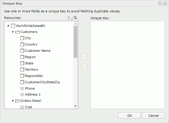
- In the Value Number text box, specify the number of values for incremental fetch.
- Select OK to save the changes.
- Do either of the following:
- Select the Options button on the component title bar, select Auto Refresh from the menu, and then choose Others from the submenu to open the Auto Refresh dialog box.
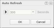
- Select the Play button to enable the auto refresh action, then specify the refresh interval by typing the time interval in the combo box that follows or selecting the drop-down list to select a value.
When the auto refresh action is started, to make it stopped, select the Pause button
. - Select OK to save the changes and close the dialog box.
To open the configuration panel of a library component in JDashboard and perform actions, select on the component title bar and select Edit Setting from the drop-down menu to display the configuration panel. After specifying values in the panel, select OK to apply the values to the library component. The Cancel button is used to close the configuration panel.
To automatically refresh the objects in a library component that are not bound with data:
Tip: If the auto refresh action is configured on a library component at design time in Logi Report Designer, when you open the Auto Refresh dialog box for the library component in JDashboard, the settings specified at design time will be loaded into the dialog box by default. You can edit the settings as you want. When you save the dashboard, the auto refresh configuration will be saved into the dashboard.