 Previous Topic
Manipulating the Data Components in a Dashboard
This topic describes how you can manipulate the data components in a dashboard. Data components include crosstabs, tables, charts, KPIs, and geographic maps.
This topic contains the following sections:
- Applying a Style to a Data Component
- Going Through the Data of Tables, Crosstabs, and Charts
- Customizing the Data Format of Values in Tables, Crosstabs, and Charts
- Removing Component Level Filters From a Data Component
- Manipulating a Table
- Manipulating a Chart
- Manipulating a Crosstab
- Manipulating Geographic Map Group Markers/Areas
Applying a Style to a Data Component
Right-click in the component, then on the shortcut menu, select a style from the Apply Style submenu.
 Back to top
Going Through the Data of Tables, Crosstabs, and Charts
Going actions enable you to switch among data groups freely for viewing different records without having to create a new data component. You can perform going actions on table groups, crosstab column/row headers, and data labels on the chart category/series axis as well as the legend entry labels.
Choose the proper one to meet your needs from the following:
- Go-To
Jumps to a different group by replacing the current. - Go-to-by-Value
Jumps to another group while applying the current value being clicked on as a filter condition. - Go-Down
Goes from a group which is a higher level in a predefined hierarchy to the one-level-lower group while applying the currently selected value as a filter condition. - Go-Up
Goes from a group which is a lower level in a predefined hierarchy to the one-level-higher group.
For more information, see Going Through Web Report Data.
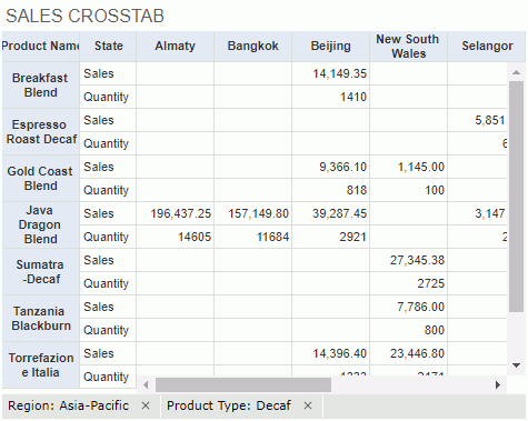
The go-to-by-value and go-down actions always happen along with the generation of a filter condition. The filters are displayed as "FieldName: Value" at the bottom of the data components, in a row one by one from left to right according to the time they are generated. When the row cannot hold all the filters, two buttons are displayed at the two ends of the row for scrolling through the filters to the left and right. Each select on the button will show one hidden filter. To remove a filter condition, select X right to it.
Tip: You can also directly select group objects to perform the go-down action, however, if the group objects are also defined with links, you can go down to the next level with a single select only when the report designer has given the "Drill-down" action the highest Click Priority for the corresponding report at design time. Otherwise, you have to use the Go Down command on the objects' shortcut menu to perform the action.
Customizing the Data Format of Values in Tables, Crosstabs, and Charts
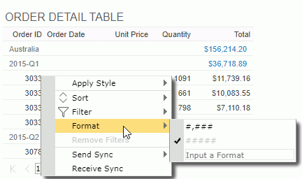
To customize the data format of the values of a field in a table or crosstab, right-click on any value of the field, then select a format from the Format submenu, or type a format in the text box at the bottom of the submenu and select Enter on the keyboard.
You can also customize the data format of the legend entry labels and data labels on the category and series axes if they are of Number or Date/Time type. To do this, right-click on the labels and select the required format from the Format submenu, or type a format in the text box at the bottom of the submenu and select Enter on the keyboard.
Removing Component Level Filters From a Data Component
On the shortcut menu of data components, there is an option Remove Filters which is used to remove filter conditions generated via the configuration panel and via message delivery from the data components. These two kinds of filters are referred to as component-level filters.
In a dashboard, you can also use filter controls to filter data, however, filters created by filter controls are not under the control of the removing component-level filter action, because they are regarded as dashboard-level filters.
Manipulating a Table
- Filtering data in a table
You can take the following ways to filter data in a table.- Using shortcut menu
Right-click on any value of a detail field by which you want to filter data, then you can see the Filter item which provides a submenu containing the following commands: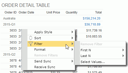
- Remove Filter
This command is enabled when the field is ever applied a filter. Selecting this item will remove the filter from it. - First N
Filters the field to display only its first N values. You can select a number from the submenu or type a positive integer into the text box on the submenu to specify the number. - Last N
Filters the field to display only its last N values. You can select a number from the submenu or type a positive integer into the text box on the submenu to specify the number. - Select Values
Brings up the Select Values dialog box to select the values to filter the field with.
- Remove Filter
- Using the filter button on table column headers
You can use the filter button on any table column header to filter values in the column if the feature is enabled in the server profile. By default, the feature is disabled so you need to configure the profile before you can use it.- In the Common tab of the My Profile > Customize Profile page or Administration > Server Profile > Customize Profile page, select the option Filter on Column Headers, then select Show Sort/Filter Status on Column Headers if you want the filter buttons to be displayed on the table column header after the columns are applied with filter conditions. Select OK to save the profile setting.
- Run a dashboard containing a table.
- Put the mouse pointer on any column header and you can find the filter button
 . Select the button and a filter list which contains the same items as the Filter submenu appears.
 - Select the required item to filter the column. When a column is filtered its filter button will be highlighted. The summary column that contains multiple aggregation objects cannot be filtered using this way.
- Using labels
With Logi Report Designer, you can bind a label in a table with a field used in the table to enable filtering on the label by setting the label's Bind Column and Filterable properties. Then in JDashboard you can select the filter button beside the label to filter values of the bound field. This functions the same as via the table column headers.When a label is bound with a field, if the Filter on Column Header feature is also enabled, the former has higher priority. For example, if you bind the label in column A header with the field in column B, when selecting the filter button on column A header, values in column B are filtered.
- Using shortcut menu
- Sorting data in a group table
You can take the following ways to sort data in a group table. When you sort data in a group table by a detail field and then by another detail field, data in the table will be sorted by the later sort condition first and then by the former sort condition.- Using shortcut menu
Right-click on any value in the table, then on the shortcut menu select Ascend or Descend from the Sort submenu.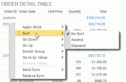
If a detail/summary field value is clicked on, the sorting will affect the order of detail/summary records in the table; if it is a group field value, the order of groups in the group level represented by the group field will be rearranged. To remove the sort condition, select No Sort.
- Using the sort button on table column headers
You can use the sort button on any table column header to sort values in the column, because Server enables the feature in the server profile by default.- In the Common tab of the My Profile > Customize Profile page or Administration > Server Profile > Customize Profile page, make sure the option Sort on Column Headers is selected, then select Show Sort/Filter Status on Column Headers if you want the sort button to be displayed with the current sort status on the table column headers after the columns are applied with sort orders. Select OK to save the profile setting.
- Run a dashboard containing a table.
- Put the mouse pointer on any column header and you can find the sort button
 .
. - To sort data in the column ascending, select the upward triangle; to sort the values descending, select the downward triangle. When a sort order is applied on a column, the corresponding triangle on its sort button will be highlighted. You can select the highlighted triangle to remove the sort order.
A summary column that contains multiple aggregation objects cannot be sorted using this way. Moreover, a group header in a web report table created in Web Report Studio is always merged as a table cell. If a summary column contains only one aggregation object which is in a merged group header, you cannot use this way to sort it either.
- Using labels
With Logi Report Designer, you can bind a label in a table with a field used in the table to enable sorting on the label by setting the label's Bind Column and Sortable properties. Then in JDashboard you can select the sort button beside the label to sort values of the bound field. This functions the same as via the table column headers.When a label is bound with a field, if the Sort on Column Header feature is also enabled, the former has higher priority. For example, if you bind the label in column A header with the field in column B, when selecting the sort button on column A header, values in column B are sorted.
- Using shortcut menu
- Sorting data in a summary table
You can use the same methods on group tables to sort the group and summary columns in summary tables. However, for summary tables, you can define whether to use major sort or minor sort via the Use Major Sort as Default option in the server profile. By default, major sort is applied which is to sort data in a summary table by the last sort condition only, that is to say the later sort condition always replaces the former one. When minor sort is used, sort of a lower group is always based on the sort result of all its higher-level groups.For example, a summary table contains group columns G1, G2 and G3 (G1 the highest group level and G3 the lowest) and the summary columns S1 and S2. When minor sort is applied, after sorting the group column G1 ascending, if you apply a sort on G2 descending, the table will be sorted based on G1 ascending first and then G2 descending; if you further sort G3 descending and the sort result is G1 ascending, G2 descending and G3 descending. Based on this sort result, if you apply the ascending order on the summary column S1, the table will be sorted based on G1 ascending, G2 descending and S1 ascending. Sort order on G3 is removed, this is because all summary columns calculate data based on the lowest group in a summary table and they are considered as one group, so on the lowest group and the summary columns only one sort order can take effect. Therefore, based on the former sort result, if you apply a sort order on G3 again the sort on S1 will be removed.
Manipulating a Chart
You can perform the following operations on a chart, including the KPI chart in a KPI.
- Swapping chart groups
You can swap the chart groups by switching data between the category and series axes, or between the category and value axes when the chart has no field on the series axis but several on the value axis. To do this, right-click the chart, then on the shortcut menu, select Swap Chart Groups.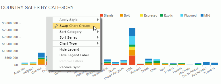
- Sorting the data in a chart
Data labels on the category and series axes of a chart can be sorted alphabetically. To do this, right-click the chart, then on the shortcut menu select Ascend or Descend from the Sort Category or Sort Series submenu. To remove the sort condition, select No Sort on the Sort Category or Sort Series submenu. - Changing the chart type
Right-click the chart, then on the shortcut menu, locate Chart Type. From the drop-down menu, select the desired chart type and its subtype. - Showing/Hiding the chart legend or legend label
Right-click the chart and select the corresponding show/hide option from the shortcut menu to show or hide the legend or legend label. However, the legend will always be displayed on the export and print result.This operation is not supported on KPI charts since they do not have legend.
- Zooming in chart values
For a bar, bench, line, area, or stock chart, you can select the values you are interested in to have them zoomed in. To do this, drag the mouse from the start value to the end value you want to select, then release the mouse. The selected values will be zoomed in. If you want to return to the initial status, just select the return button at the upper right corner of the chart paper.
 - Configuring real time chart settings
For a real time chart, you can further configure it when inserted in a dashboard. To do this:- Right-click the chart and select Real-time Settings from the shortcut menu. Server displays the Real-time Settings dialog box.
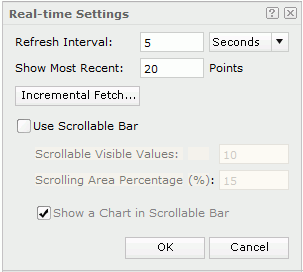
- Specify the time interval at which the chart will get data and refresh itself automatically in the Refresh Interval text box.
- Specify the most recent N records to be kept for the real time data in the chart in the Show Most Recent text box.
- Select the Incremental Fetch button to add the fields you want to use as the unique key of the real time chart in the Unique Key dialog box.
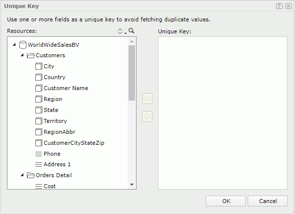
Once a unique key is defined, each time when the chart automatically updates itself, the data that has the same unique key value as the previously loaded data records will be filtered and only data with different unique key value will be added to the chart. For instance, if you add the fields Country and Product ID as the unique key of a real time chart, when a record with the product ID 1 in USA has already been loaded into the chart, no more records of this product ID in USA will be added to the real time chart because they have the same unique key value. The most common usage is with a time field so when a time is part of the unique key the data in the chart will be updated each time new records are added to the database with more recent times.
- Select Use Scrollable Bar if you want to use a scrollbar to control the visible value range on the X axis of the chart, then specify how many data items will be selected on the scrollbar and displayed on the axis by default, the percentage the scrollbar occupies the whole size of the chart, and whether to show the thumbnail chart in the scrollbar.
- Select OK to accept the settings and close the dialog box.
- Right-click the chart and select Real-time Settings from the shortcut menu. Server displays the Real-time Settings dialog box.
- Stopping or resuming a real time chart from refreshing
For a real time chart, you can stop or resume it from automatically refreshing by right-clicking it and selecting the Pause Refresh or Resume command from the shortcut menu.
Manipulating a Crosstab
- Switching crosstab fields
You can change the fields in a crosstab using the Switch command. To do this, right-click any row header/column header/aggregation value and select Switch Row/Switch Column/Switch Summary from the shortcut menu. Objects in the business view used by the crosstab and the available dynamic resources which can be applied as the row/column/aggregation field are listed in the submenu with the currently used one selected. Select the object you want to use to replace the current one.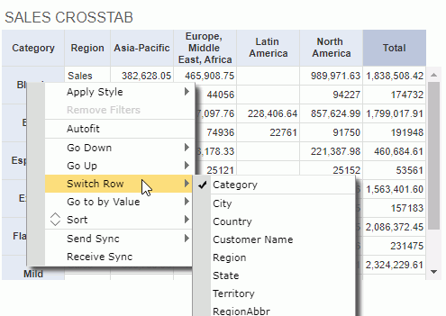
- Sorting data in a crosstab
You can make the data in a crosstab sorted based on any column or row field. To do this, right-click on any value on the column or row header, then choose the command Sort > Ascend or Sort > Descend from the shortcut menu. To remove the sort condition, select Sort > No Sort from the shortcut menu. - Auto fitting values in a crosstab
When the values in the crosstab row/column headers or aggregation cells need more space to completely display, right-click any value in the row/column header or aggregation cell and select Autofit from the shortcut menu. Logi Report then adjusts the width of the corresponding cells to match the contents in them. However, for performance concern, you should not select the option as auto fitting the values in a crosstab may cause poor performance.
Manipulating Geographic Map Group Markers/Areas
- Going up/down on geographic map group markers/areas
- For the group level that is higher than some other group levels in a geographic map component, right-click its group marker/area and select Go Down from the shortcut menu to jump one group level down. The go-down action always happens along with the generation of a filter condition based on the selected value. You can find the condition at the bottom of the map after the result generates. For example, if you perform the action on the country Germany and the next group level is State, you will get data of states in Germany only after going down.
- For the group level that is lower than some other group levels in a geographic map component, right-click its group marker/area and select Go Up from the shortcut menu to jump one group level up.
- Showing/Hiding geographic map group markers/areas
By default, all visible group markers/areas are shown. To hide them, right-click the geographic map (not the group markers/areas) and select Hide Markers/Areas from the shortcut menu. If you want to show them again, right-click the geographic map and select Show Markers/Areas from the shortcut menu.