 Previous Topic
Web Report Wizard Properties
This topic describes how you can use the Web Report Wizard to create a web report. Server displays the wizard when you select New > Web Report on the task bar of the Resources page on the Server Console, or select Menu > File > New Report or the New Report button  on the toolbar in Web Report Studio.
This topic contains the following sections:
You see these elements on all the screens:

Select to view information about the Web Report Wizard.
Back
Select to go back to the previous screen.
Next
Select to go to the next screen.
Save
Select to save the report to the server resource tree.
Run
Select to open the report in Web Report Studio in Edit Mode.
Page Properties
Specifies the page settings of the report.
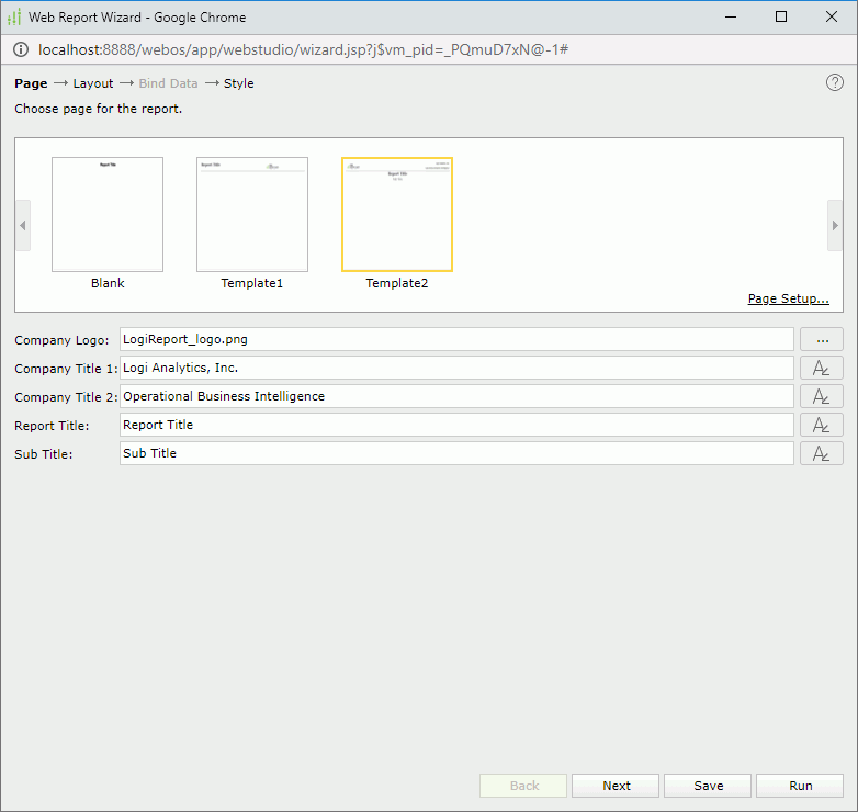
Templates
Specifies the template to be applied to the report.
- Blank
Specifies to use the blank template. - Template1
Specifies to use Template1, in which you can specify the report title and company logo. - Template2
Specifies to use Template2, in which you can specify the company logo, company title, report title and sub title.
Page Setup
Opens the Page Setup dialog box to specify the page properties.
Report Title
Specifies the display name of the report title.
Company Logo
Specifies the company logo image file. Select the ellipsis button  to select the image in the Insert Image dialog box.
Company Title 1
Specifies the display name of the company title 1.
Company Title 2
Specifies the display name of the company title 2.
Sub Title
Specifies the display name of the sub title.

Specifies the font properties for report title, sub title or company title.
After you select the button, Server displays the following dialog box for you to edit the font properties:

- Font
Select the font face of the title. - Font Style
Select the font style of the title: regular, bold, italic, and bold italic. - Size
Specify the font size of the title. - Align
Specify the position of the title to be left, right, center, or justify. - Font Color
Specify the font color of the title.To change the color, select the color indicator. Server displays the color palette. Select a color, or select More Colors to access the Color Picker dialog box in which you can specify a color within a wider range. You can also type a hexadecimal RGB value to specify a color, for example, #9933ff.
- Background Color
Specify the background color of the title. - OK
Select to apply any changes you made here and exit the dialog box. - Cancel
Select to close the dialog box without saving any changes.
 Back to top
Layout Properties
Specifies the layout of the report.
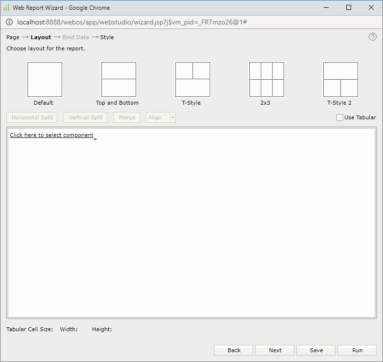
Layouts
Lists the built-in layouts for arranging components in the report. Choose the layout you want to use for the report.
Buttons
The buttons are enabled when a cell in the editing layout box is selected.
- Horizontal Split
Splits the selected cell into two cells horizontally. - Vertical Split
Splits the selected cell into two cells vertically. - Merge
Merges the selected adjacent cells that form a rectangular into one cell. - Align
Specifies how the component aligns in the cell. Enabled when Use Tabular is selected.- Left
Aligns the component to the left of the cell. - Center
Aligns the component to the center of the cell. - Right
Aligns the component to the right of the cell.
- Left
Use Tabular
Specifies whether to use a tabular to lay out the components in the report.
Editing layout box
Specifies the component to be inserted into the selected cell.
- Existing Components
Specifies a component from the ones existing in the open report to create the report. - New Components
Specifies the component you want to place in the cell: Table, Crosstab, Chart, Banded or Blank.
Bind Data Properties
Specifies the data source and the fields to be displayed in each component selected in the Layout screen. This screen differs according to the following component types: Table, Crosstab, Chart and Banded. When the component type is specified as Blank, the screen is disabled.
For Table Component
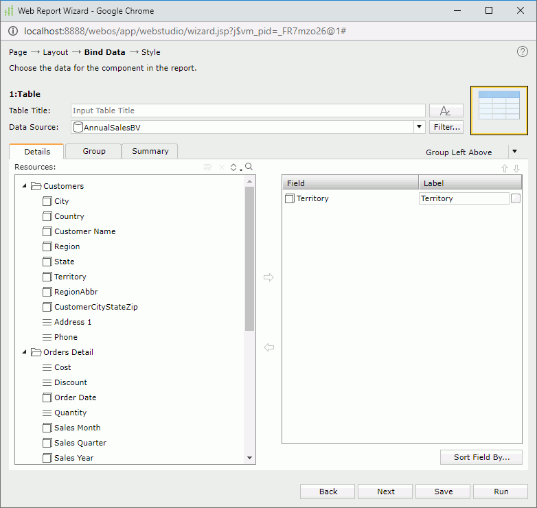
Table Title
Specifies the title of the table. The title is a special label bound with the table. Though it can be positioned freely in a report, once you remove the table from the report, the title will be removed too.
Specifies the font properties of the table title.
Data Source
Specifies the business view in the current catalog on which the table will be built.
Filter
Opens the Query Filter dialog box to specify the filter you want to apply to the selected business view.
Table type drop-down menu
Specifies the type of the table. The tabs available in the screen differ according to the selected table type. When a group table type is selected, you can define the table in the Details, Group and Summary tabs respectively; when the summary table type is selected, only the Columns and Summary tabs are available.
- Group Above
Creates a table with group information above the detail row. - Group Left
Creates a table with group information left to the detail row. - Group Left Above
Creates a table with group information left above the detail row. - Summary Table
Creates a table with only group and summary information.
The tabs for defining a table are different according to the following table types:
For Group Left, Group Above and Group Left Above
Specifies the detail fields that you want to display in the table.
- Resources :
Displays the group objects and detail objects
  in the selected business view. You can also create dynamic formulas to use in the table.
 -

Edits the selected dynamic resource. -

Removes the selected dynamic resource. -

Sorts the view elements in the specified order from the drop-down list. Once a user changes the order, it will be applied to all the resource trees where business view elements are listed for this user.The order can be one of the following:
- Predefined Order
Select if you want to sort the resources in the order as in the Business View Editor of Designer. - Resource Types
Select if you want to sort the resources by the resource type. Namely, category objects come first, then group objects, then aggregation objects, and at last detail objects. - Alphabetical Order
Select if you want to sort the resources in alphabetical order. Logi Report sorts the resources that are not in any category first, and then the categories. It also sorts the resources in each category alphabetically.
- Predefined Order
-

Launches the search bar to search for objects.See the following properties in the search bar:

- Text box
Type the text you want to search in the text box. Server lists the values that contain the matched text. - Close button
Select to close the search bar.  More Options button
Select the button and Server displays more search options.- Highlight All
Select if you want to highlight all matched text. - Match Case
Select if you want to search for text that meets the case of the typed text. - Match Whole Word
Select if you want to search for text that looks the same as the typed text.
- Highlight All
 Previous button
Select to go to the previous matched text when you have selected Highlight All. Next button
Select to go to the next matched text when you have selected Highlight All.
- Text box
-

Adds the selected object to display in the table. -

Removes the selected object. - Field
Lists the objects that have been added to the table as detail fields. - Label
Specifies the text for the labels of the detail fields, which by default are the display names of the added objects. You can select a text box to edit the label, or select the Auto Map Field Name checkbox beside the text box to automatically map the label to the dynamic display name of the object. -
 Move Up button
Moves the selected object higher in the list. -
 Move Down button
Moves the selected object lower in the list. - Sort Fields By
Opens the Custom Sort dialog box to specify how to sort data in the table.
Specifies the fields to group the data in the table.
- Resources
Displays all the available group objects you can use to group data in the table. You can also create dynamic formulas to use in the table. -
Edits the selected dynamic resource. -
Removes the selected dynamic resource. -
Sorts the view elements in the specified order from the drop-down list. Once a user changes the order, it will be applied to all the resource trees where business view elements are listed for this user. -
Launches the search bar to search for objects. -
Adds the selected object as a group-by field. -
Removes the selected object. - Field
Lists all the objects that have been added to the table as the group-by fields. - Sort
Specifies the sort order for groups at the specific group level.- Ascend
Groups will be sorted in an ascending order (A, B, C). - Descend
Groups will be sorted in a descending order (C, B, A). - No Sort
Groups will be sorted in the original order in database. - Custom Sort
Opens the Custom Sort dialog box to set how groups will be sorted.
- Ascend
-
Move Up button
Moves the selected group higher in the list. -
Move Down button
Moves the selected group lower in the list.
Specifies the fields on which to create summaries in the table.
- Resources
Displays all the available aggregation objects you can use to create summaries in the table. You can also create dynamic formulas and aggregations to use in the table.
 -
Edits the selected dynamic resource. -
Removes the selected dynamic resource. -
Sorts the view elements in the specified order from the drop-down list. Once a user changes the order, it will be applied to all the resource trees where business view elements are listed for this user. -
Launches the search bar to search for objects. -
Adds the selected object as the summary field. -
Removes the selected object. - Field
Lists the groups that have been added in the table and the objects added to summarize data in each group. - Row
Specifies to put the summary field in the header or footer row. If the summary is calculated on a group-by field, it will be put in the group header or footer of the corresponding group; if the summary is calculated on the table, it will be put in the table header or footer. Available only when the table is Group Left type. - Column
Specifies to put the summary field in the specified detail column. If no column is selected, the summary field will be displayed in a separate summary column. Available only when the table is Group Left type. -
Move Up button
Moves the selected object higher in the list. -
Move Down button
Moves the selected object lower in the list.
For Summary Table
Specifies the fields that you want to display as the columns of the table.
- Resources
Displays all the group objects and aggregation objects in the selected business view. You can also create dynamic formulas and aggregations to use in the table. -
Edits the selected dynamic resource. -
Removes the selected dynamic resource. -
Sorts the view elements in the specified order from the drop-down list. Once a user changes the order, it will be applied to all the resource trees where business view elements are listed for this user. -
Launches the search bar to search for objects. -
Adds the selected object to display in the table. -
Removes the selected object. - Column
Lists the objects that have been added to the table. - Sort
Specifies the sort order for groups at the specific group level.- Ascend
Groups will be sorted in an ascending order (A, B, C). - Descend
Groups will be sorted in a descending order (C, B, A). - No Sort
Groups will be sorted in the original order in database. - Custom Sort
Opens the Custom Sort dialog box to set how groups will be sorted.
- Ascend
-
Move Up button
Moves the selected object higher in the list. -
Move Down button
Moves the selected object lower in the list.
Summary tab
Specifies to insert aggregations to the header/footer rows of the table and groups.
- Resources
Displays the aggregations that are added in the Columns tab. - Summarized Fields
Displays the groups that are added in the Columns tab under the Table node. - Header
Represents the table header or the group header of a specific group. After an aggregation is selected in the Resources box, you can select the checkboxes in the column to insert the aggregation in the corresponding header rows. - Footer
Represents the table footer or the group footer of a specific group. After an aggregation is selected in the Resources box, you can select the checkboxes in the column to insert the aggregation in the corresponding footer rows.
For Crosstab Component
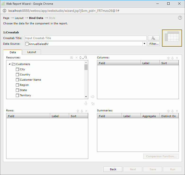
Crosstab Title
Specifies the title of the crosstab. The title is a special label bound with the crosstab. Though it can be positioned freely in a report, once you remove the crosstab from the report, the title will be removed too.
Specifies the font properties of the crosstab title.
Data Source
Specifies the business view in the current catalog on which the crosstab will be built.
Filter
Opens the Query Filter dialog box to specify the filter you want to apply to the selected business view.
Data tab
Specifies the column, row and aggregate fields to display in the crosstab.
- Resources
Displays the group, detail, and aggregation objects in the selected business view. You can also create dynamic formulas and aggregations to use in the crosstab.
Edits the selected dynamic resource.
Removes the selected dynamic resource.
Sorts the view elements in the specified order from the drop-down list. Once a user changes the order, it will be applied to all the resource trees where business view elements are listed for this user.
Launches the search bar to search for objects.
- Columns/Rows
Specifies the column/row fields to display in the crosstab.- Field
Lists the objects that will be displayed on the columns/rows of the crosstab. - Label
Specifies the text of the labels for the column/row headers. You can select a text box to edit the label, or select the Auto Map Field Name checkbox beside the text box to automatically map the label to the dynamic display name of the object. - Sort
Specifies the sort order of the group objects.
- Field
- Summaries
Specifies the aggregate fields to display in the crosstab.- Field
Lists the objects that you select to create summaries. - Label
Specifies the text of the labels for the summaries. You can select a text box to edit the label, or select the Auto Map Field Name checkbox beside the text box to automatically map the label to the dynamic display name of the object. - Aggregate
Specifies the functions used to summarize data of the detail objects. - Comparison Function
Opens the Comparison Function dialog box to add a comparison function as an aggregate for the crosstab.
- Field
-
Adds the selected group object to display on the columns of the crosstab. -

Adds the selected group object to display on the rows of the crosstab. -

Adds the selected aggregation object and detail object to be the summary field of the crosstab. -
Moves the selected object higher in the list. -
Moves the selected object lower in the list. -
Removes the selected object.
Layout tab
Specifies the layout of the crosstab.
-
Aggregate
Specify the layout of the aggregate fields.
- Vertical Layout
Select this option to arrange the aggregate fields vertically.- Number of Rows
Specify the number of rows to hold the aggregate fields in the crosstab. By default, it is -1 which means that Server places each aggregate field in a row so that the aggregate fields are in one column vertically. Server treats a number equal to or larger than the number of aggregate fields in the crosstab as -1. If you set the number of rows (3 for example) less than the number of aggregate fields (6 for example), there will be 3 rows to hold the 6 fields with each row containing 2 fields.
- Number of Rows
- Horizontal Layout
Select this option to arrange the aggregate fields horizontally. When you have multiple aggregate fields in the crosstab, using horizontal layout can make the report more readable.- Number of Columns
Specify the number of columns to hold the aggregate fields in the crosstab. By default, it is -1 which means that Server places each aggregate field in a column so that the aggregate fields are in one row horizontally. Server treats a number equal to or larger than the number of aggregate fields in the crosstab as -1. If you set the number of columns (3 for example) less than the number of aggregate fields (6 for example), there will be 3 columns to hold the 6 fields with each column containing 2 fields.
- Number of Columns
- Vertical Layout
- Suppress Row Grand Totals
Specifies whether to show the grand total row in the crosstab. - Suppress Column Grand Totals
Specifies whether to show the grand total column in the crosstab. - Suppress Row Subtotals
Specifies whether to show the subtotals of the row fields in the crosstab. You can select the ellipsis button to customize which subtotals of the row fields will be suppressed and which will be shown in the Suppress Row Subtotals dialog box.
 - Suppress Column Subtotals
Specifies whether to show the subtotals of the column fields in the crosstab. You can select the ellipsis button to customize which subtotals of the column fields will be suppressed and which will be shown in the Suppress Column Subtotals dialog box. - Column Totals On
Specifies the position of subtotal and grand total columns on the left or right of the detail aggregations. - Row Totals On
Specifies the position of subtotal and grand total rows on the top or bottom of the detail aggregations.
For Chart Component
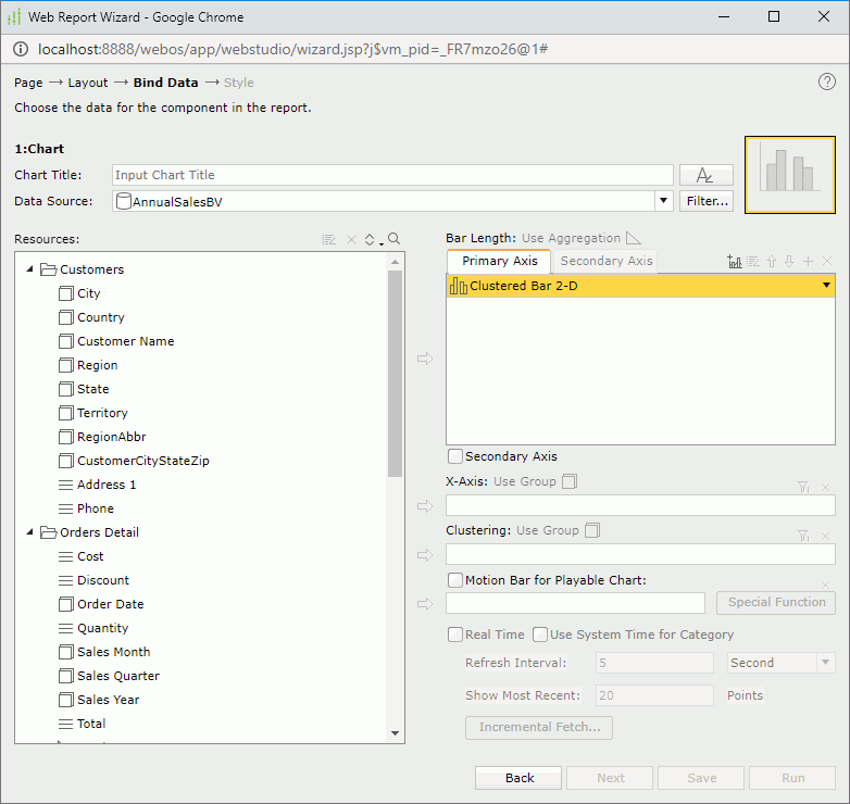
Chart Title
Specify the title of the chart. The title is a special label bound with the chart. Though you can position the chart title freely in a report, once you remove the chart from the report, Server removes the chart title too.
Specifies the font properties of the chart title.
Data Source
Specifies the business view in the current catalog on which the chart will be built.
Filter
Opens the Query Filter dialog box to specify the filter you want to apply to the selected business view.
Resources
Displays the group, detail, and aggregation objects in the selected business view. You can also create dynamic formulas and aggregations to use in the chart.
-
Edits the selected dynamic resource. -
Removes the selected dynamic resource. -
Sorts the view elements in the specified order from the drop-down list. Once a user changes the order, it will be applied to all the resource trees where business view elements are listed for this user. -
Launches the search bar to search for objects.
Adds the selected object to the chart.
Removes the selected object.
The other options for defining the chart component varies according to different chart types: common chart types, organization chart, heat map.
For Common Chart Types
Value box
The actual name of the box varies with different chart types, for example, it is Bar Length for a clustered bar chart. The box lists the values you want to show in the chart. For a real time chart, the values you add must be of Numeric type and cannot be aggregation objects.
- Primary Axis
Adds a chart type to the primary axis. - Secondary Axis
Adds a chart type to the secondary axis. Active only when the option Secondary Axis is selected. Not available to gauge chart. - X-Axis
Lists the value you want to show on the X axis of the bubble chart. - Y-Axis
Lists the value you want to show on the Y axis of the bubble chart. - Size
Lists the value you want to show as the bubble size.

Adds a combo chart to the Primary Axis or Secondary Axis. Not available to gauge chart.
Opens the Edit Additional Value dialog box to edit the selected additional value.
Move Up button
Select to move the selected item higher in the list.
Move Down button
Select to move the selected item lower in the list.

Adds a new pair of Y Axis and Radius for the bubble chart.
Removes the selected resource.
Secondary Axis
Specifies whether to show the secondary axis in the chart. Not available to gauge chart.
Category box
The actual name of the box varies with different chart types, for example, it is X-Axis for a clustered bar chart. The box lists the group object that will be displayed on the category axis of the chart.
For a real time chart, if no object is specified on the category axis, Use System Refresh Time will be automatically displayed in the category box, namely, the time at which the chart refreshes itself will be used as the category value.
Series box
The actual name of the box varies with different chart types, for example, it is Clustering for a clustered bar chart. The box lists the group object that will be displayed on the series axis of the chart. Not available to real time chart.

Opens the Category Options dialog box or Series Options dialog box to define the sort order of the category or series values and specify the number of the category or series values that will be displayed in the chart.
Motion Bar for Playable Chart
Lists the group object you want to use as the motion field. A motion field can only be of Integer, Date or Time data type. Available to single bar, bench and bubble chart types only.
- Special Function
Available only when the motion field is of Date data type. Select it to define the special function.- Field
Displays on which field the special function will be applied. - Function
Specifies the special function to the field. - OK
Accepts the special function settings and leaves the dialog box. - Cancel
Cancels the special function settings and leaves the dialog box.
- Field
Real Time
Specifies to run the chart in real time mode, which means it will be updated automatically using real time data. Available to single bar, bench, line, and area chart types only.
- Use System Time for Category
Specifies to use the time at which the chart refreshes itself as the category value. - Refresh Interval
Specifies the time interval at which the chart will get data and refresh itself automatically. - Show Most Recent N Points
Specifies the number of records that will be kept for the real time data in the chart. - Incremental Fetch
Opens the Unique Key dialog box to configure a unique key for the real time chart.
For Organization Chart
Specifies the data displayed in the chart.
Value box
- Primary Axis
Select Org from the chart type drop-down menu. - Node
Add a field from the Resources box which identifies the entity by selecting both the field and Node and then selecting. - Parent
Add a field from the Resources box which shows the "reporting to" relationship among the entity members, that is, which child node field member reports to or belongs to which child node field member, by selecting both the field and Parent and then selecting. -
Select to remove the selected child node or parent field.
Properties
The Properties box presents a node model of the org chart. Data fields, labels and images can be inserted into the node as the information about the entity in the org chart, using . By default, all added objects are placed at the left top of the node, you need to adjust their positions and sizes in the node. You can also resize the node.
To remove an object from the node, select it, and then select .
For Heat Map
Chart type drop-down list
Displays Heat Map as the selected chart type.
Area
Lists the fields used to group the data to different areas. There should be at least one group. When there are multiple groups, their levels are defined by their positions from top down. The group at the top is of the highest level and the bottom the lowest.
- Color by
Specifies whether to color by a group. 0-n groups can be used as the color-by fields. - Label by
Specifies whether to show the group name in the innermost rectangle. -
Moves the selected group field higher in the list. -
Moves the selected group field lower in the list. -
Opens the Group Options dialog box to define the sort order of the group values and specify the number of the group values that will be displayed in the chart. -
Removes the selected group field.
Property
Lists the summary fields used as size-by/color-by or displayed in the innermost rectangle.
- Size by
Specifies to size by one summary or none. - Color by
Specifies to color by one summary or none. - Label by
Specifies whether to show a summary in the innermost rectangle.
For Banded Object Component
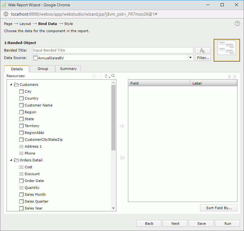
Banded Title
Specifies the title of the banded object. The title is a special label bound with the banded object. Though it can be positioned freely in a report, once you remove the banded object from the report, the title will be removed too.
Specifies the font properties of the banded object title.
Data Source
Specifies the business view in the current catalog on which the banded object will be built.
Filter
Opens the Query Filter dialog box to specify the filter you want to apply to the selected business view.
Specifies the detail fields that you want to display in the banded object.
- Resources
Displays the group objects and detail objects in the selected business view. You can also create dynamic formulas to use in the banded object. -
Edits the selected dynamic resource. -
Removes the selected dynamic resource. -
Sorts the view elements in the specified order from the drop-down list. Once a user changes the order, it will be applied to all the resource trees where business view elements are listed for this user. -
Launches the search bar to search for objects. -
Adds the selected object to display in the banded object. -
Removes the selected object. - Field
Lists all the objects that have been added to the banded object as detail fields. - Label
Specifies the text for the labels of the added objects, which by default are the display names of the objects. You can select a text box to edit the label, or select the Auto Map Field Name checkbox beside the text box to automatically map the label to the dynamic display name of the object. -
Move Up button
Moves the selected object higher in the list. -
Move Down button
Moves the selected object lower in the list. - Sort Fields By
Opens the Custom Sort dialog box to specify how to sort data in the banded object.
Specifies the fields to group the data in the banded object.
- Resources
Displays all the available group objects you can use to group data in the banded object. You can also create dynamic formulas to use in the banded object. -
Edits the selected dynamic resource. -
Removes the selected dynamic resource. -
Sorts the view elements in the specified order from the drop-down list. Once a user changes the order, it will be applied to all the resource trees where business view elements are listed for this user. -
Launches the search bar to search for objects. -
Adds the selected object as a group-by field. -
Removes the selected object. - Field
Lists all the objects that have been added to the banded object as group-by fields. - Sort
Specifies the sort order for groups at the specific group level.- Ascend
Groups will be sorted in an ascending order (A, B, C). - Descend
Groups will be sorted in a descending order (C, B, A). - No Sort
Groups will be sorted in the original order in database. - Custom Sort
Opens the Custom Sort dialog box to set how groups will be sorted.
- Ascend
-
Move Up button
Moves the selected group higher in the list. -
Move Down button
Moves the selected group lower in the list.
Specifies the fields on which to create summaries in the banded object.
- Resources
Displays all the available aggregation objects you can use to create summaries in the banded object. You can also create dynamic formulas and aggregations to use in the banded object. -
Edits the selected dynamic resource. -
Removes the selected dynamic resource. -
Sorts the view elements in the specified order from the drop-down list. Once a user changes the order, it will be applied to all the resource trees where business view elements are listed for this user. -
Launches the search bar to search for objects. -
Adds the selected object as the summary field. -
Removes the selected object. - Field
Lists the groups that have been added in the banded object and the objects added to summarize data in each group. - Row
Specifies to put the summary field in the header or footer row. If the summary is calculated on a group-by field, it will be put in the group header or footer of the corresponding group; if the summary is calculated on the banded object, it will be put in the banded header or footer. - Column
Works together with the Row option to specify the location where a summary will be placed. -
Move Up button
Moves the selected object higher in the list. -
Move Down button
Moves the selected object lower in the list.
Style Properties
Specifies the style of the report.
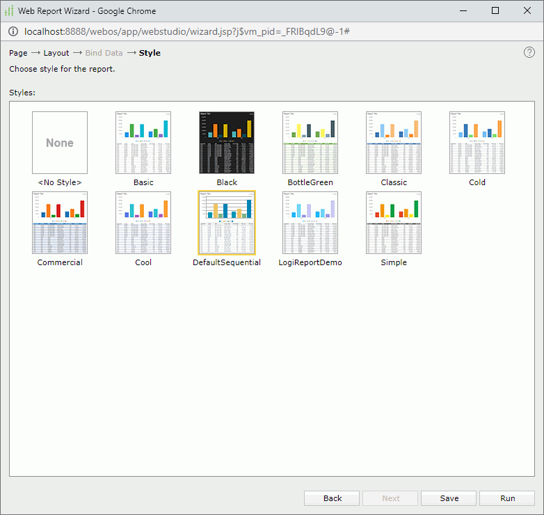
Styles
Lists all the available styles for you to select from. No style will be applied when you select None.