Previous Topic
Performing Visual Analysis
You can make use of the Visual Analysis window to analyze the data in a business view intuitively and conveniently, after you access it in your browser by any of the ways introduced in Starting a Visual Analysis Session. This topic describes how you can add data fields, change their display types, work with the five legends, filter and sort data, and switch view mode.
 You can only add group and aggregation fields into the data presentation area.
This topic contains the following sections:
- Adding Data Fields as Column or Row Headers
- Changing the Display Type of the Data Values
- Working With the Color Legend
- Working With the Size Legend
- Working With the Label Legend
- Working With the Slice Legend
- Working With the Shape Legend
- Showing the Tip Information of the Data Values
- Exchanging Columns and Rows
- Filtering Data
- Sorting a Row/Column Header Field
- Undoing/Redoing Actions
- Refreshing the Current Data View
- Switching Fields Between Legends
- Showing/Hiding the Row/Column Title/Header
- Switching the View Mode
- Examples of Using Different Display Types
Adding Data Fields as Column or Row Headers
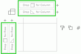
You can add group and aggregation fields as column or row headers. Drag a data field from the resources panel and drop it to the proper control box, following the instructions of the four control boxes highlighted in the following image. You can select the button  beside the four control boxes to add a group or an aggregation field from a list of group fields or aggregation fields in the current business view.
When you add an aggregation as a header, the aggregation will be used to draw axes in the header cells.
You can add multiple fields as column or row headers. For column headers, the order of the group fields or the aggregation fields from left to right decides the grouping order from the first level to the last level. That is, the grouping order is from left to right. For example, there are Year, Region, and Category group fields added as the column headers and are displayed from left to right. Year will be the first level group, Region the second, and Category the last. For row headers, the grouping order is from bottom to top.
When you drag a field to be a header, you can decide its position if there are already existing fields. If you are not satisfied with the current grouping order, you can adjust the order of the fields by dragging and dropping.
To remove a data field from being a column or row header, drag the field outside of its control box, or right-click the field and select Delete from the shortcut menu.
 Back to top
Changing the Display Type of the Data Values
To specify the way of presenting the data values, select the Display Type button which may vary with the context and select the required display type from the type list.
Working With the Color Legend
You can use the color legend to identify the members of a data field by colors.
- Adding data fields to the color legend
Drag the field from the resources panel to in the legend section. If group fields are already added in the color legend, dragging an aggregation field to the legend will remove all the existing group fields from the legend; if an aggregation field is already added in the color legend, dragging another group field or aggregation field to the legend will remove the existing aggregation field from the legend.
 - Moving a color legend field to another legend
Drag the field to the target legend button, or right-click on the field name and select the proper item:- As Size
Moves the field from the color legend to the size legend. - As Label
Moves the field from the color legend to the label legend. - As Slice
Moves the field from the color legend to the slice legend. - As Shape
Moves the field from the color legend to the shape legend.
- As Size
- Replacing a data field
To replace a group field in the color legend with another group field, drag the new field and drop it to the existing field name in the color legend until the name bar is highlighted.To replace an aggregation field with another aggregation field, drag the new field and drop it to
or drop it to the existing field name in the color legend until the name bar is highlighted. - Changing the field order
When multiple group fields are bound with the color legend, you can change their order. By default, the bound fields are listed from top to bottom. Drag a field that is not at the bottom of the list to and the field will be moved to the bottom of the list. - Removing a data field from the color legend
Drag and drop the field name outside of its position. - Customizing color when color legend is bound with no field
If no field is bound with the color legend, the color legend will use one single color. Select and you will be able to select a color in the color palette, or select More Colors to select a color within a wider range.
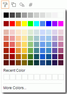
- Recent Colors
Recent used colors are listed here. It is session level. You can select a recent color to apply it. - More Colors
Opens the Color Picker dialog box in which you can select a color within a wider range.
- Recent Colors
- Customizing color when color legend is bound with fields
If group fields are bound with the color legend, the colors will be discrete colors that come from a pattern. To change the color, select to access the Edit Color dialog box.
If an aggregation field is bound with the color legend, the colors will be gradient colors which also come from a pattern. To change the color, select
to access the Edit Gradient Color dialog box.
Working With the Size Legend
You can use the size legend to identify the members of a data field by sizes.
- Adding data field to the size legend
Drag the field from the resources panel to in the legend section. The size legend can be bound with one field only, so when you drag a different field to which is already bound with a field, the new field will replace the existing field.
 - Adjusting the size legend
Select and you will be able to adjust the size legend in percentage. The range is from 1% to 200%. - Moving the size legend field to another legend
Drag the field to the target legend button, or right-click on the field name and select the proper item:- As Color
Moves the field from the size legend to the color legend. - As Label
Moves the field from the size legend to the label legend. - As Slice
Moves the field from the size legend to the slice legend. - As Shape
Moves the field from the size legend to the shape legend.
- As Color
- Removing the size legend field
Drag and drop the field name outside of its position.
Working With the Label Legend
You can use the label legend to show the labels of the members of a data field.
- Adding data fields to the label legend
For example, to show the country names in the data values displayed in the data presentation area, drag the Country field to in the legend section.
 - Moving a label legend field to another legend
Drag the field to the target legend button, or right-click on the field name and select the proper item:- As Color
Moves the field from the label legend to the color legend. - As Size
Moves the field from the label legend to the size legend. - As Slice
Moves the field from the label legend to the slice legend. - As Shape
Moves the field from the label legend to the shape legend.
- As Color
- Replacing a data field
Drag the new field and drop it toor drop it to the existing field name in the label legend until the name is highlighted. - Changing the field order
When multiple data fields are bound with the label legend, you can change their order. By default, the bound fields are listed from top to bottom. Drag a field that is not at the bottom of the list to and the field will be moved to the bottom of the list. - Removing a data field from the label legend
Drag and drop the field name outside of its position.
Working With the Slice Legend
You can use the slice legend to make the pie divided around the center according to an aggregation field. The slice legend is available when the display type is Pie.
- Adding data field to the slice legend
Drag the field from the resources panel to in the legend section. The slice legend can be bound with one aggregation field only, so when you drag a different aggregation field to which is already bound with a field, the new field will replace the existing field.
 - Moving the slice legend field to another legend
Drag the field to the target legend button, or right-click on the field name and select the proper item:- As Color
Moves the field from the slice legend to the color legend. - As Size
Moves the field from the slice legend to the size legend. - As Label
Moves the field from the slice legend to the label legend.
- As Color
- Removing the slice legend field
Drag and drop the field name outside of its position.
Working With the Shape Legend
You can use the shape legend to identify the members of a data field by shapes. The shape legend is available when the display type is Shape.
- Adding data field to the shape legend
Drag the field from the resources panel to
 in the legend section. The shape legend can be bound with one data field only, so when you drag a different field to which is already bound with a field, the new field will replace the existing field.
 - Moving the shape legend field to another legend
Drag the field to the target legend button, or right-click on the field name and select the proper item:- As Color
Moves the field from the shape legend to the color legend. - As Size
Moves the field from the shape legend to the size legend. - As Label
Moves the field from the shape legend to the label legend.
- As Color
- Removing the shape legend field
Drag and drop the field name outside of its position. -
Customizing shape when shape legend is bound with no field
If no field is bound with the shape legend, the shape legend will use one shape. To change the shape, select
and then select a shape from the shape list.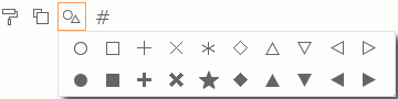
The first shape is the default applied shape.
- Customizing shape when shape legend is bound with a field
If a data field is bound with the shape legend, to change the shapes for members of the field, select and edit the shapes in the Edit Shapes dialog box.
Showing the Tip Information of the Data Values
Put the mouse pointer on any value in the data presentation area, and Server displays a tip box showing the detailed information of the value.
Exchanging Columns and Rows
To exchange the positions of the columns and rows, select the Swap button  on the toolbar.
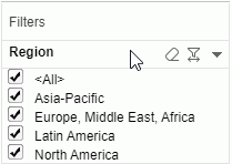
Filtering Data
You can create one or more filters based on group fields in Visual Analysis. To do this, take either of the following ways:
- Drag a group field from the resources panel into the Filters panel.
- In the data presentation area, right-click a group field and select Use as Filter from the shortcut menu.
A filter is then added in the Filters panel with all the values of the group field being applied. You can select the desired values in the filter to filter values in the data presentation area.
To remove a filter, drag its field outside of the Filters panel.
When you move the mouse pointer on the Filters panel title bar, you can see an arrow button  on the right. Select the arrow and you see two options:
- Reset All Filters
Resets the values of all the filters to the initial state. - Clear All Filters
Removes all the filters from the Filters panel. You can also remove all the filters from the Filters panel by selecting the Menu button on the toolbar and then selecting Clear Filters.
Move the mouse pointer on a filter's title bar and you will see more filter options:
-
 Reset
Reset
Resets the values of the filter to the initial state. -
 Reverse
Applies the other unselected filter values instead of the selected ones. -
More Options
Changes the display type of the filter:- Checkbox
The field values are displayed with checkboxes and multiple values can be selected. - Radio
The field values are displayed with radio buttons and only one single value can be selected except for all values. - Range Slider
The field values are displayed with a slider and a range of values can be selected. - Slider
The field values are displayed with a slider and only one single value can be selected except for all values.
- Checkbox
Sorting a Row/Column Header Field
To sort a data field in the row/column header, right-click it and select Sort from the shortcut menu. In the Sort dialog box, choose a way to specify the sort order.
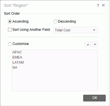
- Set the order to be Ascending or Descending. If you want to perform the sort based on another field, select the Sort Using Another Field radio button and then select a field from the drop-down list that follows. For example, when you set the sort order to Ascending and specify to use the field Total Sales to perform the sort action, the final sort result will be that Total Sales is sorted in the ascending order.
- Select the Customize option to adjust the order of the members of the current data field manually. Use the arrow buttons to adjust the order of the members.
Undoing/Redoing Actions
You can undo or redo some actions. To do this, select the Undo button  or Redo button
  on the toolbar.
Refreshing the Current Data View
Select the Refresh button  on the toolbar.
Switching Fields Between Legends
Within a display type, after a field is bound with a legend type, you can directly drag the field to another legend type, or use the menu after you right-click the field name bar under the original legend.
Showing/Hiding the Row/Column Title/Header
To show or hide the row/column title or header, right-click a related row/column control box and then select or unselect Show Title or Show Header on the shortcut menu.
Switching the View Mode
To switch the view mode, select the Menu button on the toolbar and then select an item on the View list. Or select an item from the view mode drop-down list on the toolbar.
There are also some quick ways to switch between the modes:
- Under the Normal View mode, double-click any position in the data area, the view mode will be switched to Fit Visible.
- Under the Fit XXX mode, double-click any position in the data area, the view mode will be switched to Normal View.
The view mode status will not be saved when saving the analysis template.
Examples of Using Different Display Types
The following examples use the business view WorldWideSalesBV in /SampleReports.
- Example 1: Displaying the data values in text
- Example 2: Displaying the data values as bar
- Example 3: Displaying the data values as line
- Example 4: Displaying the data values as pie
- Example 5: Displaying the data values as shape
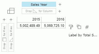
Example 1: Displaying the data values in text
- Make sure you do not change the display type, which is Text by default.
- To view total sales, drag Total Sales from the resources panel and drop it to in the legend section.
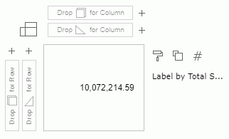
There is only one value in the data presentation area which is the total sales in the whole business view.
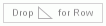
- Now let's view total sales in different years. Drag Sales Year to the column control box
 .
.
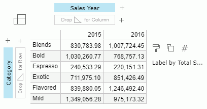
- To add product category as the row header, drag Category to the row control box
 .
.
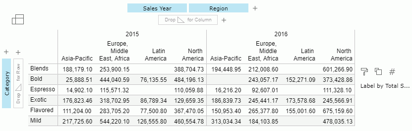
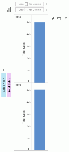
- Drag Region as a column header right to Sales Year.
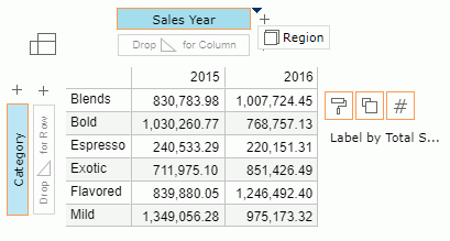
Then get the following:
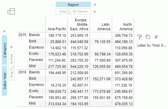
- We will move Sales Year from the column header to row header by dragging.
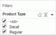
- We will filter the data with product type. Drag Product Type from the resources panel to the Filters panel.
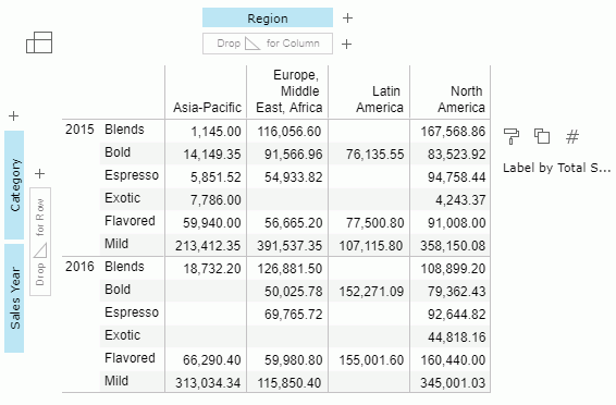
- Clear Regular. Server displays only the data about Decaf.
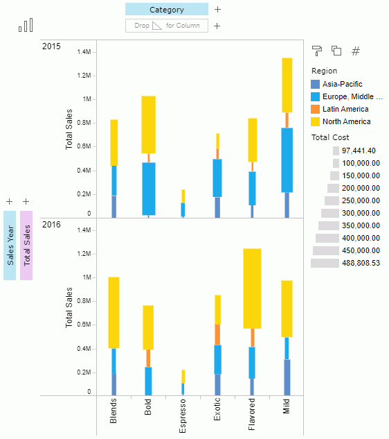
Example 2: Displaying the data values as bar
- Select the Display Type button
 and then select
  from the type list.
 - Drag Sales Year to the row control box and Total Sales to the row control box
 . The Total Sales field is used to draw axes in the row header.
- To mark different regions by color, drag Region to in the legend section.
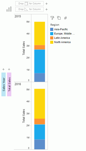
- Drag Category to the column control box as the column header.
- To show the total cost in each region by size, drag Total Cost to in the legend section.
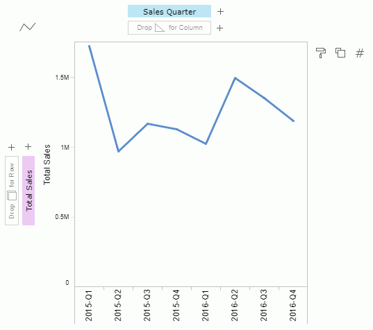
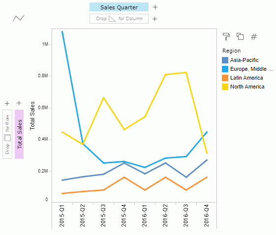
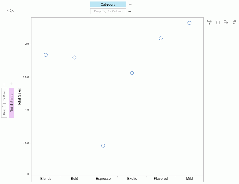
Example 3: Displaying the data values as line
- Select the Display Type button and then select
 from the type list.
 - Drag Total Sales to the row control box as the axis and Sales Quarter to the column control box to demonstrate the sales trend along the quarters.
- To view the sales trend along the quarters in each region, drag Region to in the legend section.
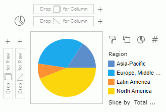
Example 4: Displaying the data values as pie
- Select the Display Type button and then select
 from the type list.
 - To mark different regions in different color in the pie, drag Region to in the legend section.
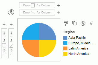
- To demonstrate the total sales of each region by portion in the pie, drag the field Total Sales to in the legend section.
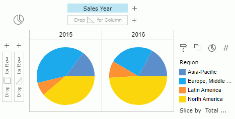
- To view the total sales in different years, drag the field Sales Year to the column control box .
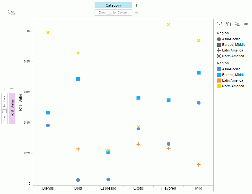
Example 5: Displaying the data values as shape
- Select the Display Type button and then select
 from the type list.
 - Add Category as the column header and Total Sales as the row axis.
- To mark different regions with different shapes, drag Region to in the legend section.
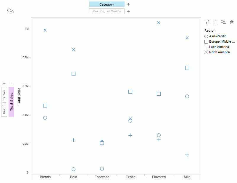
- To change the shape pattern, select . Then in the Edit Shapes dialog box, select Pattern3 from the drop-down list and select OK.
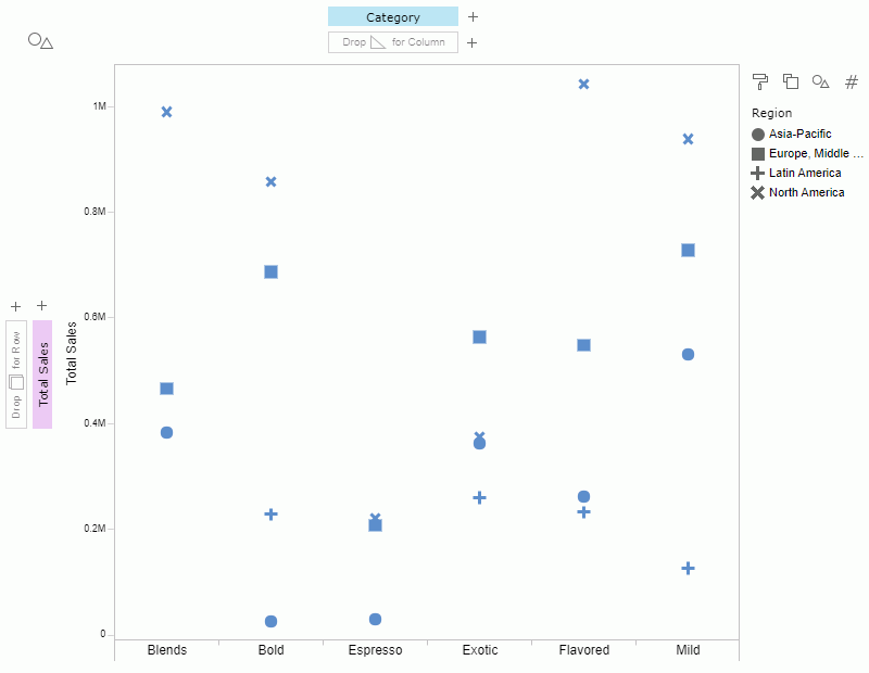
- To distinguish the shapes by color, drag Region to in the legend section.