 Previous Topic
Formatting the Legend
This topic describes how you can format the legend of chart.
- Right-click any chart element and select Format Legend from the shortcut menu or double-click the legend of the chart. Designer displays the Format Legend dialog box.
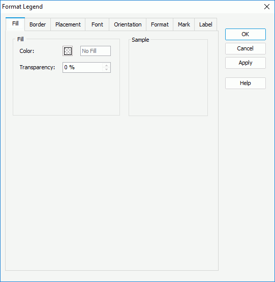
- In the Fill tab, specify the color and transparency of the color to fill the legend (to change the color, select the color indicator and select a color from the color palette, or type the hexadecimal value of a color in the text box).
- In the Border tab, specify the properties for the border of the legend.
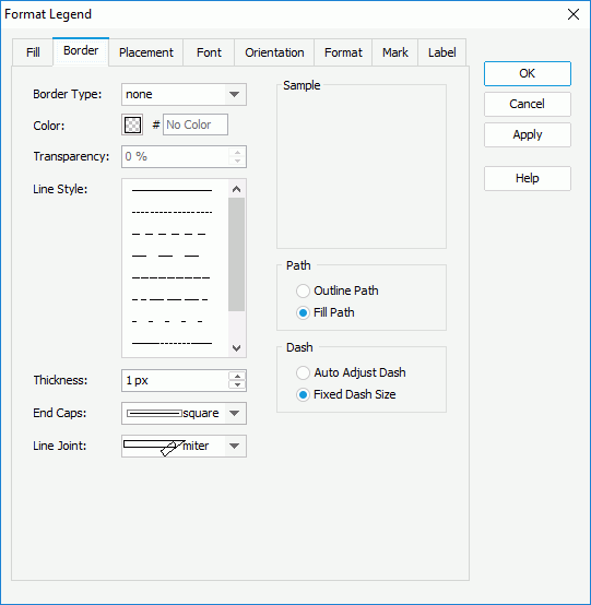
Specify the type, color, color transparency, line style, thickness, end caps style, and line joint mode of the border.
In the Path box, specify the fill pattern of the border: Outline Path or Fill Path.
In the Dash box, select to automatically adjust the dash size or use fixed dash size if you select a dash line style for the border.
- In the Placement tab, specify in which manner to place the legend in the chart.
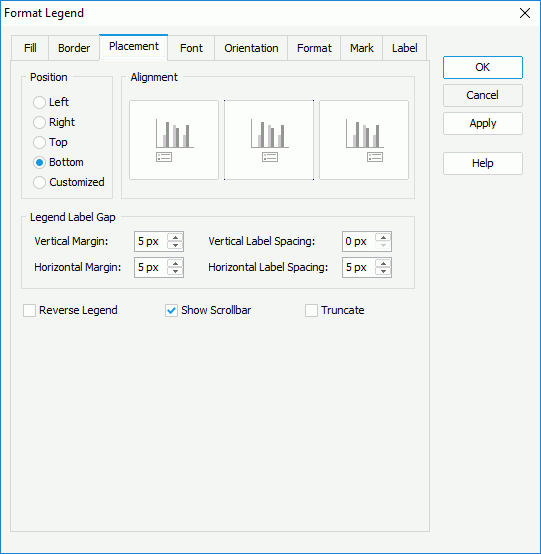
In the Position box, specify whether to place the legend at the left, right, top, or bottom of the chart, and then select the alignment style accordingly in the Alignment box. If you select Customized, you can drag the legend on the chart manually in the design area to specify its location.
In the Legend Label Gap box, specify the vertical and horizontal margins between the legend entries and the legend boundaries, and the vertical and horizontal spacing between the legend entry labels.
Select Reverse Legend if you want to arrange the legend entries in a reverse order.
Select Show Scrollbar in order to show the legend scroll bar to fully view the legend content when the content does not fit into the legend.
Select Truncate to truncate the legend entry label text when the text overflows the labels.
 Usually, it is easier to select the legend and use the grab handles to resize and move the legend as needed anywhere in the chart.
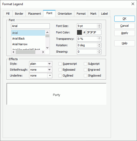
 - In the Font tab, specify the font formats of the legend entry labels, including the font face, size, color, transparency, rotation angle, shearing angle, and effects such as style, strikethrough, and underline.
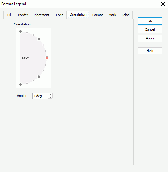
- In the Orientation tab, specify the rotation angle for legend entry labels. You can either drag the Text hand in the Orientation box or type a value in the Angle text box to set the angle.
- In the Format tab, specify the data format of the legend entry labels, which Designer applies only when you set the property Label Format Source of the chart legend to Legend Label Format in the Report Inspector.
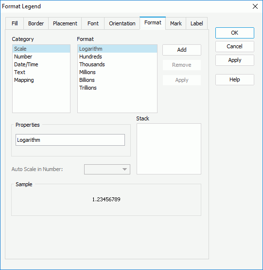
Select a category from the Category box, then select a format from the Format box and select Add to add it to the Stack box (for more information about each format, select here). If the formats that Designer provides in the Format box cannot meet your requirement, you can define the format in the Properties text box and add it as the format of the selected category. You can add more than one format, but for each category, only one format is allowed. If you do not need a format anymore, select it in the Stack box and select Remove to clear it.
Set the Auto Scale in Number option to specify whether to automatically scale the big and small Number values.
- In the Mark tab, specify the properties of the legend entry marks.
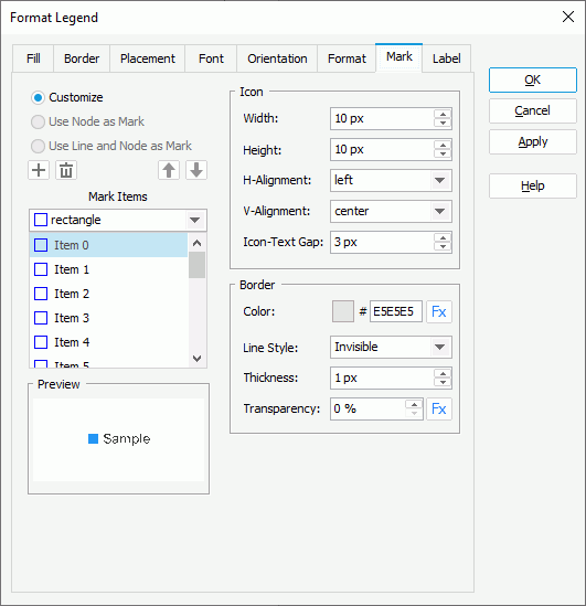
By default, Designer selects Customize, meaning, you can customize the format of the legend entry marks by yourself. To specify the style for a mark item, select the item in the Mark Items box and then select the style from the drop-down list in the box. You can select Add
 to add more items to the Mark Items box and define their style. To delete a mark item, select it and select Remove
  ; to adjust the order of the items, select a mark item and select Move Up
  or Move Down
  . The legend entry marks repeat within the mark items you define. If you define more mark items than the actual legend entry marks, Designer ignores the redundant mark items.
In the Icon box, specify the width and height of the legend entry marks, the horizontal and vertical alignment of the marks relative to the entry labels, and the gap between each entry mark and entry label.
In the Border box, set the color, style, thickness, and color transparency of the mark border. If the chart uses a query resource, you can use a formula to control the border color and transparency.
For a line chart, you can also select Use Node as Mark or Use Line and Node as Mark to apply the style and color of the line nodes or lines and line nodes automatically to the legend entry marks. When you select either of these two options, Designer disables the Mark Items and Border boxes, but you can still specify the properties of marks in the Icon box.
- Designer enables the options in the Label tab, if the legend entry labels show the values of the field displaying on the category or series axis of the chart. You can customize the text of the legend entry labels as follows: clear Auto, then from the Label Text drop-down list, select a field the values of which you prefer to display as the entry labels, or use a formula to control the label text; you can also select
 and type the text that you want to show in the labels in the text box manually.
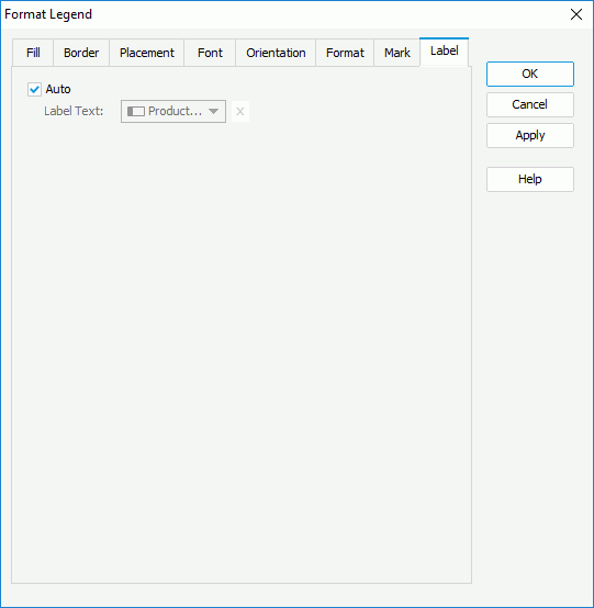
- For a chart in a library component, you can define web behaviors on its legend in the Behaviors tab.
A web behavior contains a trigger event and a web action to be triggered when the event occurs on the legend at runtime. You can add as many web behaviors to the legend as you need.
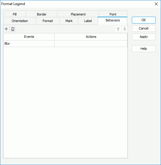
To define the web behavior, select a trigger event from the drop-down list in the Events column, then select in the Actions column and select the ellipsis
 . In the Web Action List dialog box, bind a web action the same as you do to web controls in the library component. The web actions you can bind include Filter, Sort, Parameter, Property, and SendMessage.
You can select Add
to add and define more web behaviors; to delete a web behavior, select it and select Remove . You can also select a web behavior and select Move Up or Move Down to adjust the order of the behaviors, then at runtime, when an event that is bound with more than one action happens, JDashboard triggers the upper action first. - Select OK to apply the settings and close the dialog box.
 Back to top