 Previous Topic
Button Properties
You can use the Button Properties dialog box to update the properties of a button. This topic describes the properties in the dialog box.
Server displays the dialog box when you right-click a button in a navigation control and select Properties from the shortcut menu.
The dialog box properties vary with the button type:
- Button
Select if you want to display the button as a normal button. - Image Button
Select if you want to display the button as an image.
Button Properties
When you select Button as the button type, you see the following properties.
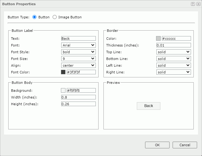
Button Label
Specify the properties of the button label.
- Text
Specify the text of the label. - Font
Select the font face of the text. - Font Style
Select the font style of the text. - Font Size
Select the font size of the text. - Align
Select the alignment way of the label in the button. - Font Color
Specify the font color of the text.
Border
Specify the properties of the button border.
- Color
Specify the border color. - Thickness
Specify the border width. - Top Line
Select the style of the top border line. - Bottom Line
Select the style of the bottom border line. - Left Line
Select the style of the left border line. - Right Line
Select the style of the right border line.
Button Body
Specify the properties of the button body.
- Background
Specify the background color of the button.To change the color, select the color indicator. Server displays the color palette. Select a color, or select More Colors to access the Color Picker dialog box in which you can specify a color within a wider range. You can also type a hexadecimal RGB value to specify a color, for example, #9933ff. If you want to make the background transparent, type Transparent in the text box.
- Width
Specify the width of the button. - Height
Specify the height of the button.
Preview
Server displays a preview of the button according to the button properties you specified here.
 Back to top
Image Button Properties
When you select Image Button as the button type, you see the following options.
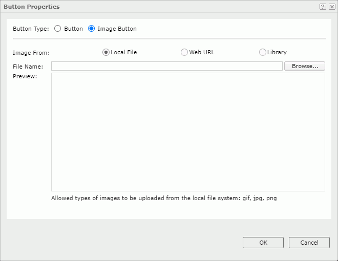
Image From
Specify the source of the image file.
- Local File
Select if you want to use an image from the local file system. Then, select Browse to locate the image file. - Web URL
Select if you want to specify an image via URL. Then, in the File URL box, type the URL of the image file. Server will record the latest 10 entered URLs in the drop-down list. If your Logi Report Server is in an intranet, to access the image via URL, you need to add the parameters
 -Dhttp.proxyHost=XXX -Dhttp.proxyPort=XXto the server's startup file JRServer.bat in<install_root>\bin. - Library
Select if you want to use an existing image. Then, select an image in the My Pictures box, which is a virtual location where Server stores the images that you have once inserted into reports.
Preview
Server displays a preview of the selected image.
OK
Select to apply any changes you made here and exit the dialog box.
Cancel
Select to close the dialog box without saving any changes.
 Help button
Select to view information about the dialog box.
 Close button
Select to close the dialog box without saving any changes.