Previous Topic
Applying Conditional Color Fills to Charts
Usually, for a data marker in a chart, it uses a predefined color pattern assigned by the style the chart applies. By using the Conditional Color Fill feature, you can specify color patterns based on different value ranges. With distinguishing colors, it is easy for users to locate the values they need to focus on in a chart. This topic introduces the types of the chart conditional color fills Designer supports and how you can apply them to your charts.
This topic contains the following sections:
- Types of Conditional Color Fills in Charts
- Adding Single-Color Conditional Fill to a Chart
- Adding Multiple-Color Conditional Fill to a Chart
Types of Conditional Color Fills in Charts
Designer supports two types of conditional color fills for charts:
- Single Color with Condition
With a single color, you can make the data markers that meet the specified condition apply the color pattern bound with the condition. - Multiple Colors with Condition
By using multiple colors, you can divide each data marker into several parts based on different value ranges along the direction of the value axis, and then specify separate color patterns to these different value ranges.
You can apply the Conditional Color Fill feature to the following chart types: Bar, Bench, Pie, Donut, Area 2-D, Area 3-D, Line 2-D, and Heat Map, and use the Multiple Colors with Condition fill type to these chart types only: Clustered Bar/Bench 2-D, Clustered Bar/Bench 3-D, Bar/Bench 3-D, Area 2-D, and Area 3-D.
 Back to top
Adding Single-Color Conditional Fill to a Chart
- Double-click any data marker in the chart.
- In the corresponding format dialog box, switch to the Fill tab.
 For a line chart, you can set conditional color fills on both the chart lines and the nodes on the lines in the Fill and Node tabs respectively, using the same method.
 - Select the fill type as Use Single Color with Condition. The following shows a sample dialog box:
- You can edit the conditional fills in either of the two modes: normal mode or advanced mode (to switch between the two modes, select Advanced or Normal).
To edit conditional fills in normal mode:
- From the Select Field drop-down list, select the field based on which to define the conditions.
- Select Add
 to add a condition line.
 - Define the condition.
- If you select the category/series field of the chart, or a field that does not contain numeric values from the Select Field drop-down list, select a value from the Values drop-down list or type it in the text box. You can specify an empty string as the value for a field of String type, by simply clearing the text box (value length=0).
- If you select the value field of the chart, or a field containing numeric values from the Select Field drop-down list, specify the start and end values for the condition from the Start Value and End Value drop-down lists or type them in the text boxes.
For a 100% Stacked Bar/Bench 2-D chart, 100% Stacked Bar/Bench 3-D chart, 100% Stacked Line 2-D chart, or a pie/donut chart, you can select Percent to display the data in the condition expression in percent; if you select the option, you need to type the percent value in decimal fraction in the Start Value and End Value text boxes.
- Specify the properties such as color and color transparency for values in the condition (to change the color, select the color indicator and select a color from the color palette, or type the hexadecimal value of a color in the text box).
For a line chart, you can apply the color pattern specified on the node to the corresponding line by selecting Apply Color to Line in the Node tab. Designer then disables the Color and Transparency columns in the Conditional Fill box of the Fill tab.
- By default, Designer uses the expression of the condition as its legend entry label. If you want to change it, select Label and change the label in the text box. For a line chart, this option is available in the Node tab of the Format Line dialog box only.
- Repeat the above steps to add more conditional fills. To remove a condition fill, select it and select Remove
 .
. - The values beyond the ranges that you define in all your conditions automatically apply the Other condition settings. You can edit properties of the Other condition and edit its legend entry label as well.
- For a line chart, besides properties in the Conditional Fill box of the Format Line dialog box, you can edit more line/node properties for values in a condition.
To edit the line properties of a condition, select the condition and select Edit
 in the Conditional Fill box in the Fill tab of the Format Line dialog box. In the Edit Line Style dialog box, specify the color and color transparency of the chart line and the area formed by the chart axes and the chart line, and the style and thickness of the chart line respectively. Designer displays a sample based on your selection in the Sample box. Select OK if you are satisfied with the format.
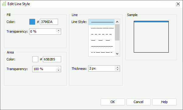
To edit the node properties of a condition, select the condition and select Edit
in the Conditional Fill box in the Node tab of the Format Line dialog box. In the Edit Node Style dialog box, set Show Node to true if you want to show the nodes in the chart line, then specify the style, transparency, width, height, and color of the nodes. In the Border box, set the border properties of the nodes in the selected chart line, including the border color, color transparency, line style, and thickness. If you set the node style to plus, multiplication, star1 or star2, Designer displays the Line box instead of the Border box, in which you can specify the line style and thickness for the nodes. Select OK to apply the node properties and close the dialog box.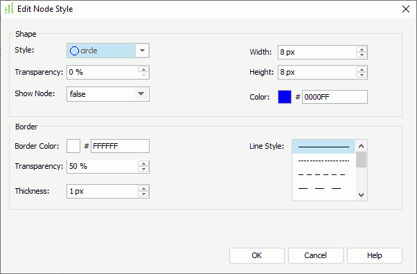
To edit conditional fills in advanced mode:
- Select Add to add a condition in the Edit Conditions dialog box. The following shows a sample dialog box.
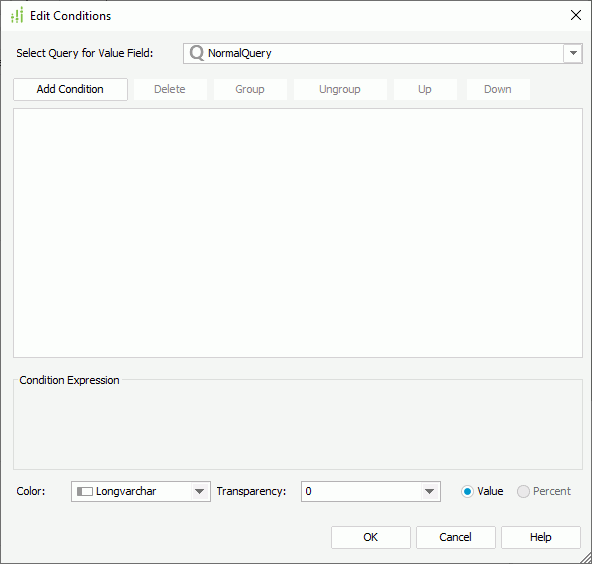
- From the Select Query for Value Field drop-down list, select the query which contains the fields the values of which you want to use to build the conditions.
For a line chart, if you want to use field values to build the conditions, you need to select Imported Conditions at the bottom of the dialog box.
- Select Add Condition to add a condition, select a field on which the condition is based from the field drop-down list, specify the operator with which to compose the condition, then select a field in the specified query from the value drop-down list as the value to build the condition or select <Input...> and type the value in the text box. You can apply an empty string as the value for a field of String type, by simply leaving the text box blank (value length=0).
Repeat this to add more conditions.
To group some condition lines, select them and select Group, Designer then adds the selected condition lines in one group and applies them as one line of filter expression (you can also group conditions and groups together); to take out any condition or group from a group, select it and select Ungroup; to adjust the priority of the condition lines, select it and select Up or Down; to delete a condition line, select it and select Delete.
For a 100% Stacked Bar/Bench 2-D chart, 100% Stacked Bar/Bench 3-D chart, or a pie/donut chart, if you select a field which contains numeric values from the field drop-down list, you can control whether to display the data in the condition expression as value or in percent by selecting Value or Percent at the right bottom of the dialog box.
- Specify the fill properties for values in the condition.
For a chart other than the Line type, select the fields in the specified query to control the color and color transparency of the condition. The values of the field that you select to control color should contain strings such as "0x000000", and the values of the field used to control transparency should be integers between 0 and 100; otherwise, select <Input...> and type the value in the text box.
For a line chart, specify values for the line properties/node properties. If you select Imported Conditions, you can select the fields in the specified query to control some of the properties, such as Color and Transparency.
- Select OK to close the dialog box and return to the format dialog box.
Designer displays the condition that you specify in the Edit Conditions dialog box in the Conditional Fill box in the format dialog box. You can select Edit
to further edit the condition and the corresponding conditional fill properties. - By default, Designer shows the expression of the condition as the legend entry label. If you want to change it, select Label and change the label in the text box. For a line chart, this option is available in the Node tab of the Format Line dialog box only.
- For a chart of the Bar, Bench, or Line type, you can select Add and repeat the above steps to add more conditional fills.
- The values beyond the ranges that you define in all your conditions automatically apply the Other condition settings. You can edit properties of the Other condition and edit its legend entry label as well. For a line chart, besides properties in the Conditional Fill box, you can select Edit to edit more conditional fill properties for the Other condition in the same way as you do when editing the conditional fills in normal mode.
- Select OK to accept the settings and close the dialog box.
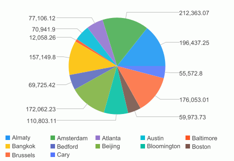
Example of Applying Single-Color Conditional Fill in a Chart
- Make sure SampleReports.cat is the currently open catalog file. If not, select File > Open Catalog to open it from
<install_root>\Demo\Reports\SampleReports. - Select File > New > Web Report to create a web report.
- Insert a chart in the web report as follows:
- Use WorldWideSalesBV in Data Source 1 of the catalog.
- Display in the Clustered Pie chart type.
- Show the group object City on the category axis and the aggregation object Total Sales on the value axis.
- Apply a Select N condition to the category field City to show its Top 12 values only.
- Use the Basic style.
- Save the report and select the View tab to preview the chart.
- Select the Design tab to go back to design mode and double-click a pie in the chart.
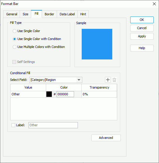
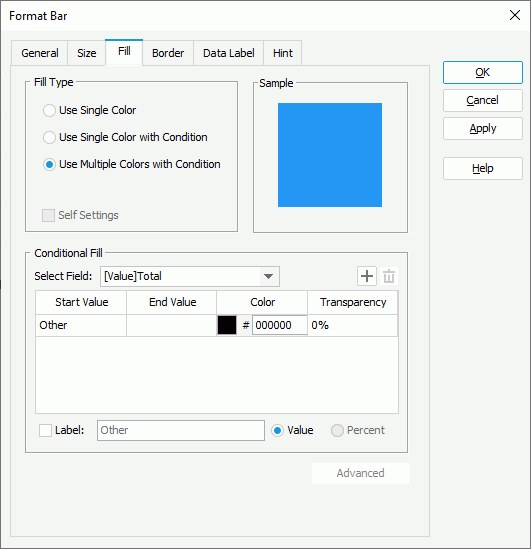
- In the Format Pie dialog box, go to the Fill tab and select Use Single Color with Condition.
- From the Select Field drop-down list, select [Category]City, select Add three times to add three condition lines and specify the condition values and colors respectively.
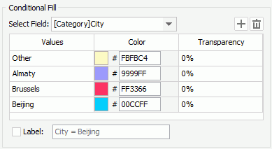
- Select OK to apply the settings and close the dialog box.
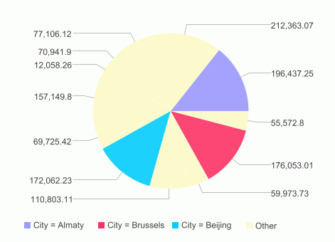
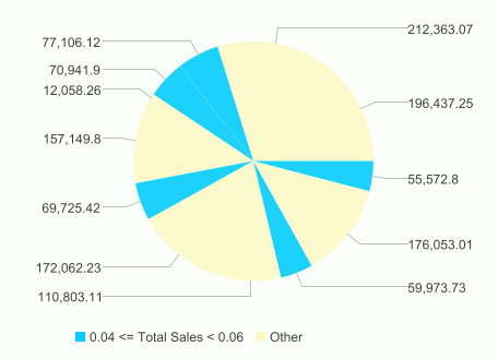
- Preview the chart again. You can see that Designer fills the pie sections that represent the cities Almaty, Brussels, and Beijing with the defined colors, and distributes all the other cities to the Other group.
Next, we use percentage values to edit the condition expressions.
- Switch to design mode and open the Format Pie dialog box again.
- In the Fill tab, select [Value]Total Sales from the Select Field drop-down list and select Percent. Specify the color for the Other condition to FBFBC4. Select Add to add a condition line, set the condition Start Value to 0.04, End Value to 0.06, and color to 00CCFF, then select Label and modify the condition label to 4% <= Total Sales < 6%.
Select OK to accept the settings and close the dialog box.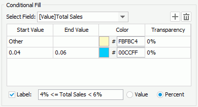
- Preview the chart.
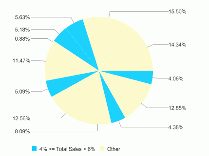
From the result above, you can see that Designer fills the Other group and all the pie sections whose values are between 4% and 6% of the total value with the defined colors. To make the result more clear, you can display the data label of the pie sections in percent by setting the property Data Label Type on the chart paper to percent in the Report Inspector.
Adding Multiple-Color Conditional Fill to a Chart
You can apply the Multiple Colors with Condition fill type to the following chart types only: Clustered Bar/Bench 2-D, Clustered Bar/Bench 3-D, Bar/Bench 3-D, Area 2-D, and Area 3-D.
- Double-click on any data marker in the chart.
- In the corresponding format dialog box, select the Fill tab.
- Select the fill type as Use Multiple Colors with Condition. The following shows a sample dialog box.
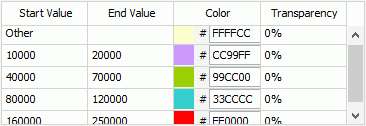
- Select Add to add a condition line, specify the start value and end value for the condition from the drop-down lists or type them in the text boxes, then set the color and transparency for the value range (to change the color, select the color indicator and select a color from the color palette, or type the hexadecimal value of a color in the text box).
- By default, Designer shows the expression of the condition as its legend entry label. If you want to change it, select Label, and then change the label in the text box that follows.
- Repeat the above steps to add more conditional fills.
- The values beyond the ranges you have defined in all your conditions automatically apply the Other condition settings. You can edit the color and transparency of the Other condition and edit its legend entry label as well.
- Select OK to accept the settings and close the dialog box.
Example of Applying Multiple-Color Conditional Fill in a Chart
- Make sure SampleReports.cat is the currently open catalog file. If not, select File > Open Catalog to open it from
<install_root>\Demo\Reports\SampleReports. - Select File > New > Web Report to create a web report.
- Insert a chart in the web report as follows:
- Use WorldWideSalesBV in Data Source 1 of the catalog.
- Display in the Clustered Bar 2-D chart type.
- Show City on the category axis and Total Sales on the value axis.
- Apply a Select N condition to the category field City to show its Top 12 values only.
- Use the Basic style.
- Save the report and select the View tab to preview the chart.
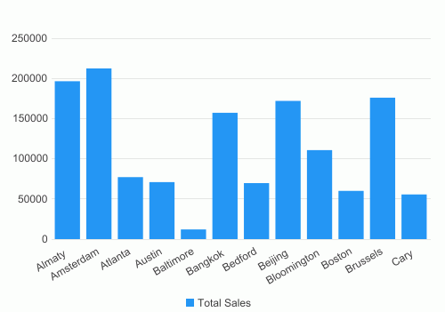
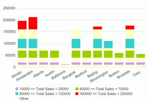
- Select the Design tab to go back to design mode and double-click a bar in the chart.
- In the Format Bar dialog box, select the Fill tab, then select Use Multiple Colors with Condition as the fill type.
- Designer selects the value field Total Sales in the Select Field drop-down list by default. Select Add four times to add four condition lines and specify the condition values and colors respectively.
- By default, Designer uses the condition expression as the legend entry label for each condition. Take the first condition line for example, its condition expression is "10000 <= Total Sales < 20000". Select each condition line and select Label one by one. Select OK.
- Preview the chart again. Designer now divides each bar into several parts based on different value ranges and fills them with different conditional colors.