 Previous Topic
Crosstab Wizard Properties
You can use the Crosstab Wizard dialog box to create a crosstab report. This topic describes the properties in the dialog box.
This topic contains the following sections:
Back
Select to go to the previous screen.
Next
Select to go to the next screen.
Finish
Select to create the crosstab and exit the wizard.
Cancel
Select to close the wizard without creating a crosstab.
Help
Select to view information about the dialog box.
Data Screen
Specify the business view you want to use to create the crosstab. Server hides this screen when there is only one business view in the current catalog.
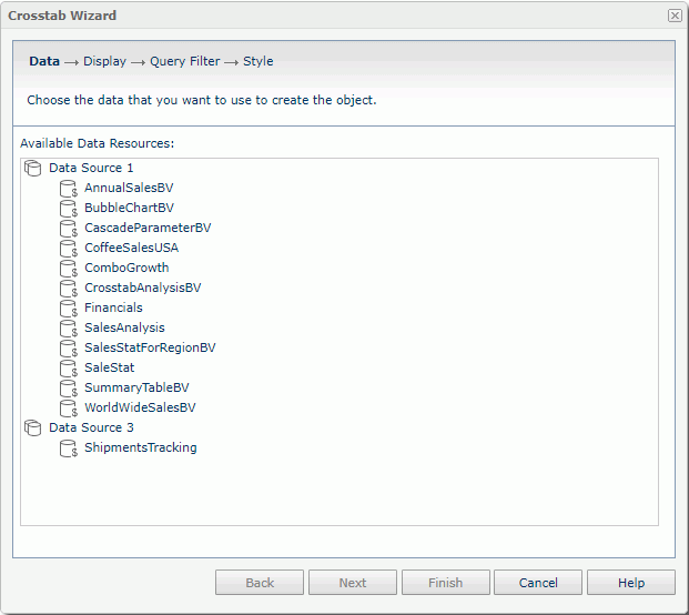
Available Data Resources
Select a business view in the current catalog, using which you want to create the crosstab.
 Back to top
Display Screen
Specify the fields to display in the crosstab.
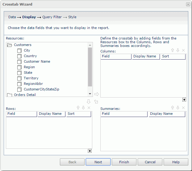
Resources
Server displays the view elements in the selected business view. Select a non-folder resource.
 Add button
Select to add the selected group object  to display on the column header of the crosstab.
 Add button
Select to add the selected group object to display on the row header of the crosstab.
 Add button
Select to add the selected aggregation object  to be the aggregate field of the crosstab.
Columns/Rows
- Field
Server lists the group objects you added to display on the column/row headers of the crosstab. - Display Name
Specify the labels for the column/row headers. You can select a text box to edit the label, or select the Auto Map Field Name checkbox beside the text box to automatically map the label to the dynamic display name of the object. - Sort
Select the sort order of the group objects. -
 Add Compound Group button
Select to add a column/row compound group.
Summaries
- Field
Server lists the aggregation objects you added as the aggregate fields of the crosstab. - Display Name
Specify the labels for the aggregations. You can select a text box to edit the label, or select the Auto Map Field Name checkbox beside the text box to automatically map the label to the dynamic display name of the object.
 Move Up button
Select to move the selected field or compound group higher in the list. For fields in a compound group, you can only change their order within the current group.
 Move Down button
Select to move the selected field or compound group lower in the list. For fields in a compound group, you can only change their order within the current group.
 Remove button
Select to remove the selected field or compound group that you do not want in the crosstab.
Query Filter Screen
Specify the filter that you want to apply to the selected business view.
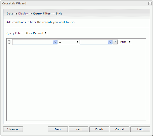
Server displays the predefined filters of the business view in the Query Filter list. You can choose one of them to apply. If you prefer to define a filter on your own, select User Defined from the list, and then define it.
If the selected business view contains parameters, Server displays the Enter Parameter Values dialog box for you to specify the parameter values before displaying the Query Filter screen.
For more information, see the Query Filter dialog box.
Style Screen
Specify the style of the crosstab. Server hides this screen when there is only one style available to the crosstab.
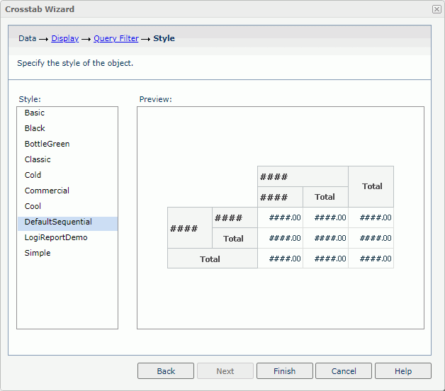
Style
Select a style you want to apply to the crosstab.
Inherit Style
Select to take the style of the parent component. The property is available when you insert the crosstab into a banded object.
Preview
Server shows a preview of the crosstab in the selected style.