Changing the Display Type of Objects in Reports
Display Type enables you to map an object such as a label to display as other value or image instead in a report. It is supported on the following objects: labels, data fields (DBFields, summary fields, formula fields, parameter fields), special fields, and basic web controls. This topics introduces the display types Designer supports and how you can change the display type of an object in a report.
The display types Designer provides include:
- General types: Text, Image, Barcode, QR Code, and Rank (for objects in web reports and library components, only Text is supported)
- Display types that you can use as basic web controls directly: Text Field, Hidden Field, Text Area, Checkbox, Radio Button, Image Button, Button, List, and Drop-down List (you can only display parameter fields as List and Drop-down List, and display the List and Drop-down List web controls as each other)
![]() You cannot use the Display Type feature in business view-based page reports.
You cannot use the Display Type feature in business view-based page reports.
The following sections show changing the display type of an object in a report as a general type:
- Displaying an Object as Text
- Displaying an Object as Image
- Displaying an Object as Barcode
- Displaying an Object as QR Code
- Displaying an Object as Rank
For more information about how to change the display type of an object to a basic web control, see Inserting Basic Web Controls.
Displaying an Object as Text
- Right-click the object and select Display Type from the shortcut menu. Designer displays the Display Type dialog box.
- In the Display As box, select Text.
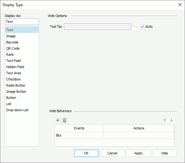
- In the Web Options panel, if you want to specify a tool tip for the text, clear the Auto option, then in the Tool Tip text box, specify the tool tip to show for the text. If the component is in a page report that uses query resources, you can also use a formula to control the tool tip: select
 and select a formula from the drop-down list. If you select a DBField from the drop-down list, Designer applies the first record of the field in the database as the tool tip. The tool tip displays when users hover the mouse over the text at runtime or in the HTML output of the report.
 If you select the Auto option, you cannot customize the tool tip. Then at runtime or in the HTML output of the report, when the text cannot display completely, users can hover the mouse over the text to get its full content in the tool tip.
- In the Web Behaviors panel, you can bind web actions to the object the same as you do to web controls.
- Select OK to accept the settings on the object.
Displaying an Object as Image
- Right-click the object and select Display Type from the shortcut menu. Designer displays the Display Type dialog box.
- In the Display As box, select Image.
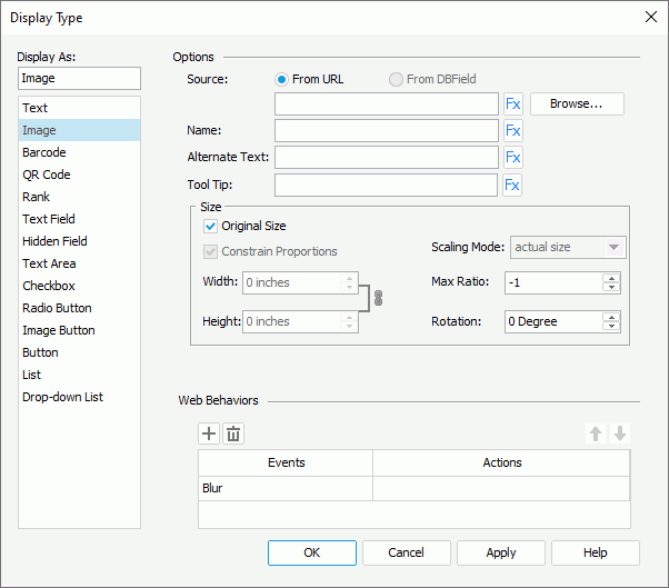
- In the Web Options panel, select Browse to specify the image source. If you want to use a formula to control the image source, select
 and select it from the drop-down list. If you select a DBField from the drop-down list, Designer applies the first record of the field in the database as the image source.
For a data field such as DBField, formula, and summary in which image data is stored, you can also select From DBField to apply the data field as the image source. Then, you can specify the type for decoding the image from the Decode Type drop-down list and decide whether to parse the image using the data URI scheme. If the image type is SVG, Designer shows the image within the display area of the data field and ignores the Size settings in the following steps 7 to 9. Designer uses the viewport of the SVG image if you define to scale the image to fit into the display area; otherwise, Designer uses the display area as the viewport. Designer cannot displays the SVG image if it refers to external resources or contains JavaScript code, and does not support the dynamic effect in SVG.
- In the Name text box, type the name of the image, or select
 and use a formula or DBField to control the name.
 - In the Alternate Text text box, type a string to serve as the content when the image cannot display, or select
 and use a formula or DBField to control the alternate text.
 - In the Tool Tip text box, specify the tool tip to show for the image, or select
 and use a formula or DBField to control the tool tip. The tool tip displays when users hover the mouse over the image at runtime or in the HTML output of the report.
 - In the Max Ratio text box, specify the maximum scaling ratio of the image. By default, the scaling ratio of the image is not limited. If you set the ratio to any value greater than 0, the actual scaling ratio is less than or equal to it.
- In the Rotation text box, specify the rotation degree of the image. The value 0 means no rotation; a positive value means rotating the image clockwise and a negative value anticlockwise.
- By default, Designer displays the image in its original size. Clear Original Size if you want to use customized image size, then set the width and height of the area for displaying the image in the Width and Height text boxes, select Constrain Proportion to constrain the aspect ratio when setting the width and height, and specify the scaling mode of the image from the Scaling Mode drop-down list.
Designer supports the following scaling modes. The scaling mode you select controls the image behavior when you adjust the size of the area for displaying the image.
- actual size - Select to show the image in its actual size. If the size of the area for displaying the image is smaller than that of the image, part of the image will be cut off.
- fit image - Select to adjust the image to fill up the area for displaying the image, with its original perspective remained but under the limitation of Max Ratio.
- fit width - Select to adjust the image to fit the width of the area for displaying the image but under the limitation of Max Ratio.
- fit height - Select to adjust the image to fit the height of the area for displaying the image but under the limitation of Max Ratio.
- customize - Select to adjust the image according to the width and height that you specify in the Width and Height text boxes, regardless of Max Ratio.
- In the Web Behaviors panel, you can bind web actions to the component the same as you do to web controls.
- Select OK to accept the settings on the object.
![]() If you specify a rotation degree for the image, the area for displaying the image maintains its original size in the report result, hence it may result in that the rotated image exceeds the area boundary. In this case, Designer cuts the parts that extend outside of the area.
If you specify a rotation degree for the image, the area for displaying the image maintains its original size in the report result, hence it may result in that the rotated image exceeds the area boundary. In this case, Designer cuts the parts that extend outside of the area.
Displaying an Object as Barcode
- Right-click the object and select Display Type from the shortcut menu. Designer displays the Display Type dialog box.
- In the Display As box, select Barcode.
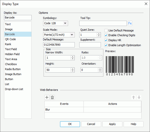
- In the Web Options panel, select the required barcode type from the Symbology drop-down list. You can preview the format of the selected symbology in the Preview box.
- In the Tool Tip text box, specify the tool tip to show for the barcode. If you want to use a formula to control the tool tip, select
 and select a formula from the drop-down list. If you select a DBField from the drop-down list, Designer applies the first record of the field in the database as the tool tip. The tool tip displays when users hover the mouse over the barcode at runtime or in the HTML output of the report.
When you select the Auto option, you cannot customize the tool tip. Then at runtime or in the HTML output of the report, when the text cannot display completely, users can hover the mouse over the text to get its full content in the tool tip.
- From the Scale Mode drop-down list, select the unit for the values of Quiet Zone, Narrow Width, Supplement, Height, and Ratio.
- In the Quite Zone text box, specify the space around the barcode (most symbologies require quiet zones that precede and follow the barcode).
- You can change the default value of the barcode in the Default Message text box, which Designer applies for the barcode in design mode. If you want to use it as the value of the barcode in the report result, select Use Default Message.
- Specify the supplement of the barcode.
If you select the barcode type as Code 39, Code 128/128A/128B/128C, or Codabar, you do not need to set the supplement.
- Set the barcode bar width in the Narrow Width text box, and the height of the bars in the Height text box.
- Specify the width ratio of the thick bar to the thin bar in the Ratio text box if you select the barcode type as Code 39 or Codabar. The ratio can only be 2.0 or 3.0. Designer regards any ratio values not equal to 2.0 or 3.0 as 2.0.
- In the Orientation text box, specify the rotation angle, in degrees.
- Select Enable Checking Digits if you want to include check digits in the barcode. When you select the barcode type as Code 39, Code 128/128A/128B/128C, or Codabar, you can select Display HR to display the barcode numbers together with the barcode.
- In the Web Behaviors panel, you can bind web actions to the component the same as you do to web controls.
- Select OK to accept the settings on the component.
You can also use barcodes as independent component and insert them into a report directly. For more information, see Barcodes.
Displaying an Object as QR Code
- Right-click the object and select Display Type from the shortcut menu. Designer displays the Display Type dialog box.
- In the Display As box, select QR Code.
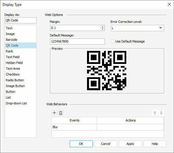
- In the Web Options panel, set the margin between the image in the middle of the QR Code and the border of the QR Code.
- Select the error correction level for the QR Code. Error correction helps in making a QR Code stay readable, even when some pixels are missing. There are four correction levels. Level L means 7% of the code words can be recovered from a damaged symbol, level M 15%, level Q 25%, and level H 30%. The higher the level is, the bigger the QR Code gets.
- You can change the default value of the QR Code in the Default Message text box, which Designer applies for the QR Code in design mode. If you want to use it as the value of the QR Code in the report result, select Use Default Message.
- In the Web Behaviors panel, you can bind web actions to the component the same as you do to web controls.
- Select OK to accept the settings on the component.
You can also use QR Codes as independent component and insert them into a report directly. For more information, see Barcodes.
Displaying an Object as Rank
- Right-click the object and select Display Type from the shortcut menu. Designer displays the Display Type dialog box.
- In the Display As box, select Rank.
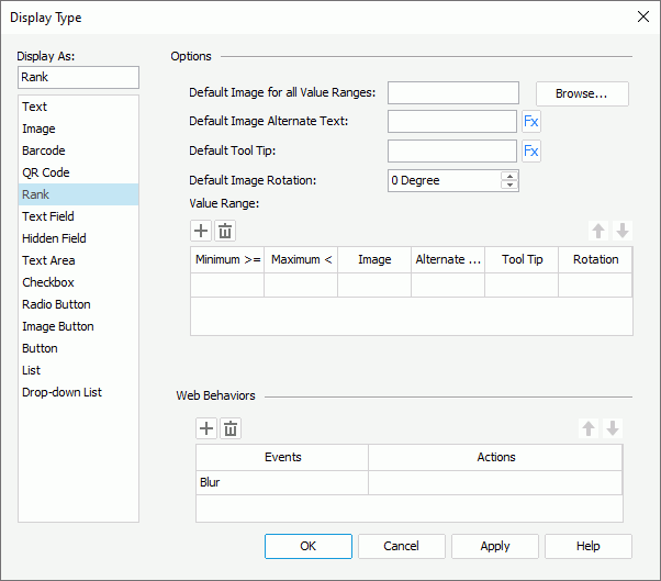
- In the Web Options panel, select Browse to select an image file to be the default image (Designer applies the image if a value does not fit any of the specified value ranges).
- In the Default Image Alternate Text text box, type a string to serve as the content when the default image cannot display. If you want to use a formula to control the alternate text, select
 and select a formula from the drop-down list. If you select a DBField from the drop-down list, Designer applies the first record of the field in the database as the alternate text.
 - In the Default Tool Tip text box, specify the tool tip to show for the default image, or select
 and use a formula or DBField to control the tool tip. The tool tip displays when users hover the mouse over the image at runtime or in the HTML output of the report.
 - In the Default Image Rotation text box, specify the rotation degree of the default image.
- 0 - No rotation.
- Positive value - Rotates the image clockwise.
- Negative value - Rotates the image anticlockwise.
- In the Value Range box, select in the cell of the corresponding column to specify the minimum value, maximum value, image, alternate text, tool tip, and rotation of the first range.
- Select Add
 to add and define more ranges. To delete a range, select it and select Remove
  . You can also use Move Up
  and Move Down
  to adjust the order of the ranges.
Designer displays a value, which is larger than or equal to the minimum value of a range and less than the maximum value, as the image, or the alternate text if the image cannot be loaded or is not available. For a value belonging to two or more overlapping ranges, Designer applies the highest range in the Value Range box.
- In the Web Behaviors panel, you can bind web actions to the component the same as you do to web controls.
- Select OK to accept the settings on the component.
You can also use ranks as independent component and insert them into a report directly. For more information, see Ranks.
![]()
- The tool tip you specify for an object when editing the display type displays differently on different browsers:
- On Internet Explorer, the tip text is automatically wrapped if its length exceeds the maximal tip width the browser allows. In addition, for Internet Explorer, you can manually make some text displayed in a new line by adding 
 or 
 ahead of the text when editing the tool tip.
- On Firefox, the tip text displays in one line with the maximal tip width the browser allows, and the text that it cannot display within the width is cut off and replaced by an ellipsis (...).
- When you rotate an image, the rectangle that holds the image maintains its original size, which may result in that the image exceeds the field border and therefore the parts that extends outside of the border is cut off.
 Previous Topic
 Back to top