 Previous Topic
Format Label Dialog Box
You can use the Format Label dialog box to format the labels of a chart. This topic describes the options in the dialog box.
Designer displays the Format Label dialog box when you right-click a label of a chart and select Format Label from the shortcut menu, or double-click a label in a chart.
The dialog box contains the following tabs:
You see these buttons in the tabs:
OK
Select to apply your settings and close the dialog box.
Cancel
Select to close the dialog box without saving any changes.
Apply
Select to apply all changes and leave the dialog box open.
Help
Select to view information about the dialog box.
General Tab
Use this tab to specify the general properties of the label.
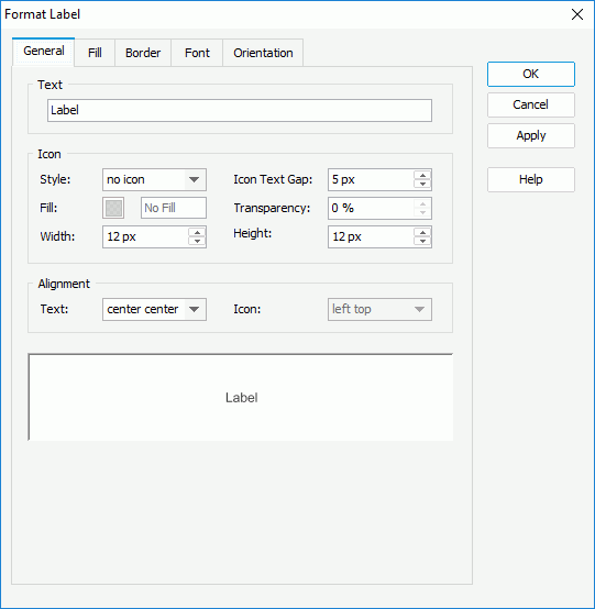
Text
Specify the text in the label.
Icon
You can specify the properties of the icon to display in the label in this box.
- Style
Select the style of the icon. Designer enables the other options in the Icon box when you do not select "no icon" from the drop-down list. - Icon Text Gap
Specify the distance between the icon and the label text. - Fill
Specify the color to fill the icon. To edit the color, select the color indicator and select a color from the color palette or type the hexadecimal value of a color (for example, 0xff0000) in the text box. - Transparency
Specify the transparency of the color to fill the icon. - Width
Specify the width of the icon, in pixels. - Height
Specify the height of the icon, in pixels.
Alignment
You can specify the alignment of the text and icon in this box.
- Text
Select the alignment of the text in the label. - Icon
Designer enables this option when you select to display icon in the label. You can use it to specify the alignment of the icon relative to the text in the label.
Sample
This box displays a preview sample based on your selections.
 Back to top
Fill Tab
Use this tab to specify the color pattern to fill the label.
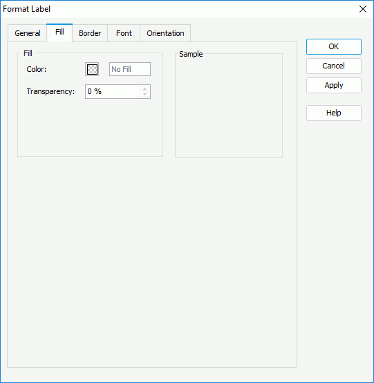
Color
Specify the color to fill the label. To edit the color, select the color indicator and select a color from the color palette or type the hexadecimal value of a color (for example, 0xff0000) in the text box.
Transparency
Specify the transparency of the color to fill the label.
Sample
This box displays a preview sample based on your selections.
Border Tab
Use this tab to specify the properties for the border of the label.
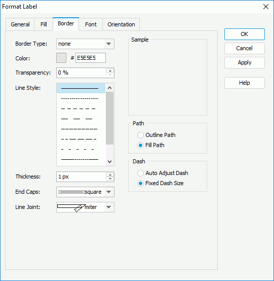
Border Type
Select the type of the border.
- none
Select if you do not want to show the border. - raised
Select to show 3-D border which appears as if it is raised off the page. - recess
Select to show 3-D border which appears as if it is pressed into the page. - shadow
Select to show two shadowed borders, beneath and to the right of the object. - solid
Select to use single-line border.
Color
Specify the color of the border. To edit the color, select the color indicator and select a color from the color palette or type the hexadecimal value of a color (for example, 0xff0000) in the text box.
Transparency
Specify the transparency for the color of the border.
Line Style
Select the line style of the border.
Thickness
Specify the width of the border, in pixels.
End Caps
Select the ending style of the border line.
- butt
Select to end unclosed sub paths and dash segments with no added decoration. - round
Select to end unclosed sub paths and dash segments with a round decoration that has a radius equal to half of the width of the pen. - square
Select to end unclosed sub paths and dash segments with a square projection that extends beyond the end of the segment to a distance equal to half of the line width.
Line Joint
Select the joint style of the border line.
- miter
Select to join path segments by extending their outside edges until they meet. - round
Select to join path segments by rounding off the corner at a radius of half the line width. - bevel
Select to join path segments by connecting the outer corners of their wide outlines with a straight segment.
Sample
This box displays a preview sample based on your selections.
Path
You can specify the fill pattern of the border in this box.
- Outline Path
Select to use outline path for the border. - Fill Path
Select to use whole path for the border.
You can specify the dash size of the border in this box if you select a dash line style for the border.
- Auto Adjust Dash
Select to adjust the dash size automatically. - Fixed Dash Size
Select to use fixed dash size.
Font Tab
Use this tab to specify the font properties of the text in the label.
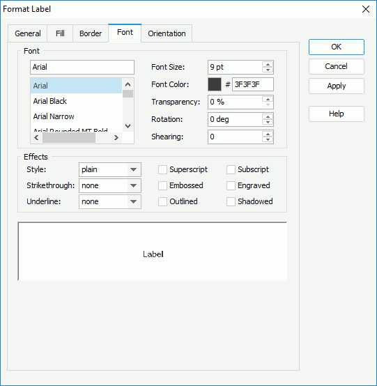
Font
You can specify the font format of the text in the labels in this box.
- Font list
This drop-down list contains all the font faces that you can select to apply to the text. - Font Size
Specify the font size of the text. - Font Color
Specify the font color of the text. To edit the color, select the color indicator and select a color from the color palette or type the hexadecimal value of a color (for example, 0xff0000) in the text box. - Transparency
Specify the color transparency of the text. - Rotation
Specify the rotation angle of the text around its center, in degrees. The default value is 0. - Shearing
Specify the gradient of the text.
Effects
You can specify the special effects of the text in the labels in this box.
- Style
Select the font style of the text. It can be one of the following: plain, bold, italic, and bold italic. - Strikethrough
Select the style of the horizontal line using which to strikethrough the text. It can be one of the following: none, thin line, bold line, and double lines. - Underline
Select the style of the horizontal line under the text. It can be one of the following: none, single, single lower, bold line, bold lower, double lines, bold double, patterned line, and bold patterned. When you select "patterned line" or "bold patterned", Designer draws a line or bold line in the pattern of the text. - Superscript
Select to raise the text above the baseline and change the text to a smaller font size, if a smaller size is available. - Embossed
Select to make the text appear to be raised off the page in relief. - Outlined
Select to display the inner and outer borders of each character. - Subscript
Select to lower the text below the baseline and change the text to a smaller font size, if a smaller size is available. - Engraved
Select to make the text appear to be imprinted or pressed into the page. - Shadowed
Select to add a shadow beneath and to the right of the text.
 Web Report Studio and JDashboard do not support underlining chart text, therefore, Logi Report Engine ignores this property when the chart runs in Web Report Studio or is used in a dashboard.
Sample
This box displays a preview sample based on your selections.
Orientation Tab
Use this tab to specify the rotation angle for the text and icon in the label.
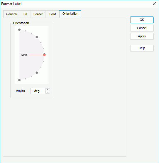
Angle
Specify the rotation angle of the text and icon in the label. When you change the rotation angle in the text box, the red line in the spin box changes correspondingly, and vice versa.