 Previous Topic
Formatting the Indicators in an Indicator Chart
This topic describes how you can format the indicators in an indicator chart.
- Right-click an indicator in the indicator chart and select Format Indicator from the shortcut menu or double-click any indicator in the chart. Designer displays the Format Indicator dialog box.
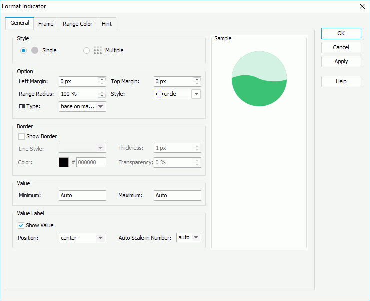
- In the General tab, specify the general properties of the indicators.
In the Style box, specify to use an indicator or multiple indicators to show each value in the chart.
In the Option box, set the left margin, top margin, range radius, and the shape of the indicators. If the indicator chart displays numeric values, select how to fill the indicators from the Fill Type drop-down list: select all to fill the whole indicator or based on max value to fill a portion of the indicators calculated based on the maximum value of the chart. When you select "based on max value", if a value is less than the minimum value, Designer does not fill the indicator; if a value is greater than the minimum value, Designer fills the portion of the value in the indicator which is divided by the maximum value.
In the Border box, select Show Border if you want to show the border of the indicators, then specify the properties of the border including the line style, thickness, color, and color transparency (to change the color, select the color indicator and select a color from the color palette, or type the hexadecimal value of a color in the text box).
If the indicator chart displays numeric values, in the Value box, specify the maximum and minimum values to display in the chart. By default, Designer calculates the minimum and maximum values based on the real values in the chart using certain algorithm, which is the meaning of the default value "Auto".
In the Value Label box, select Show Value to show the value labels for the indicators, then specify the position of the value labels relative to the indicators, and whether to scale big and small numbers in the values.
- In the Frame tab, specify the properties for the frame of the indicator chart.
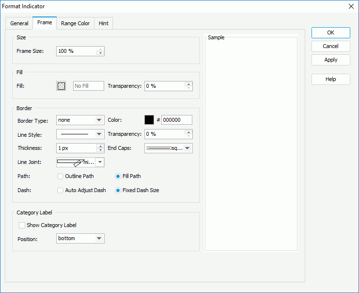
In the Size box, specify the size of the frame.
In the Fill box, specify the color and the transparency of the color to fill the frame.
In the Border box, specify the properties for the border of the frame, including the type, color, line style, color transparency, thickness, ending style, line joint style, fill pattern, and dash size.
In the Category Label box, select Show Category Label to show the category labels for the indicators, which display the category value each indicator represents, and the position of the category labels relative to the indicators.
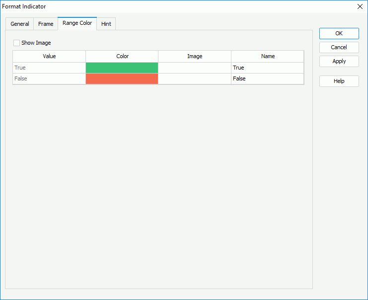
- In the Range Color tab, specify different colors or images to fill the indicators.
- If the indicator chart displays Boolean values, select in the Color and Name columns to specify the color from the color palette and the name for the two values in the indicator chart. If you want to use images to represent the two values, select Show Image, then select in the Image column and select the ellipsis
 to specify the image for each value.
- If the indicator chart displays String or numeric values:
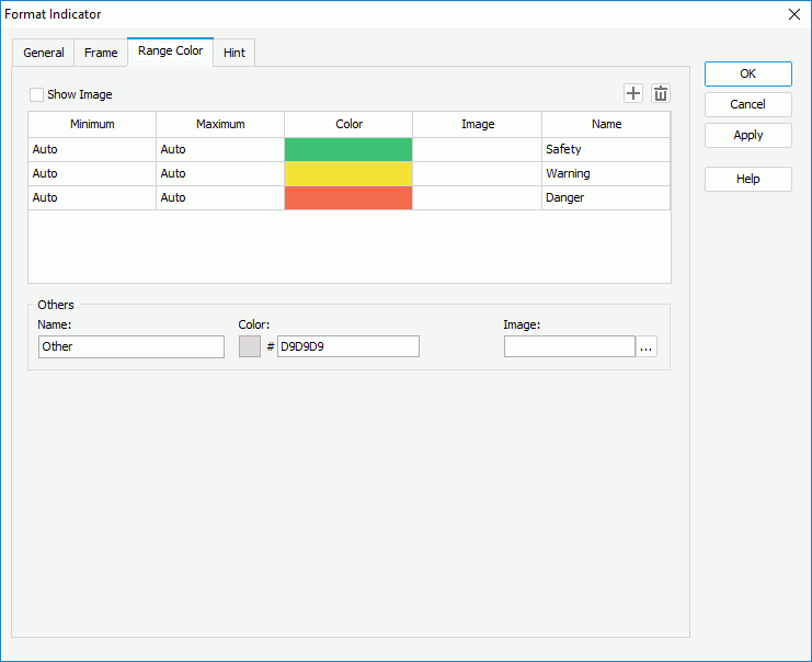
By default, Designer provides three predefined value ranges and calculates the minimum and maximum values for each range using certain algorithm, which is the meaning of the default value "Auto": if the indicator chart displays numeric values, Designer calculates the minimum and maximum values according to the minimum and maximum values that you specify in the General tab; if the indicator chart displays String values, Designer calculates the minimum and maximum values according to how many values there are in the chart and the alphabetic order of the values. You can select in the corresponding columns to edit the minimum and maximum values, colors from the color palette, and names for the ranges according to your own requirements. Select Add
 to add and define more ranges; to delete a range, select it and select Remove
  .
.In the Others box, specify the name and color for the values that do not fall into any of the ranges you define.
If you want to use images to represent the values, select Show Image and specify the image for each value range and the Others value group respectively.
 If you only edit the minimum and maximum values for one range but keep the default "Auto" value for all the rest ranges, Designer regards that there is only one value range in the indicator chart; therefore, you should either keep the default "Auto" value for all the ranges to let Designer calculates them for you, or edit them all to apply your own values.
- If the indicator chart displays Boolean values, select in the Color and Name columns to specify the color from the color palette and the name for the two values in the indicator chart. If you want to use images to represent the two values, select Show Image, then select in the Image column and select the ellipsis
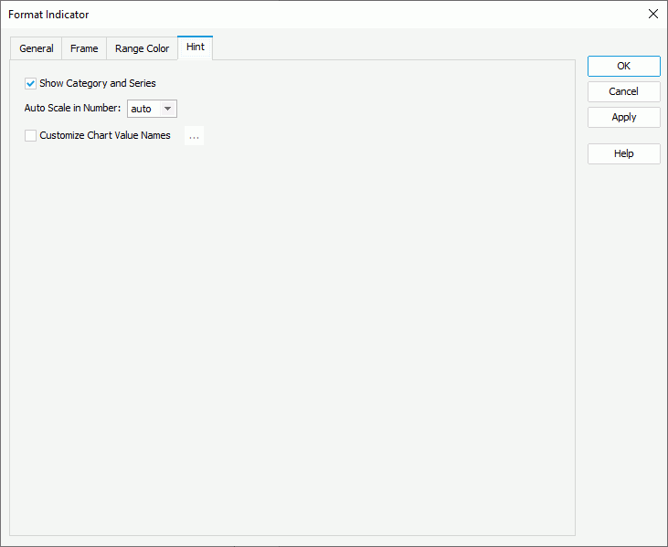
- In the Hint tab, specify the properties of the chart hint (the Show Tips property of the chart paper in the Report Inspector should be "true" if you want to show the hint): specify whether to include the category and series values in the hint, whether to scale big and small numbers, and whether to use customized names for the fields on the value axis in the hint, and customize the names as you want. A hint displays the value an indicator in the indicator chart represents when you point to the indicator in Designer view mode, in HTML result, or at runtime.
- For an indicator chart in a library component, you can define web behaviors on the indicators in the Behaviors tab.
A web behavior contains a trigger event and a web action to be triggered when the event occurs on the indicators at runtime. You can add as many web behaviors to the indicators as you need.
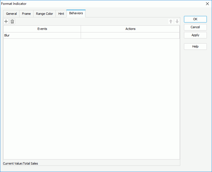
To define the web behavior, select a trigger event from the drop-down list in the Events column, then select in the Actions column and select the ellipsis
. In the Web Action List dialog box, bind a web action the same as you do to web controls in the library component. The web actions you can bind include Filter, Sort, Parameter, Property, and SendMessage.You can select Add
to add and define more web behaviors; to delete a web behavior, select it and select Remove . You can also select a web behavior and select Move Up  or Move Down
  to adjust the order of the behaviors, then at runtime, when an event that is bound with more than one action happens, JDashboard triggers the upper action first.
 - Select OK to accept the changes and close the dialog box.
 Back to top