 Previous Topic
Editing Range Groups on Category Values
In Designer, you can divide data on the category axis of a chart into different range groups based on certain group criteria and customize the data labels for each range group to show required information. This can help you compare the chart data in the way you desire. This topic presents an example to show you how to customize range groups in a chart.
You can use the Range Group feature on charts which meet the following conditions:
- The chart is of the Bar, Bench, Line, or Area type.
- The value fields of the chart do not contain detail information. For example, for a business view-based chart, its value fields cannot be the detail objects in the business view.
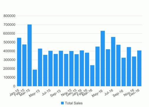
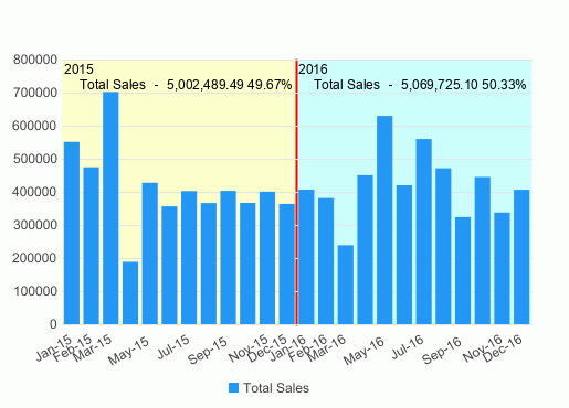
In the following example, it is supposed that you have a chart showing the total sales of each month in 2015 and 2016, and you want to compare the total sales of the two years and also the percentage each month occupies. Take the following steps to define the range groups:
- Make sure SampleReports.cat is the currently open catalog file. If not, select File > Open Catalog to open it from
<install_root>\Demo\Reports\SampleReports. - Select File > New > Web Report to create a web report.
- Insert a chart in the web report as follows:
- Use WorldWideSalesBV in Data Source 1 of the catalog.
- Display in the Clustered Bar 2-D chart type.
- Show Sales Month on the category axis and Total Sales on the value axis.
- Apply the Basic style.
- Save the report and select the View tab to preview the chart.
- Select the Design tab to return to design mode.
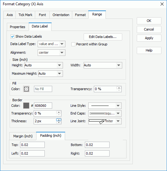
- Right-click the chart and select Format Axes > Format Category (X) Axis from the shortcut menu. Designer displays the Format Category (X) Axis dialog box.
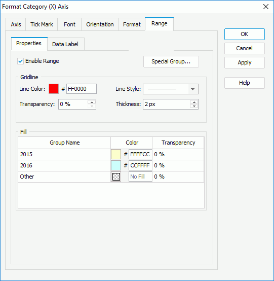
- Select the Range > Properties tab, then select Enable Range and select Special Group to open the User Defined Group dialog box.
- Select Add two times and define the two range groups.
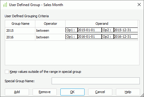
- Select Keep values outside of the range in special group and keep the default name for the special group.
- Select OK to apply the range groups and return to the Format Category (X) Axis dialog box.
- In the Gridline box, specify the line color as FF0000 and thickness as 2 px for the separating line, then in the Fill box, specify the background colors of the 2015 and 2016 range groups as FFFFCC and CCFFFF.
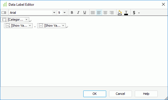
- Select the Data Label subtab, select Show Data Label and then select Edit Data Labels. Designer displays the Data Label Editor dialog box. You can see there are three data labels which represent the category ranges, the summary field name, and the values of the summary field respectively by default. Select OK to go back to the Format Category (X) Axis dialog box.
- Select value and percent from the Data Label Type drop-down list. Select OK.
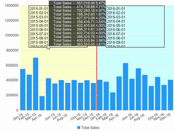
- Select the View tab to preview the chart again. Designer divides the category values into two range groups with different background colors. In each range group, the data labels display the year information and the total sales of each year, and the percentage of the total sales each year occupies.
- Select the Design tab to return to design mode.
This time, we format some properties of the areas that display the data labels on the range groups and make the data labels show total sales of each month instead.
- Right-click the chart and select Format Axes > Format Category (X) Axis from the shortcut menu to open the Format Category (X) Axis dialog box again.
- Go to the Range > Data Label tab, in the Border box, specify Color as 606060, select the first item from the Line Style drop-down list, set Thickness to 2 px.
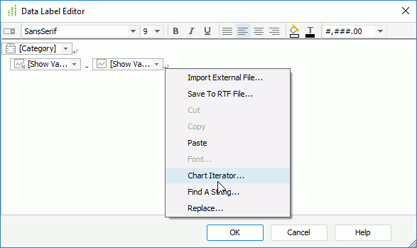
- Select Edit Data Labels to open the Data Label Editor dialog box.
- Select [Category] from the drop-down list of the first iterator.
- Right-click the blank area in the Data Label Editor dialog box and
select Chart Iterator from the shortcut menu.
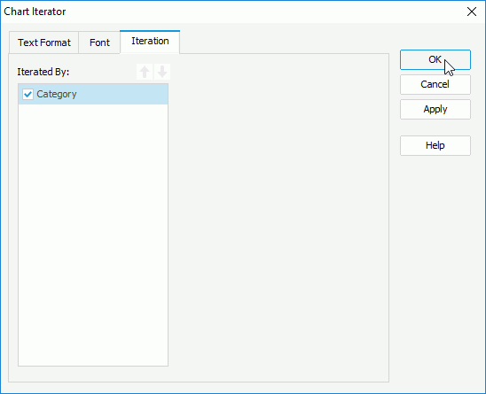
Designer displays the Chart Iterator dialog box.
- Select Category in the Iterated By box and select OK.
- Select OK in the Data Label Editor and Format Category (X) Axis dialog boxes respectively to close them and apply the settings.
- Resize the chart and preview it again. Designer displays the border of the data label areas and the data labels now show the total sales of each month and the percentage each month occupies. You can put the mouse over the data labels when they cannot completely display to get the full text.
 Back to top